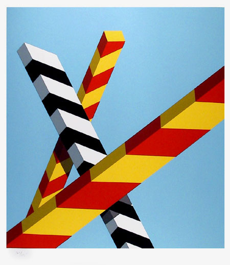
STRUCTURE
structure
ˈstrʌktʃə/Submit
noun
1.
the arrangement of and relations between the parts or elements of something complex.
"the two sentences have equivalent structures"
verb
1.
construct or arrange according to a plan; give a pattern or organization to.
"services must be structured so as to avoid pitfalls"
ˈstrʌktʃə/Submit
noun
1.
the arrangement of and relations between the parts or elements of something complex.
"the two sentences have equivalent structures"
verb
1.
construct or arrange according to a plan; give a pattern or organization to.
"services must be structured so as to avoid pitfalls"
M I N D M A P
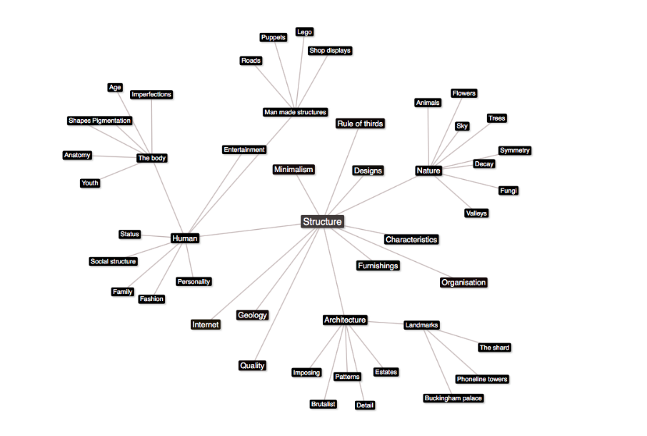
Based on my initial thoughts and ideas on the exam title "structure" I created a mind map. Throughout this unit i will make references to my primary ideas and develop them.3
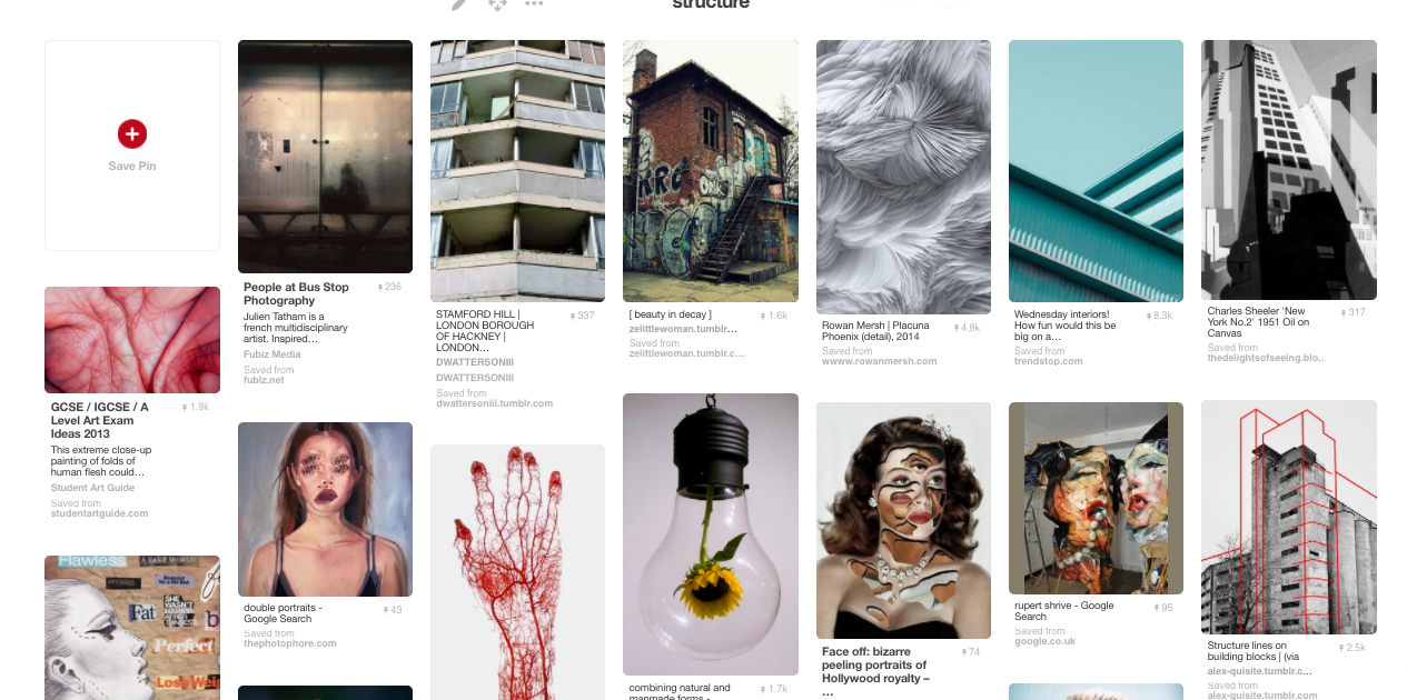
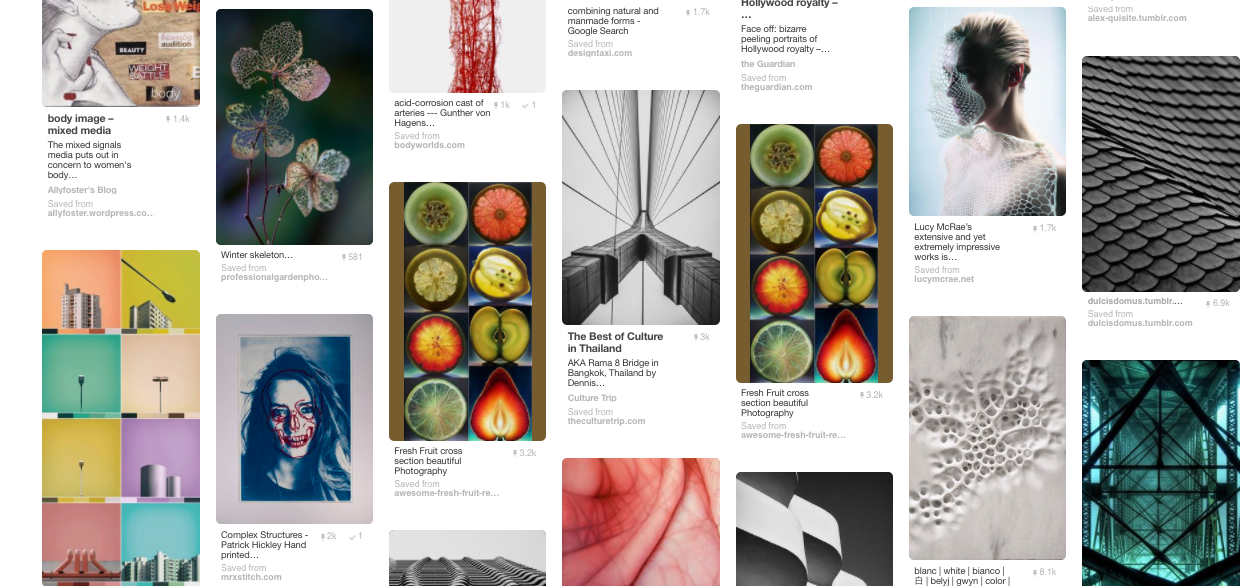
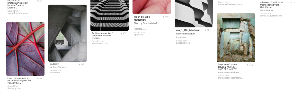
V I S U A L I N T E R P R E T A T I O N
Prior to my mind map, I created a visual brainstorm using Pintrest. In doing so, i looked at photographers and other students work on past, present and future to influence and inspire my project.
S E T T A S K ' S
G A L L E R Y V I S I T S
Below are the galleries I have visited to influence my work in this exam unit.
1 . T H E R A D I C A L E Y E - S I R E L T O N J O H N
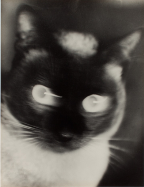
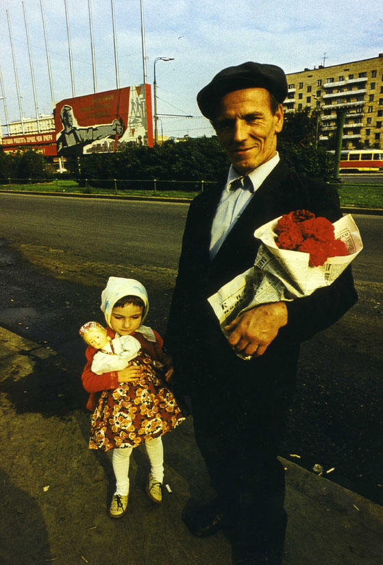
Held at the Tate Modern, the Radical Eye collection is from Elton JohnThe exhibition consisted of many rare vintage prints from the modernist era, the 1920's to 1950's, in photography this is also known as the 'coming of age' era. The work consists of original contracts which is very unique and interesting.With over 70 artists and nearly 150 rare vintage prints on show from seminal figures including Brassai, Imogen Cunningham, André Kertész, Dorothea Lange, Tina Modotti, and Aleksandr Rodchenko, this is a chance to take a peek inside Elton John’s home and delight in seeing such masterpieces of photography. Structure is apparent in the images of this collection through texture, scale, buildings and so on.
"Each of these photographs serves as inspiration for me in my life; they line the walls of my home
and I consider them precious gems. I want people to think, ‘I’ve never seen anything like that before,
never knew this kind of thing existed’ – just as I did when I first saw these photographs."
— Sir Elton John
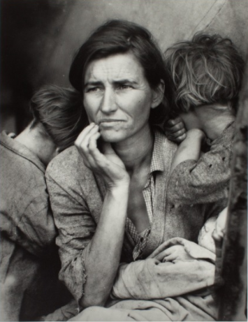
Dorothea Lange 'migrant mother', 1936 |
Otto Umber 'Katz' 1927
|
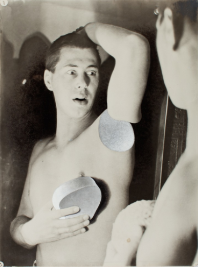
Herbert Bayer self portrait, 1932 |
'I saw and approached the hungry and desperate mother, as if drawn by a magnet. I do not remember how I explained my presence or my camera to her, but I do remember she asked me no questions. I made five exposures, working closer and closer from the same direction. I did not ask her name or her history. She told me her age, that she was thirty-two. She said that they had been living on frozen vegetables from the surrounding fields, and birds that the children killed. She had just sold the tires from her car to buy food. There she sat in that lean- to tent with her children huddled around her, and seemed to know that my pictures might help her, and so she helped me. There was a sort of equality about it.' - Dorothea Lange
2 . R E D B O R I S M I K A L I H O V
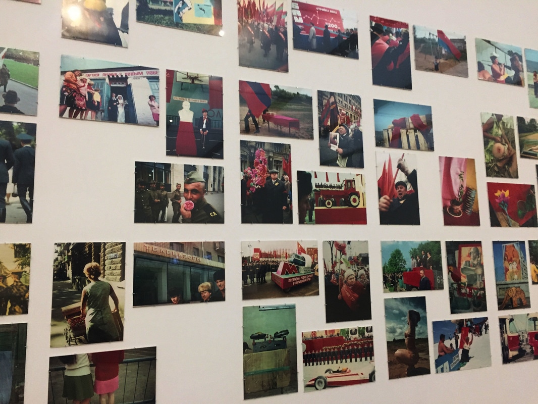
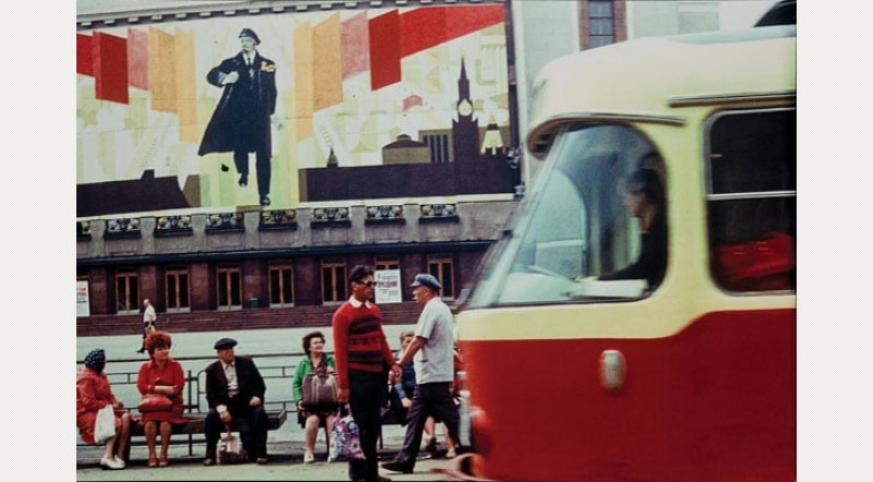
Red is a group of eighty-four colour photographs taken between 1968 and 1975 in Mikhailov’s home town of Kharkiv in the north-east of present day Ukraine. A diverse array of subjects and situations are depicted: scenes from official military parades and political rallies, views of the Kharkiv cityscape, and unofficial private moments between family and friends. The snapshots do not document significant events; instead they trace the Soviet byt, the banal mundanities of everyday life in the Soviet Union under communist rule. Mikhailov suggested that ‘the more we can exclude the event from representation, the closer we can approach the most important thing – being’ (Boris Mikhailov, Unfinished Dissertation, Zurich 1999, p.28). Shot using colour film, an unusual luxury in the Ukraine at this time, the images draw upon the aesthetics of early twentieth-century Soviet avant-garde photographers such as Aleksandr Rodchenko with their abruptly cropped compositions taken from unconventional perspectives.

3 . T E R R A I N S O F T H E B O D Y - W O M E N I N T H E A R T S
Drawn from the National Museum of Women in the Arts (Washington, U.S.), this collection display showcases photography and video work by seventeen contemporary artists from around the world. By turning their camera to women, including themselves, these artists embrace the female body as a vital medium for storytelling, expressing identity and reflecting individual and collective experience. The works of the exhibition represented the structure of society, patriarchy and women's independence were both very strong themes Many works focused on the 1970's feminist art, including film and video.
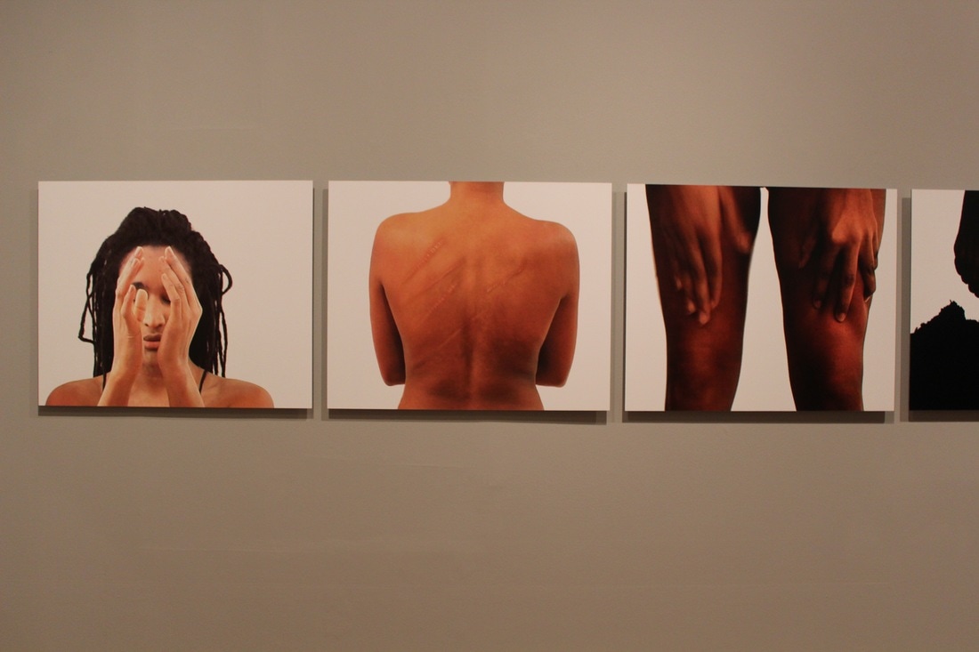
Given the history of the female body as a political and cultural battleground, photographs of the fragmented or marked female figure bear a deep emotional charge. Images of inscribed, tattooed or scarred female bodies testify to dark political history. These complex and aesthetically compelling works tell a vital a story of women, subjectivity and art.
|
|
|
|
TASK 3: STRUCTURE IN NATURE
M Y O U N G H O L E E
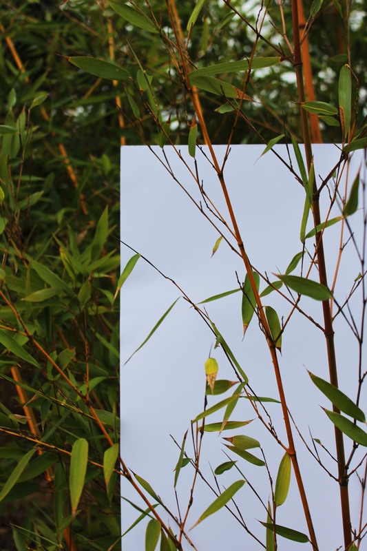
Myoung Ho Lee is a young photographer from South Korea, he has produced an elaborate series of photographs that pose some unusual questions about reality, art, reality and seeing. This series in simple in content however its complex in execution, the main focal point of this collection is looking at the tree but the main concept is the artificial separating of the tree from its surroundings. He achieves this by using a immense white sheet, this creates the sense that the tree is a painting on a billboard.
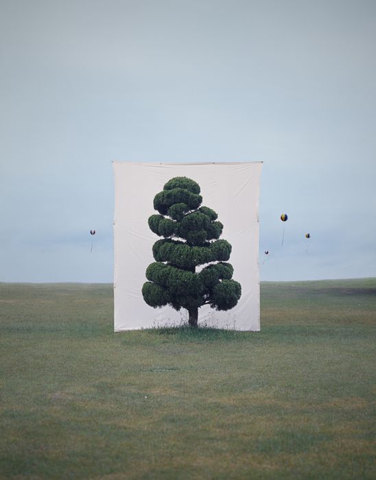

|
This photograph stood out to me because of the unusual order it consists of. Unlike Ho Lee's other photos, this one contains a series of predominant trees. However the one in the centre of the photograph is the most dominant. The white back drop helps to do this as it adds height to the tree. Moreover, the focal aspect of this image is more subtly the 'meta-subject' because of the misty, gloomy conditions.
|
I have chosen to analyse this image because of the interesting details that the tree presents. For instance, the white background highlights the quirky and bushy texture of the branches. In addition to this, the contrast of the trees colours comparing with the lighter grass colour gives the photo more depth. It seems that the artist has captured this photo in the early evening, meaning the sky looks pretty, the balloons rising also looks nice and arises thoughts on man vs nature to the viewer.
|
Here, the foreground of the photograph consists of much depth through the stratified layering and the colouring is very vibrant, drawing attention to it. Comparably the backdrop doesn't stick out as much as in his other photos but this is still an effective tool. Prior to this, the backdrop could be photoshopped into this image because of its sharp edges. The photo contains strong symmetry excluding the small, blurred tree in the far left of the frame. This photo has been taken at a wide shot angle
|
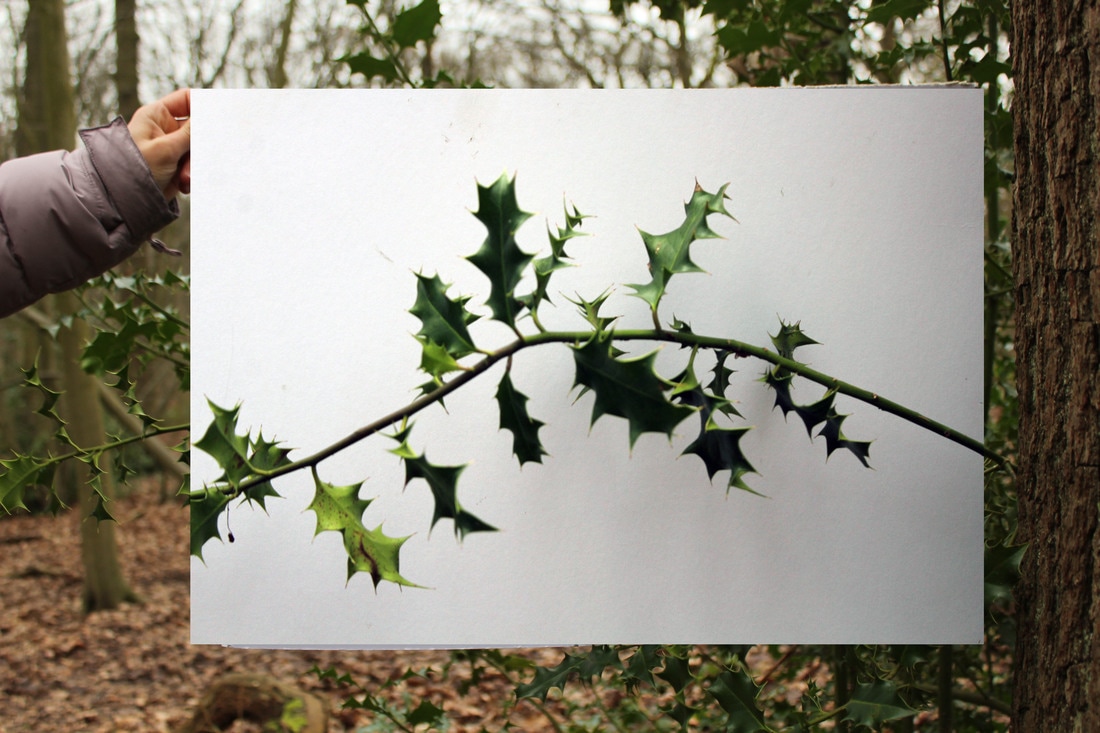
FIRST REPONSE:
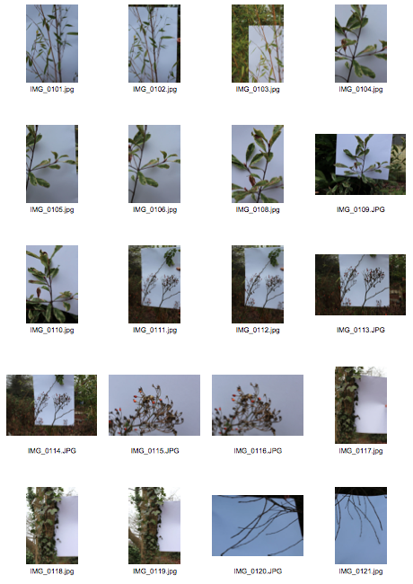
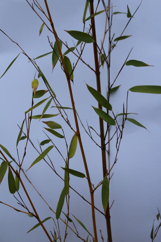
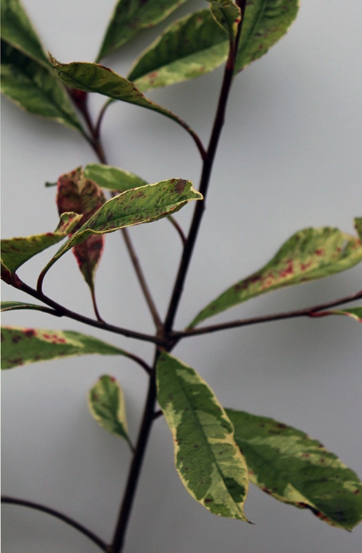
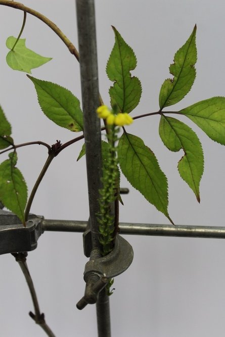
For my first response to this task I used a white piece of cardboard to frame and emphasise the chosen branches/plants i wanted my photograph to consist of. Some of my photos were taken zoomed out in order to capture the contrast between the background and what was on the white paper, like MYoung Ho Lee does but i also took a range of zoomed in photographs, just focusing on the structure of the focal point.
|
|
|
|
|
SECOND RESPONSE:
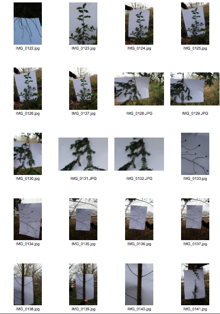
My aim for this response was to gain a variety of different locations within my images so here i visited an enclosed wooded area, Coldfall woods. I experimented with a lot more angles here but overall i don't think this response was as good as my first one. I think this was due to the lighting and the lack of variety of plants in the area. To imrpove
|
|
F I E L D W O R K S
S A N N O K A N I S T O
Finnish artist Sanna Kannisto (born in 1974) explores in her photography the theories and concepts with which we approach nature in art and science. In so doing, she uses both the methods of representation in art as well as the methods of the natural sciences. Her characteristic photographic works were made during numerous stays in Peru, French Guiana, Brazil, and Costa Rica. Plants and animals are studied, staged, and photographed in stagelike portable “field studios.” As soon as the object is removed from its original context—nature, in this case—our attention is directed toward specific characteristics and movements. The white backdoor of the “field studio” which serves of the backdrop for her stagings further amplifies this effect. Kannisto collects the most various species in great variety, explores and archives them.
|
I like the way that the artist has captured all the minor but effective details of the plant. This is achieved through the white intense lighting. Moreover, this makes the bright primary colours stand out a lot. It is also very interesting that the leaves are facing downwards. If you look closely the structure of the plant matches the shape of the stand.
|
The plant featured in this photograph is very abstract and quirky. The texture of the thick branches is very much in focus and stands out, intensified by the yellow colouring. Furthermore, the fading green of the stem is very effective. The staging of the plant draws the viewers attention, the fact its in the centre of the picture and the dramatic black curtains
|
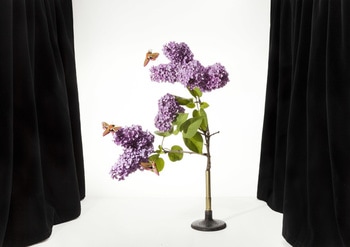
Here, the branches are leaning to one side which creates an unusual reversed L shape. The blossoming vibrant purple flowers are even more emphasised by the butterflies that are on them. Butterflies represent new beginnings which merges with the blossoming tree nice so this photo gives off very positive vibes.
|
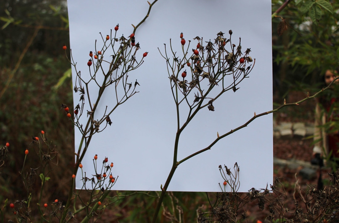
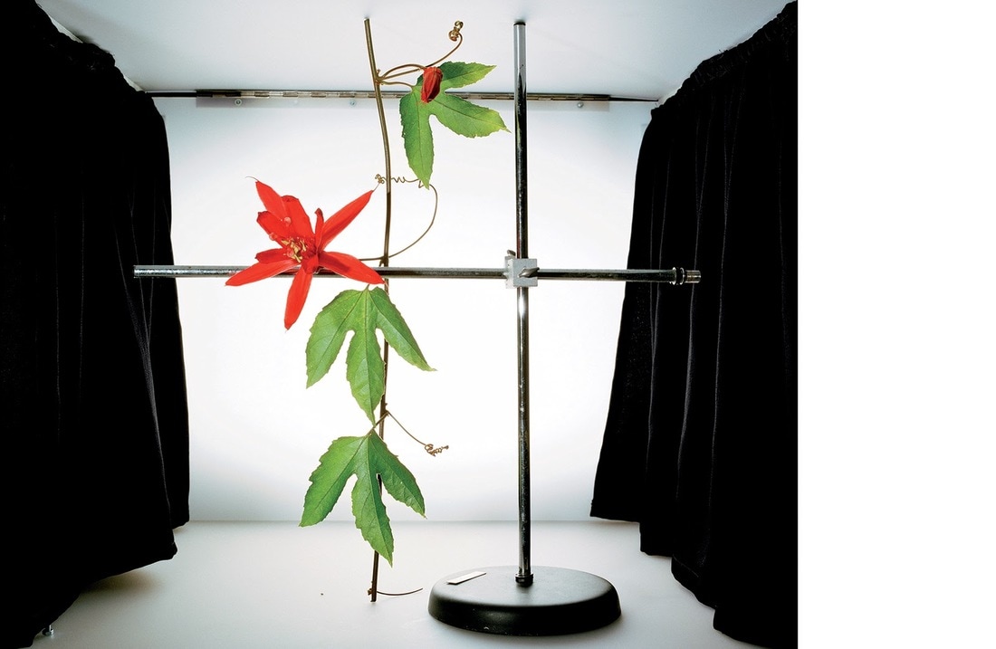
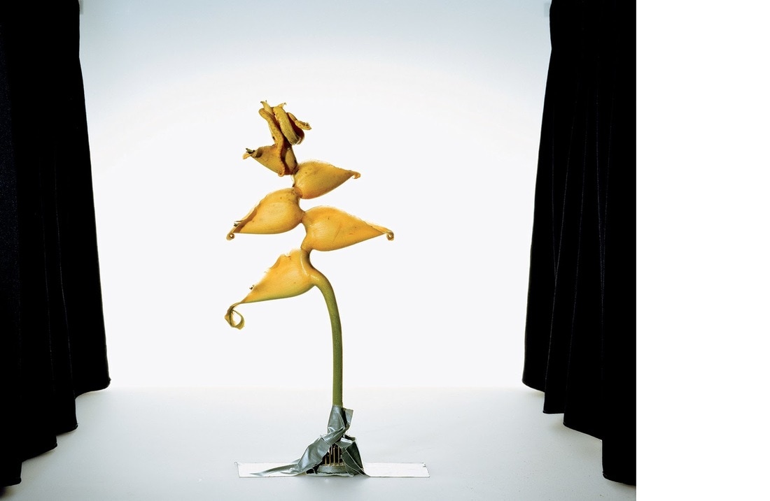
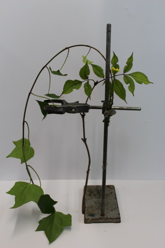
FIRST RESPONSE:
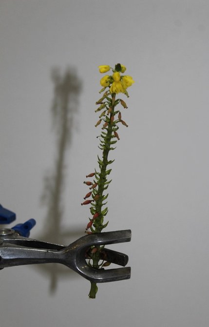
To respond to Sanno Kanisto's effective field work photos I created a similar 'stage' (set up). This portrays clearly to the viewer the focal point, this being my chosen branches/flowers. I also used a metal scientific tool to show the contrast between the natural structure and the man made objects, and almost making it look like an experiment subject.
|
|
|
|
|
|
I took a variety of photographs, some showing the detail of the plant and its colouring, for this I used the AF lens setting at times. I did this so that the white background was less visible, thus drawing the viewers attention to the plants subtle but intricate details. Moreover, the other set of images are more a replication of the artists, in which the branches are displayed neatly and the tool is predominant. The intention for these photographs was to make the plant look staged and like a scientific subject being assessed.
H E N R I Q U E F O L S T E R
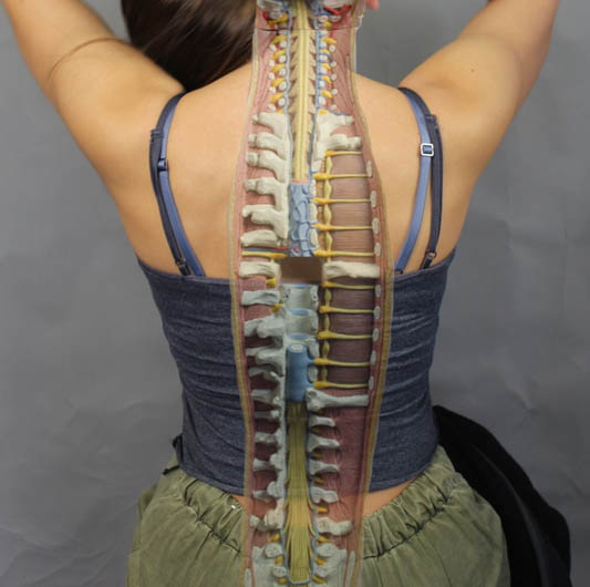
S T R U C T U R E O F T H E B O D Y
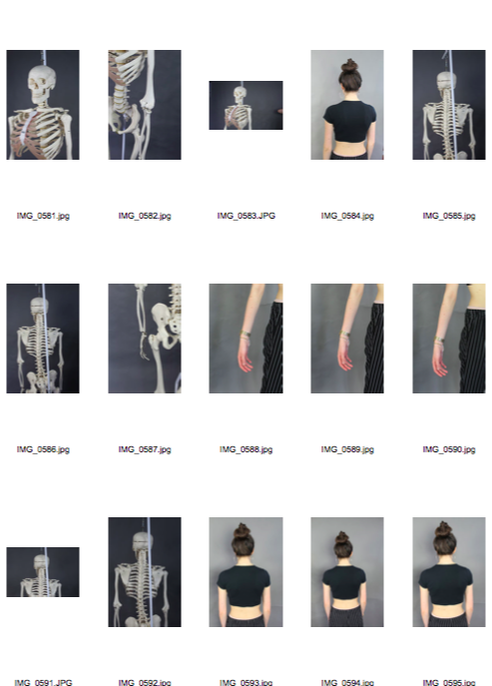
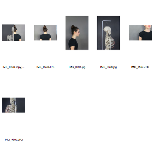
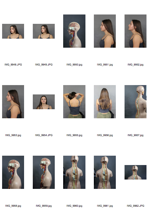
FIRST RESPONSE:
For my first response to the structure of the human body I captured a series of photographs of a skeleton figure, this shows the internal layer of the human structure. To contrast this I also photographed one of my peers, I will photoshop these images in photoshop with the intention of merging them to show this significant difference.
|
|


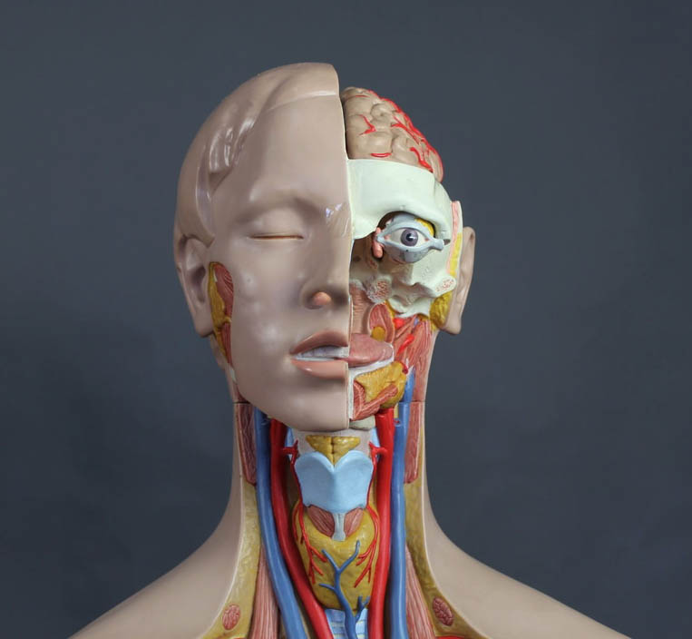
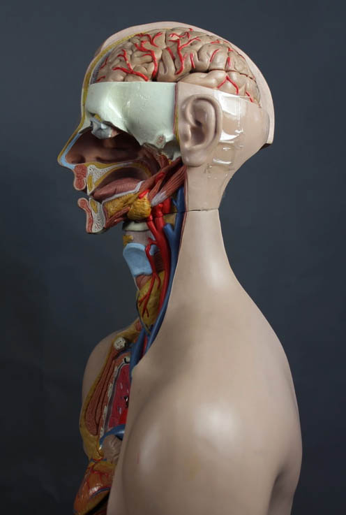
ARTIST LINK- G U N T H E R V O N H A N G E N S
Gunther Von Hagens (born 10th of January 1945) is a German anatomist who invented the technique for preserving biological tissue specimens called plastination. "The anatomist alone is assigned a specific role-he is forced in his daily work to reject the taboos and convictions that people have about death and the dead. I myself am not controversial, but my exhibitions are, because I am asking viewers to transcend their fundamental beliefs and convictions about our joint and inescapable fate."
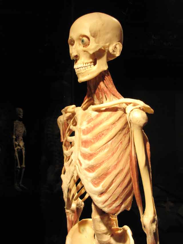
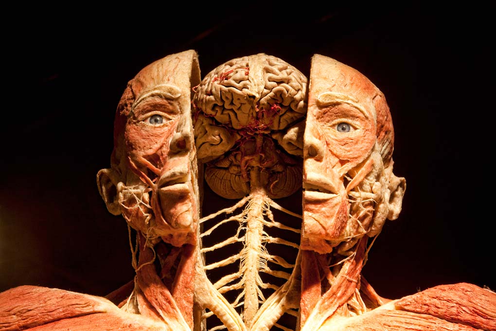
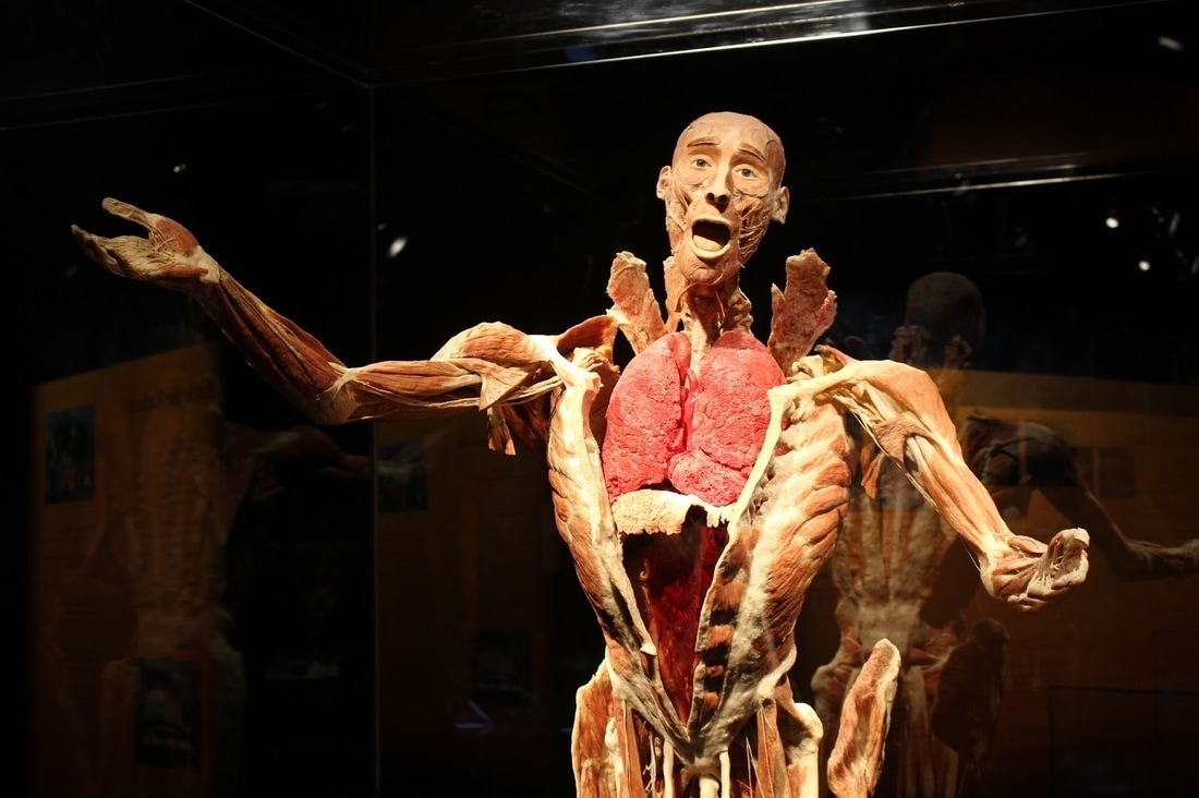
The three photographs above are all very saturated, this is effective as it makes the skeletons more exaggerated and as a result highlights clearly to the viewer that they are the centre of the image.Furthermore, the dark background helps to bring out the textured details of the skeletons, for example the fine details of the bones.
SECOND RESPONSE:
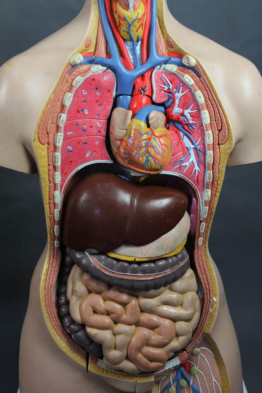
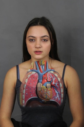
I wasn't content with my previous set of observations for this topic so here I have used the influence of Von Hagens expressional photos to improve my images. Prior to this, I used a different skeleton figure, this one showing the human body's organs. In light of this, I used a range of angles and zoomed in a lot on the particular organs/features.
|
|
|
|
|
|
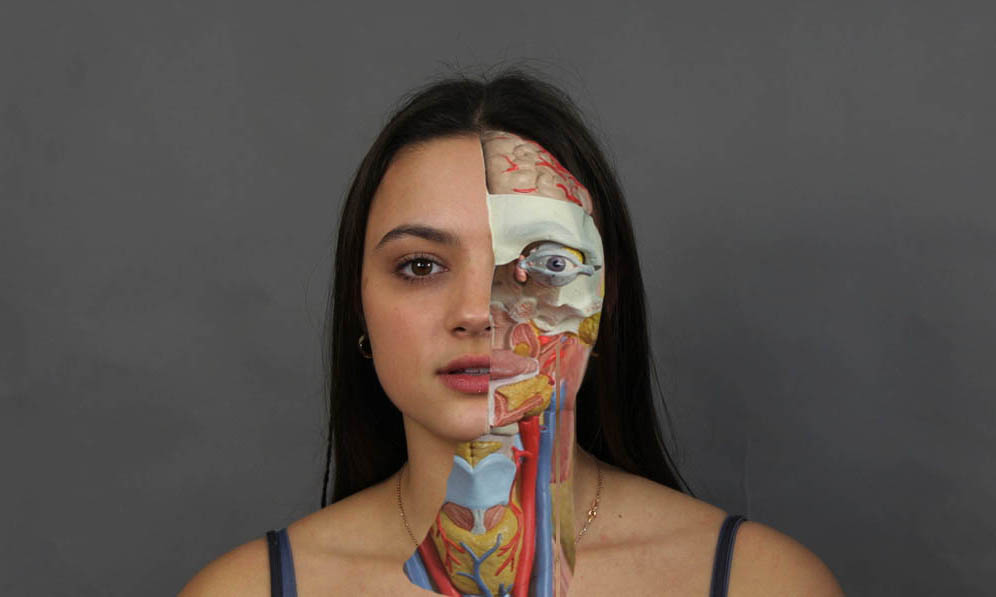
Using the 'quick selection' tool in photoshop I highlighted certain regions that I wanted to compare and contrast with my chosen model to represent the human aspect of the body structure. I feel my outcome was weak because it wasn't that realistic nor dramatic. To improve this I will try it again.
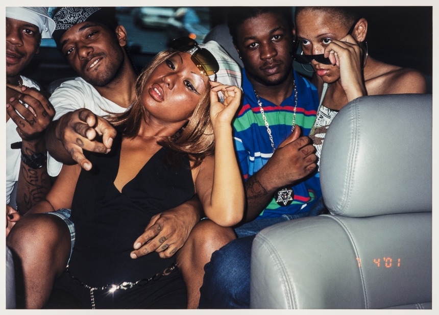
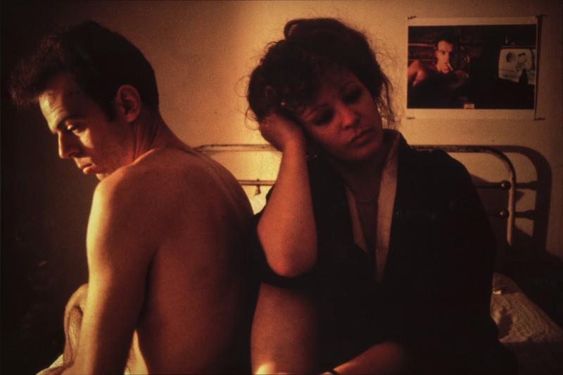
hannah starkey photography
nangoldin
sarah johns
cross processing
http://www.studentartguide.com/articles/creative-photography-ideashttp://www.studentartguide.com/articles/creative-photography-ideas
nangoldin
sarah johns
cross processing
http://www.studentartguide.com/articles/creative-photography-ideashttp://www.studentartguide.com/articles/creative-photography-ideas
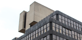
B R U T A L I S T S T R U C U R E
The term Brutalism was derived from the French ‘Béton brut’, or raw concrete, and the expression became associated with a movement emerging in postwar British architectural offices.
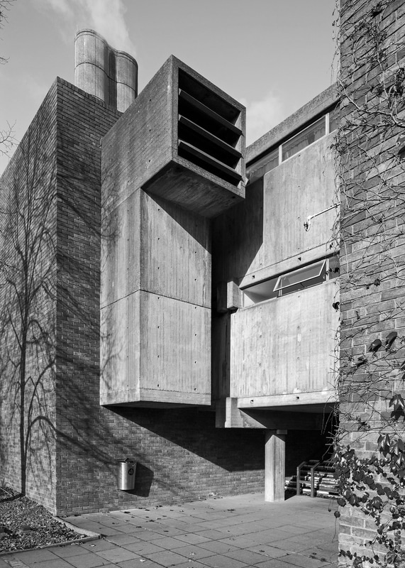
S I M O N P H I P P S
Simon Phipps is a fine art photographer operating in the UK and has captured a wide variety of subjects. However, when we came across his Brutalist Prints series, we immediately saw something special. While photographing Brutalist architecture is nothing new, Mr. Phipps' approach and execution is something very unique. We were able to speak to the photographer about the series and understand his ethos and vision.
|
The building featured in this composition is relatively simplistic, in terms of its structural similarities to other London structures. However, the artist cleverly adds more to the image through reflection and lighting. At the left of the photo the tree is embedded into the wall, this changes the image a lot. Also, the fact the composition has been taken on a bright sunny day lights up the image and makes the structure look more brutal. Like the rest of Phipps pieces, the high contrast of this photo is incredible effective as it makes the building look more raw.
|
In this image perspective and scale play a big part in the composition as you can see three similar buildings yet one is nearer to the foreground of the photo. As a result there is not just one clear focal point of the image like the majority of his other photographs. Furthermore, the picture has been taken from a low perspective, in order to capture the full height of the imposing structures. I think this is effective because it forms a realistic touch. The image looks as if it has been taken on a film camera but it might not be
|
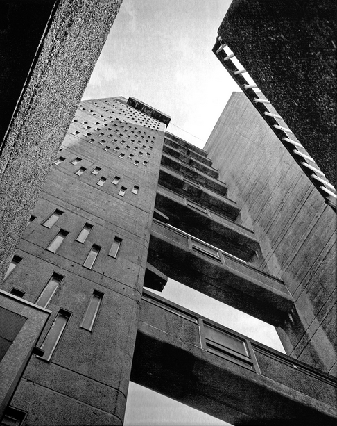
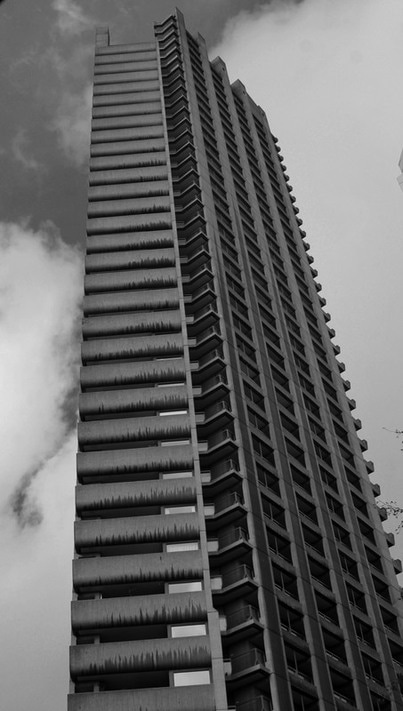
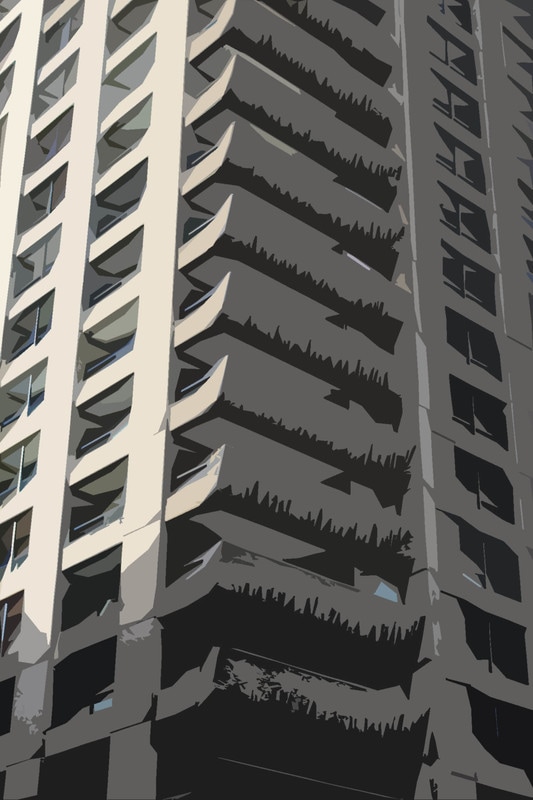
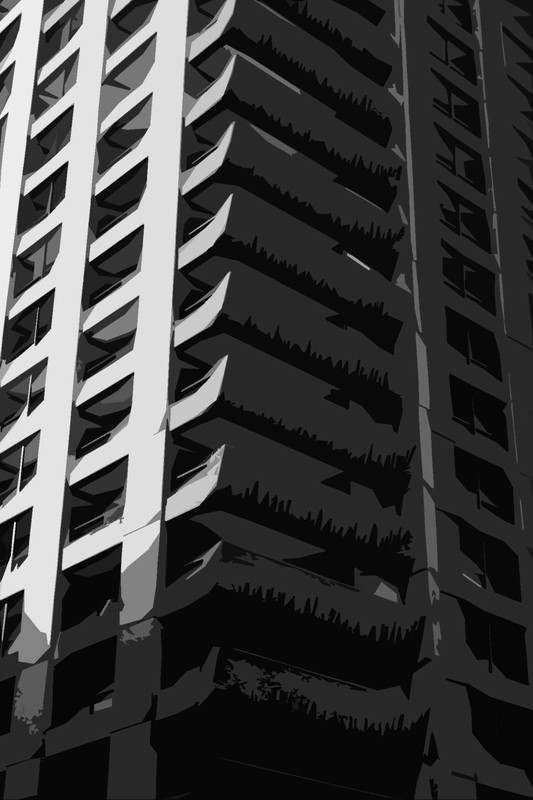
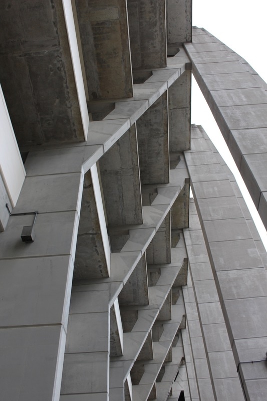
Here, the photographer has clearly got very close to the structure in order to show its imposing form. This is effective in emphasising its brutality and the high contrast also emphasises this. The photograph has been captured at Trellick tower in the Royal Borough of Kensington, Chelsea. The choice of architecture has strengthened the outcome because of the layers of the bridges. Furthermore, the building has interesting details if you look at the windows, this is very specific to this estate and therefore evokes a sense of individuality
|
F I R S T R E S P O N S E:
For my first response to this task i visited the south bank in order to photograph brutalist architecture. However i found that my photographs lacked the desired effect. To improve this i will construct my images more carefully next time, for example i will visit a more sustainable location where the architecture i capture holds simmilarity
|
|
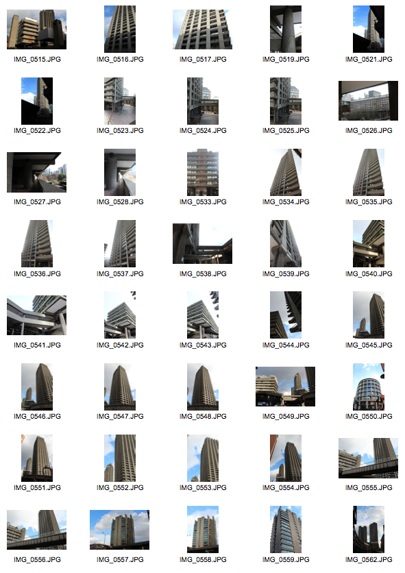
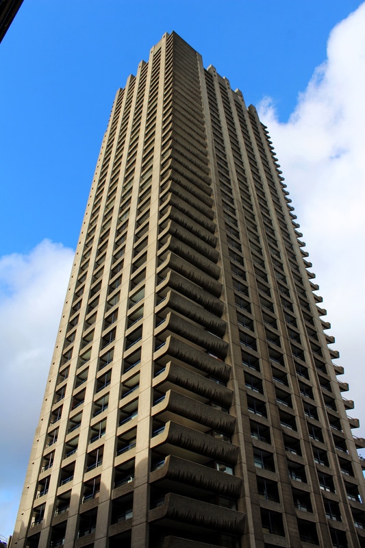
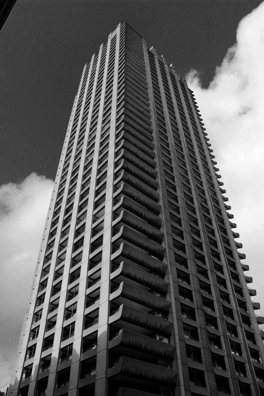
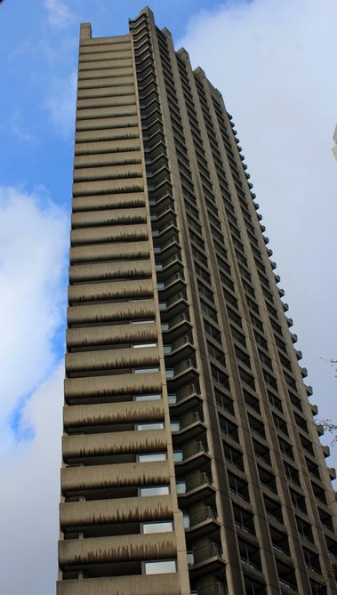
SECOND RESPONSE:
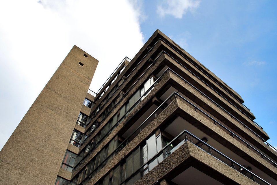
Next I visited The Barbican, I chose this location because of it's distinctive appearance and the fact that the architecture is more imposing. To refine this response from my last, I was more considerate with the angling of my images, for example I went closer to the structure and used a low vantage point. This enabled me to capture the full perspective of the building and capture details I wouldn't have from a zoomed out view.
|
|
|
|
T H O M A S D A N T H O N Y
Thomas Dathony is a French photographer who based his work in London. His work is characterised by a clever use of light, bold compositions and a dose of mystery, this is apparent through the tall frames he uses. Danthony's intentions were to explore various Brutalist architecture in London, but portray it in an unconventional way. The photographs hold much symmetry to one an other in terms of their simplistic structure. This is due to the black background that he has constructed in photoshop. Prior to this, the small print in the top left of the image and the evolving moon towards this right, as demonstrated below. The images consist of a unrealistic and thus comical touch because of the close focus on solid shapes, this is achieved using the magnetic lasso tool in photoshop and the average tool in the filters.
To create the same effect that the artist achieved I edited my photographs in photoshop, I experimented with two different processes.
|
|
Method one
Method two
P R O C E S S
1. 1. After launching your chosen image in photoshop select the polygon lasso tool
|
2. Then you select the shapes/areas that you want to simplify
|
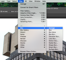
3. In the filter area select blur and then click on average or you can select an other colour
|
E X P E R I M E N T A T I O N
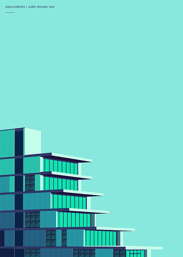
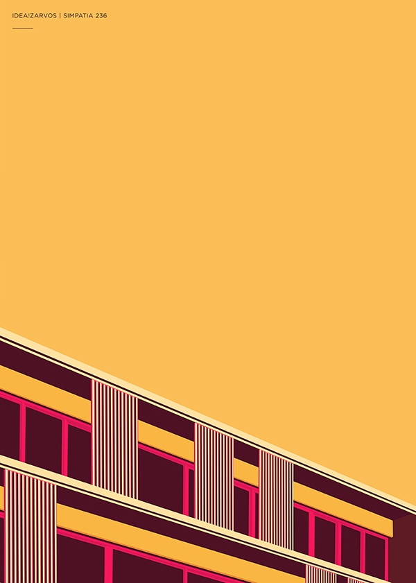
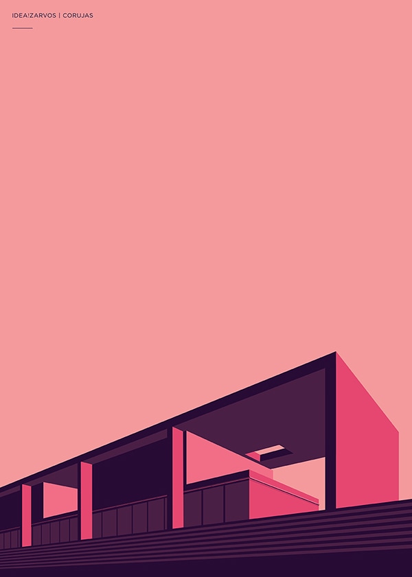
H E N R I Q U E F O L S T E R
M Y R E S P O N S E
These images are similar to Thomas Dathony's in the sense that they both use the simplification of colours to form unique and visually appealing pieces. In Folster's work the colours express vibrancy and therefore a sense of passion is shown. All of her images share the same aspect of the building being neatly portrayed at the bottom of the image. I think that the intention of this is to emphasise the modern structures edges, this enables the viewer to interpret the shape and harshness of the building precisely. The technique the photographer has used seems to be photoshop and the negative space has a strong effect on the viewer as it establishes the main colour immediately, which seems to be the focal element of each photograph
MY RESPONSE
ARTIST AND ME
Artist's image
|
My image
|
Here I have mimiced the artists use of negative space, choice of colouring and angles to refine my work from my first response. However, unlike the artist I have added in lines and shadows to strengthen my image through showing geometric shapes (a theme i would like to develop later in my structure project. Moreover i have left some of the structure (the tiles) natural and have aimed to emphasise perspective within my image
T H R E E S T R A N D S
S T R A N D O N E
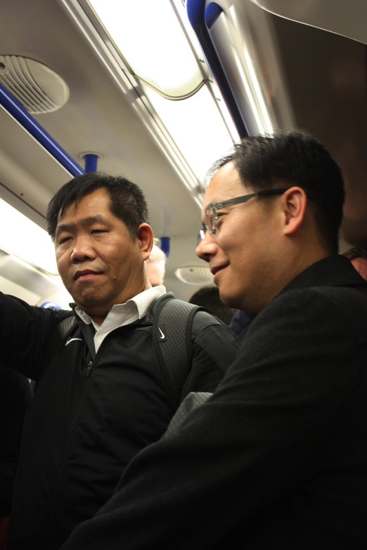
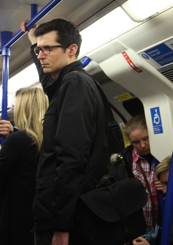
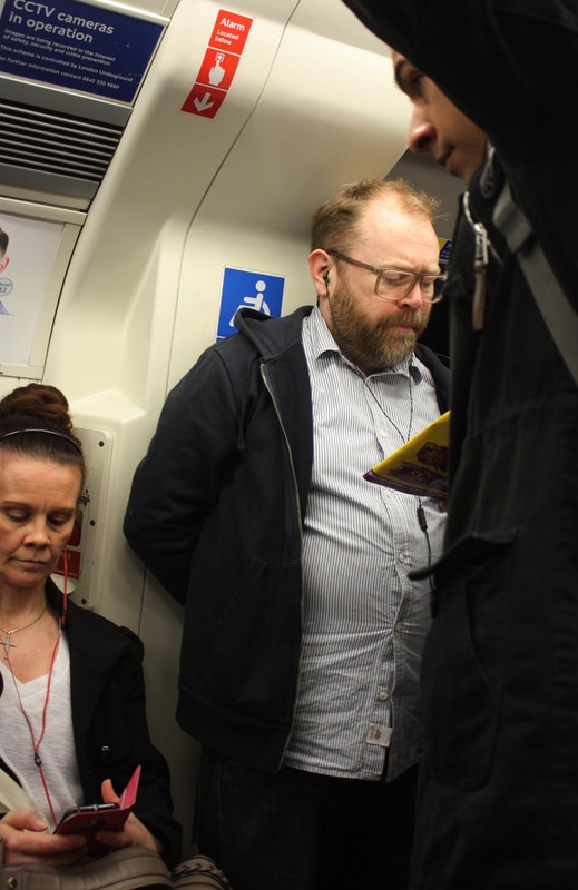
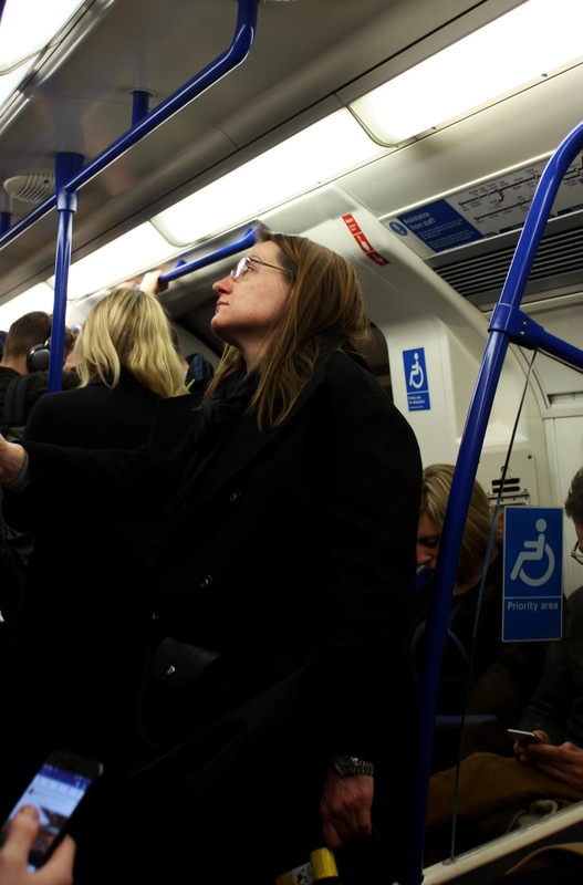
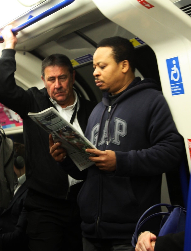
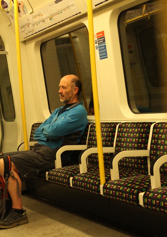
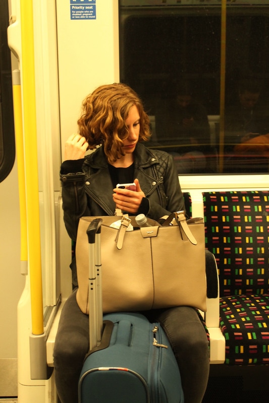
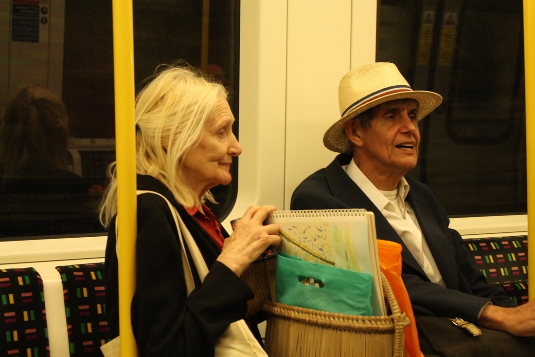
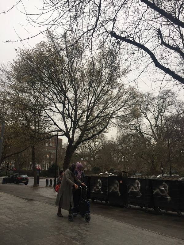
I chose social structure as one of my strands because I thought it would be interesting to document social hierachy, gender inequalities and more.
FIRST RESPONSE
To begin this strand I simply documented people on the Northern line during rush hour on a weekday. I feel like these photos aren't successful because they lack depth and meaning. To change this I will photograph another tube line to show the contrast between the locations

SECOND RESPONSE:


THIRD RESPONSE:
Due to the weakness of my tube images here i have used the background to manipulate the image and add more to it. I have also shifted the focus of my work to age structure.
|

|
S T R A N D T W O
S H A P E S
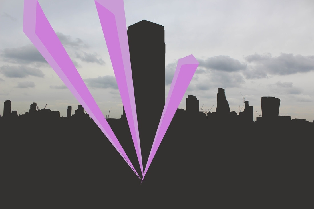
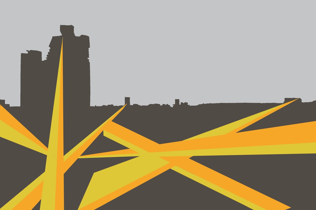
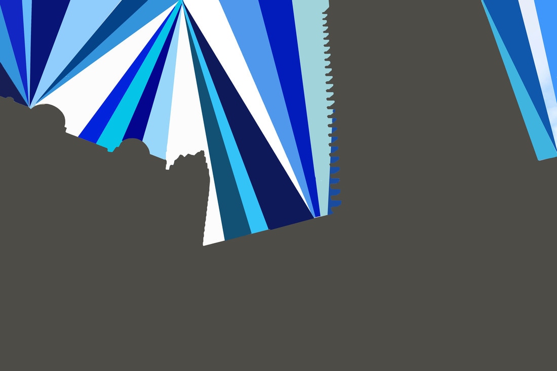
At the beginning of the project, I came across some interesting work an other student had completed for structure, on Pinterest. I liked the abstraction behind it and the fact that shapes can portray structure in an obvious but not so obvious way. I also found that it related appropriately to the flat colouring and colour experiments. I hope to incorporate the structural environment of the city in my edits with shape in order to create unusual pictures.
FIRST RESPONSE:
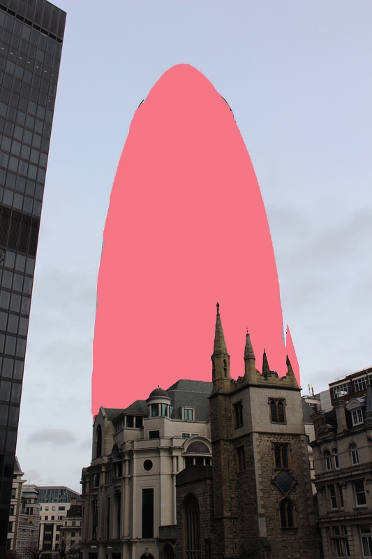
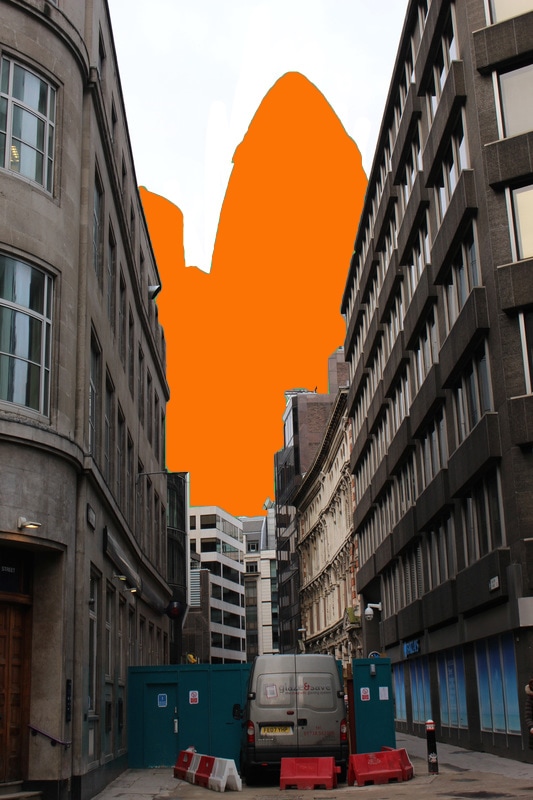
I decided to use these images in this way from the technique i learnt in one of the brutalist set tasks, Thomas Dathony's technique. This consisted of using photoshop to highlight specific shapes that could be emphasised using the blur tool in filters. I liked this process as I feel it represented structure well and had a unique, abstract outcome. Therefore, for this strand I wanted to develop this further but with the use of various buildings from a higher perspective and the use of colour to form a more commercial outcome.
|
|


FIRST RESPONSE:
The edit on the left as you can see I have left the clouds visible, but the rest of the photograph has been edited in a way that emphasises it's shapes and nothing else like the landscapes colours and fine details. This is the same with the image on the right
SECOND RESPONSE:
For this response I aimed to create a piece that was more detailed and had a greater meaning. Thus i have used different shades of blue in photoshop to create an artificial sky.
ARTIST LINK
-
A L L A N D ' A C R A N G E L O
Allan D'Arcangelo (June 16, 1930 in Buffalo, New York– December 17, 1998 in New York City, New York)was an American artist and printmaker, best known for his paintings of highways and road signs that border on pop art and minimalism, precisionism and hard-edge painting, and also surrealism. His subject matter is distinctly American and evokes, at times, a cautious outlook on the future of this country.
|
|
S O C I A L S T R U C T U R E
CHOSEN STRAND : A R C H I T E C T U R E
DEVELOPMENT 1:
MAUREN BRODBECK
Born in Geneva in 1974, Mauren Brodbeck has, since her youngest years, been delivering an eclectic and multicolored body of work that calls into question ideas around "being" vs "appearing to be", working in a realm of expressive forms sublimated by color.
Mauren Brodbeck’s concern is tracing the individual and personal history in the seemingly banal, and wresting anonymous places from their recording and surveillance grids. From the seemingly unspecified nothingness arise (partially found, and partially inserted afterwards) massive bodies, or actually monochrome surfaces which optically metamorphose through the photographically detailed periphery into monumental sculptures. Behind the urban abyss, an unexpected vitality can unfold through more careful contemplation, a Genius loci always standing, a sensual secret. Mauren Brodbeck registers this secret to memory and metamorphoses it into a visual history about the invention of space and time.
|
|
EVALUATION
So far in my developments of architecture I have experimented a lot with the use of block colours to manipulate the outcome of the structure within the images. I feel i have achieved the effects I intended to however within my next developments I will try to keep more of the image, for example using lines instead. Furthermore I want to incorporate the natural landscape and the contrast between rural and urban too, perhaps I might visit scrap yards and parks to do so.
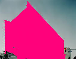
ALEXEY BOGOLEPOV
Photographer Alexey Bogolepov lives in Parnas, a suburb in the north of St Petersburg.His work focuses on the architecture and ideology of modernism, both in the former Soviet states and worldwide. He also runs Granite Editions, an independent publishing house for limited-edition photobooks.
"Where recently there were only swampy grasslands dotted with lonely wooden houses and unsightly garage cooperatives there is now, and will be in the foreseeable future, a never-ending construction site,” he says. "For an observer this is a chance to catch a territory in transition, in a delicate and almost poetic state of being not quite urban and not quite rural.”


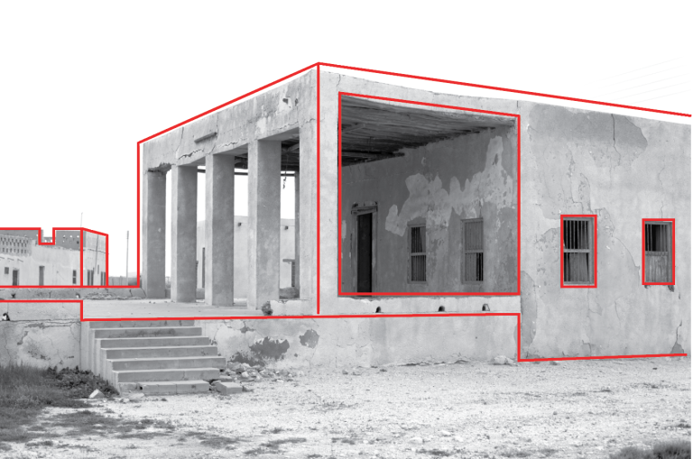
All the above photographs by Bogolepov are taken at a wide shot angle. This is extremely effective because it means that the outlines are also larger and thus more imposing. The drawing has clearly been done on photoshop and requires a high level of skill as they are all neat. Moreover, the weight of the lines varies between each photo. For example, the one on the left is done with a thin weight on the 'pencil' tool. This is appropriate because it the building isn't as large and it consists of fine details which wouldn't have suited a thick outline like the image on the far right. Another aspect of his work that is successful is the use of black and white filtering as it gives them more contrast and ensures the viewers attention is on the building not the colouring of, for example the sky.
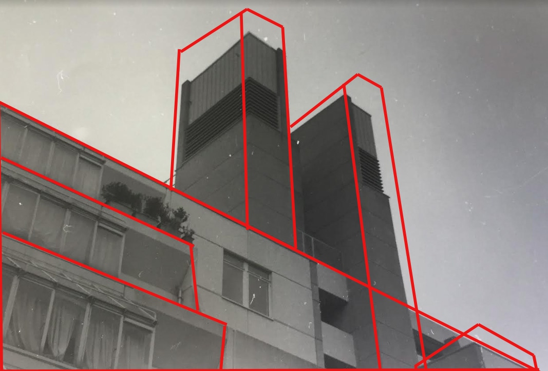
To create this images i edited my photos into black and white in photoshop (the middle image was taken on black and white film), then I used the pencil tool and made it red. I tried to outline the significant shapes to emphasise the structure of the buildings. To ensure precision I had to take much care in drawing the lines neatly.
DEVELOPMENT 2:
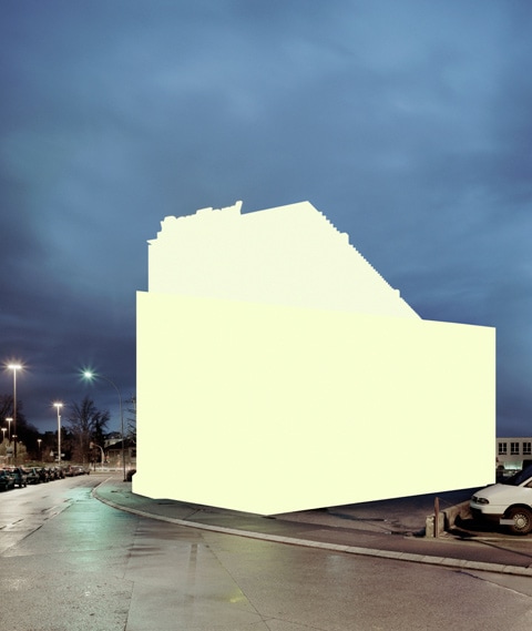
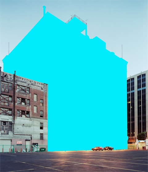
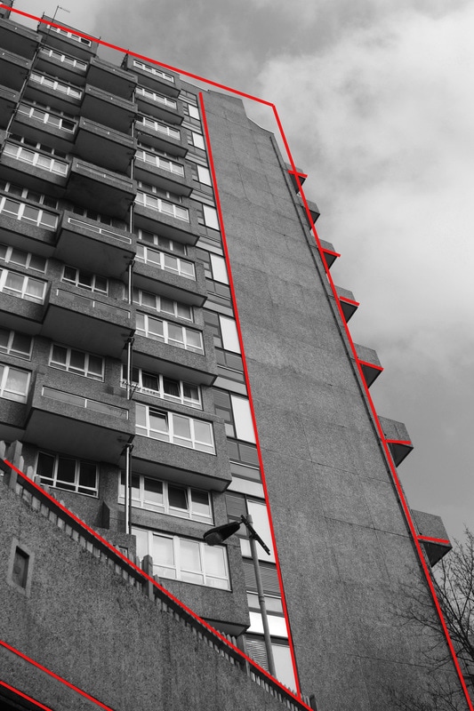
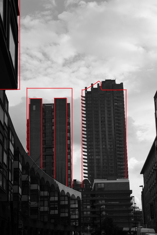
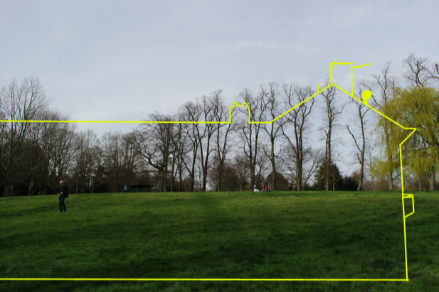
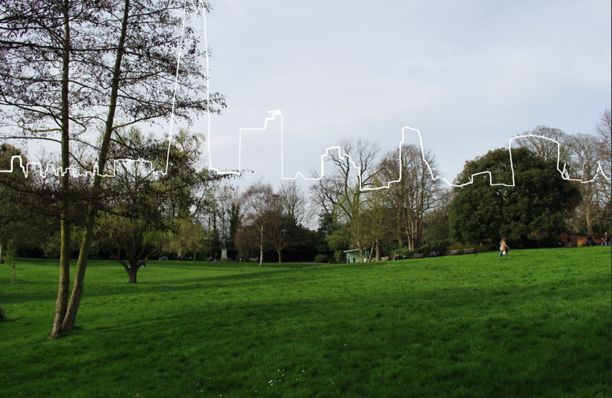
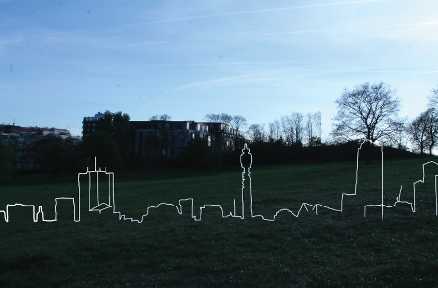
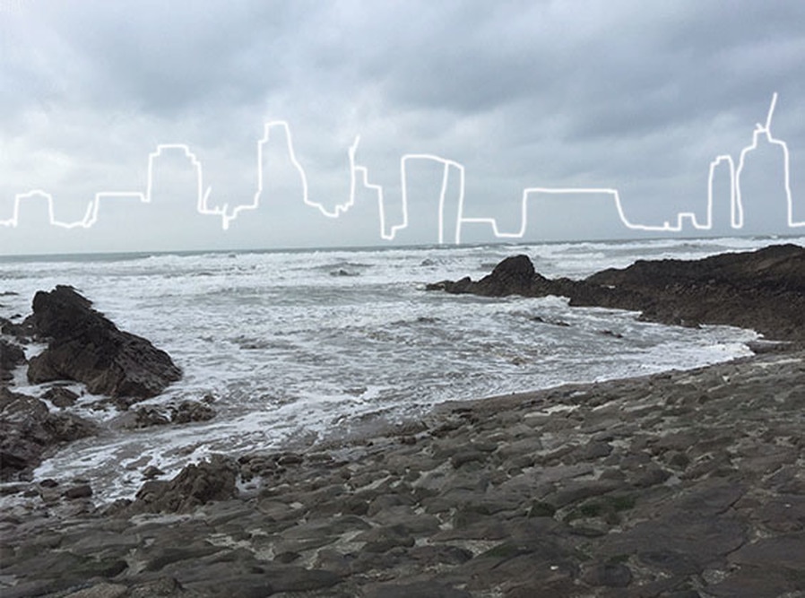
K R I S T E N F E R G U S O N
I found this artist when looking at structure of buildings on Pinterest. I like the combination of man and nature and I f


In the above photographs the artist incorporates the negative space of the blue skies in all of them. I feel like this is effective because it enables the skyline sketches to stand out more. Also, the thickness of the outlines isn't too thick in any of the edits and it varies in the areas where there are final details.
FIRST RESPONSE:
|
|
SECOND RESPONSE:
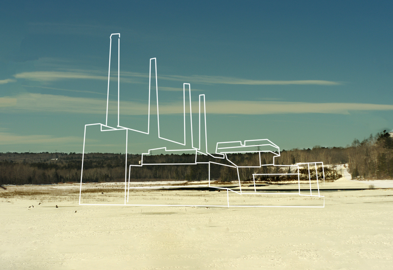
Edward Burtynsky
DEVELOPMENT 3:
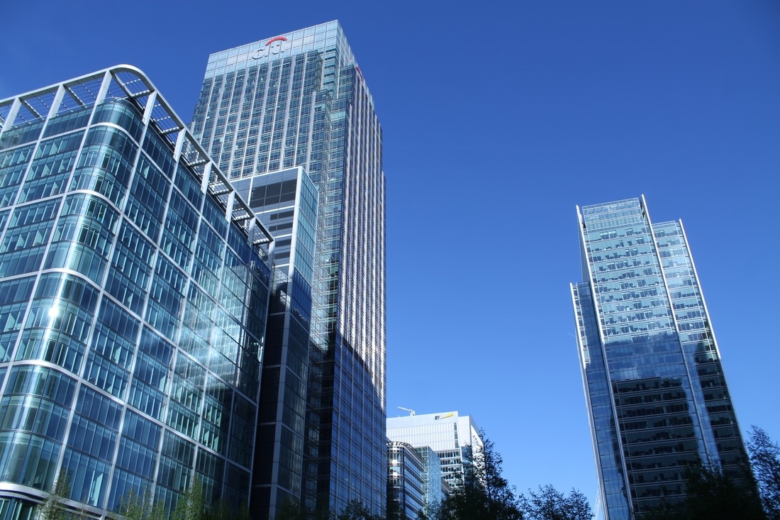
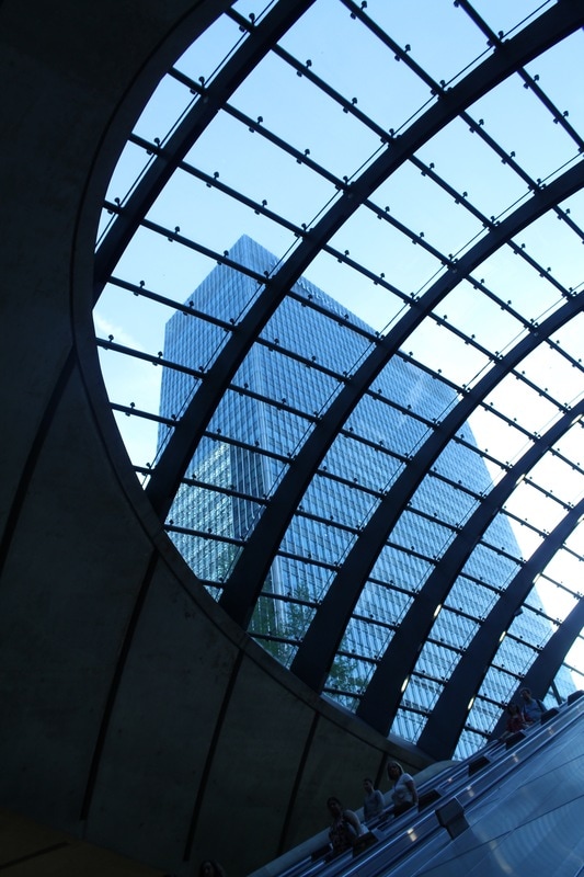
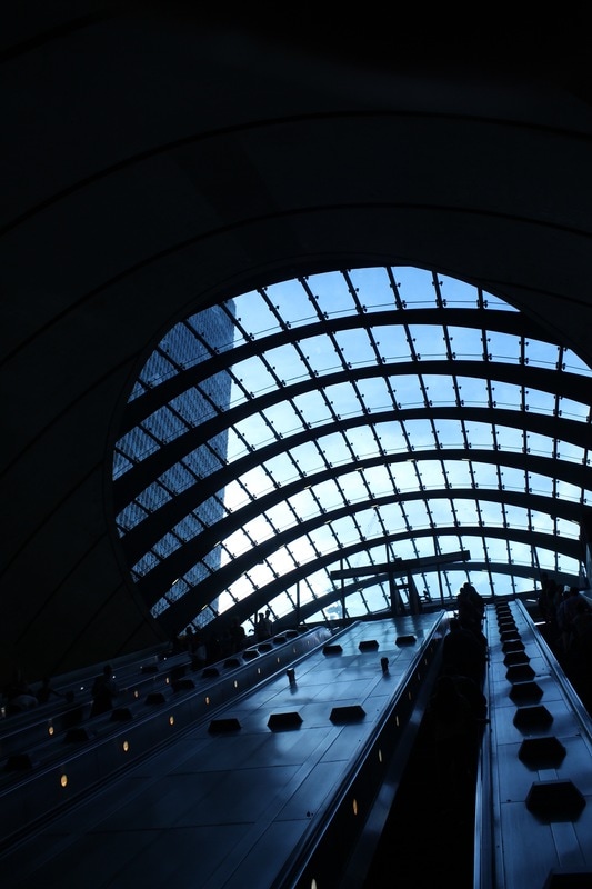
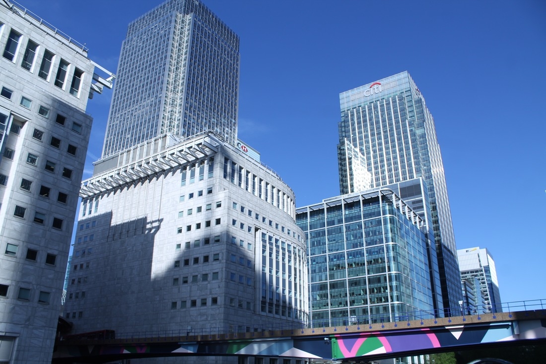
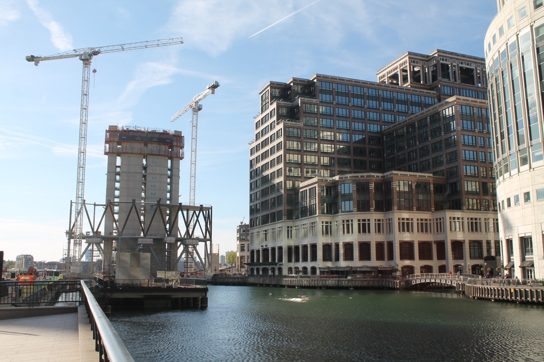
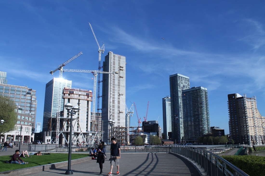
To expand my work from the Kristen Furgeson drawing over skylines to show the difference between city and landscape for this development I visited Chanary Wharf. My intention was to photograph the intertwinement of the two aspects but in a less abstract way, so focusing more on framing it all in one simple image. To do this I took a series of images that show for example the river (nature) and the modern architecture.
|
|
|
ARTIST AND ME
When taking one of my images I realised I incorporated a similar technique to a photographer named Allen Klosowski. He is interested in taking pictures of different perspectives of building he does this through focussing on lines and structure. His image was taken in Cologne in Germany and there is a mixture of old and new architecture in the images.
Artist
|
My image
|
DEVELOPMENT 4:
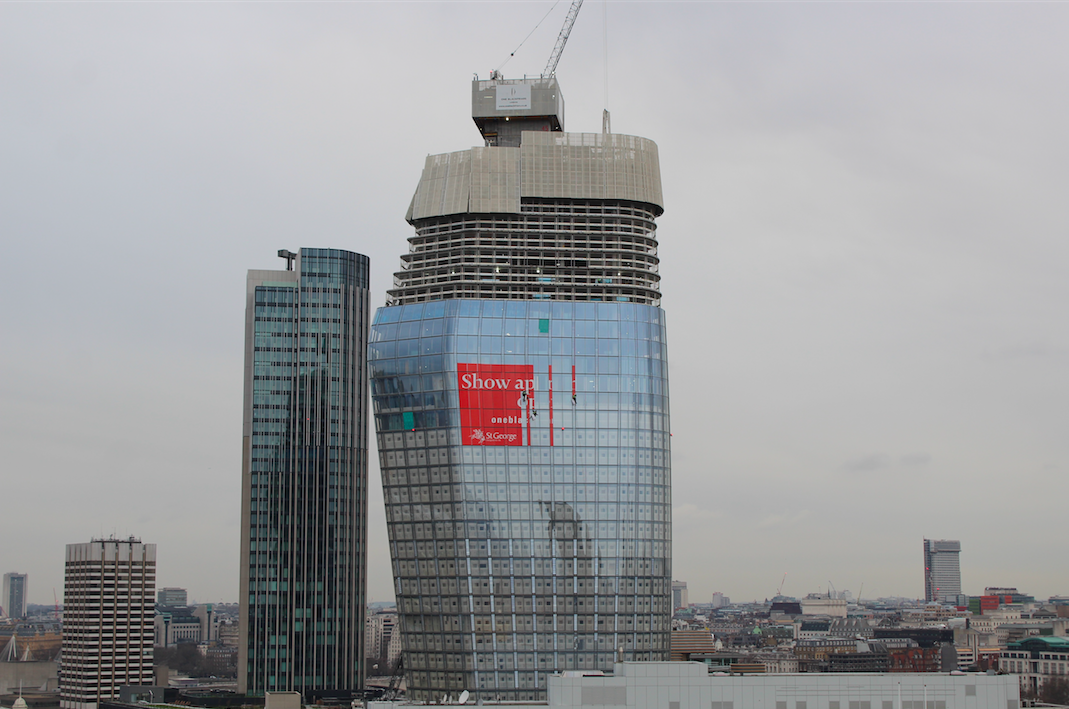
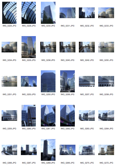
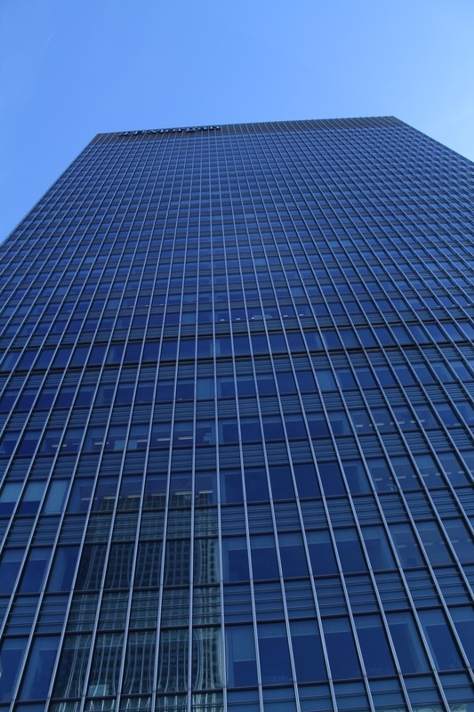
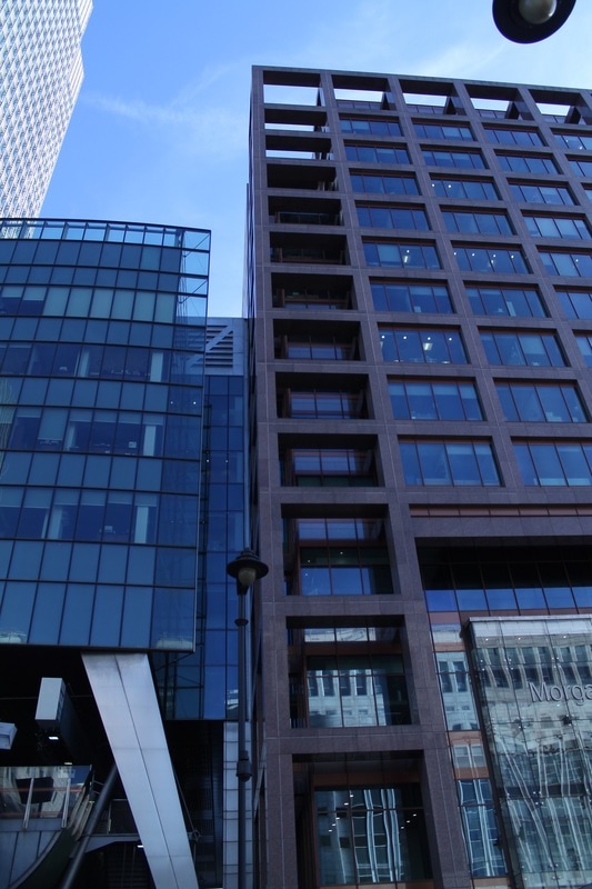
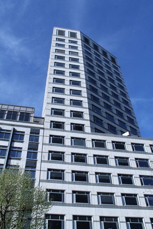
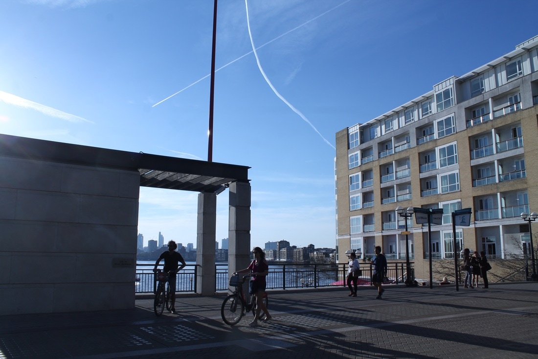
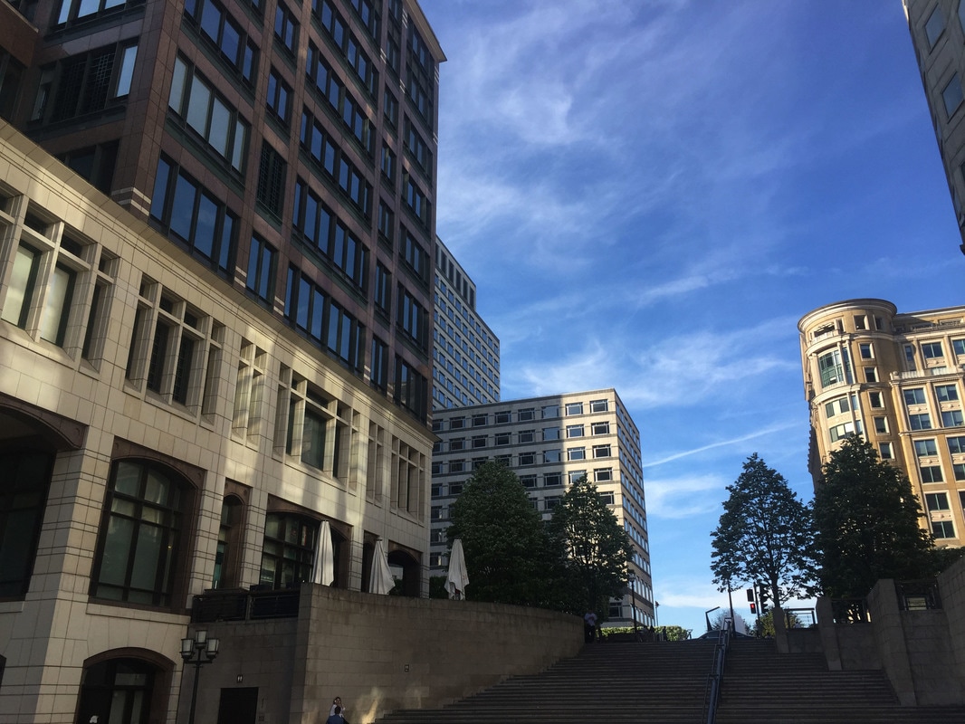
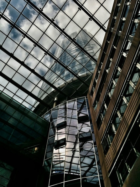
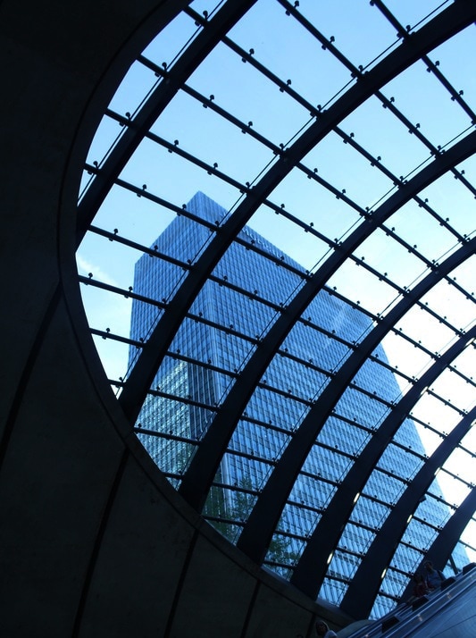
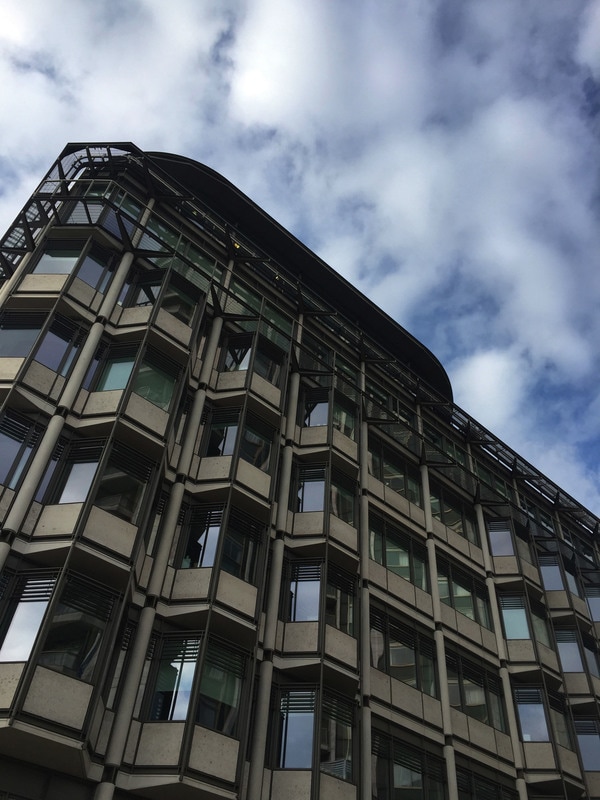
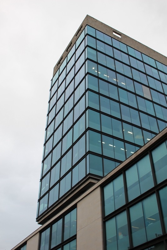
I then looked at modern architecture in London as i feel the images i took for the Henrique Folster response were interesting and I enjoyed taking them because the architecture i captured was quirky and differed from the concrete, brutalist structures. I visited Hyde Park corner, King's cross and Euston to shoot the below images. I have tried to focus on the sharp angles of the buildings and the reflections to illustrate the modern feature a lot off them share, glass.
|
|


FINAL DEVELOPMENT
For my final development of architecture I decided to go back to 'brutalism'. My reasons for this were because I like the simplicity of the buildings and I thought it would be engaging to visit lots more locations and then present them in a new form. Below is a brutalist map I found searching online and what I will use to guide my work:
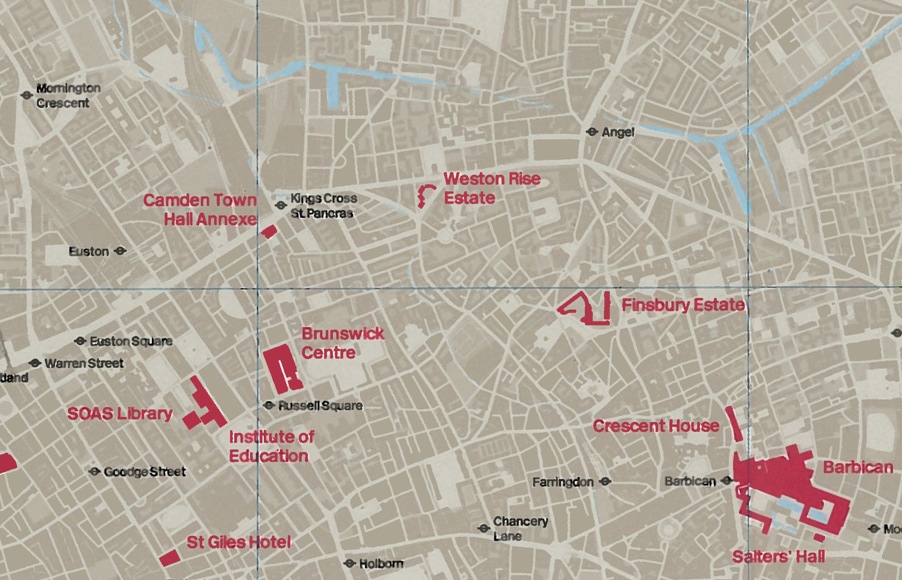
http://londonist.com/2012/05/londons-top-brutalist-buildings
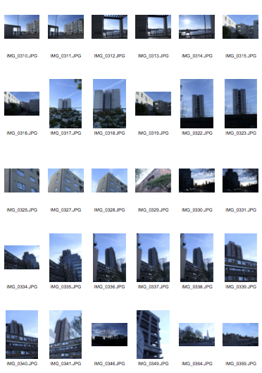
LOCATION 1:
First i found this brutalist structure on a website for brutalism in London. It is located in the South of London, in Elephant and Castle. As you can see I captured my photos with the intention of capturing its full height, but because it is a really tall building this was a challenge. Moreover, I found that the colour of the sky had an impact on the outcome
|
|
LOCATION 2
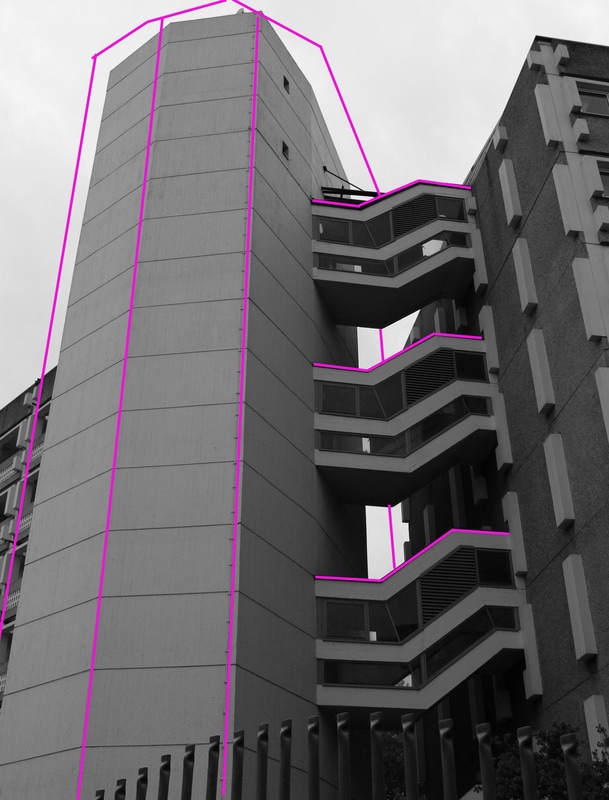
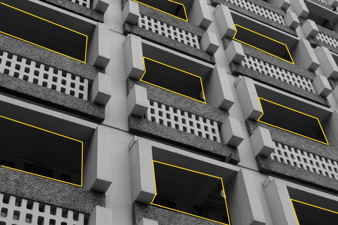
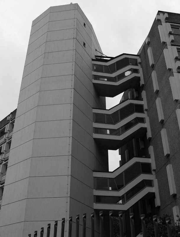
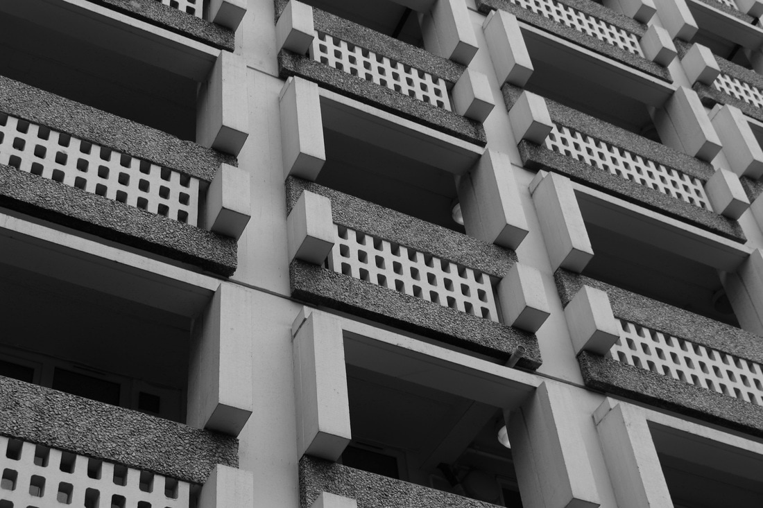
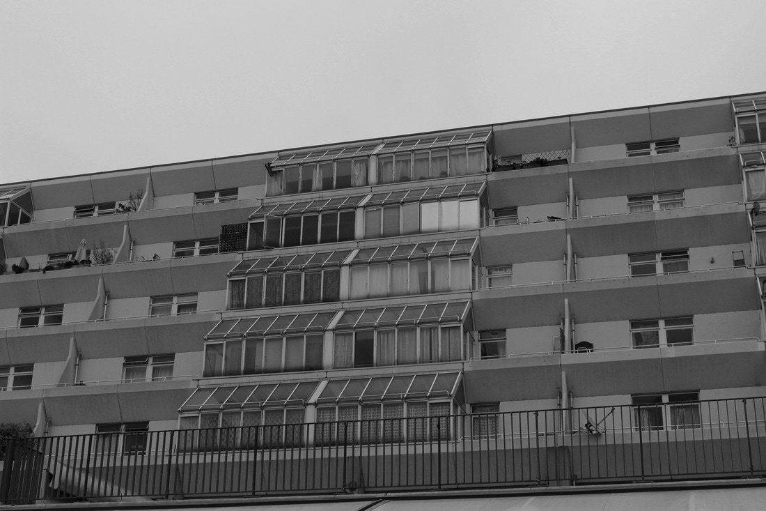
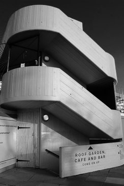
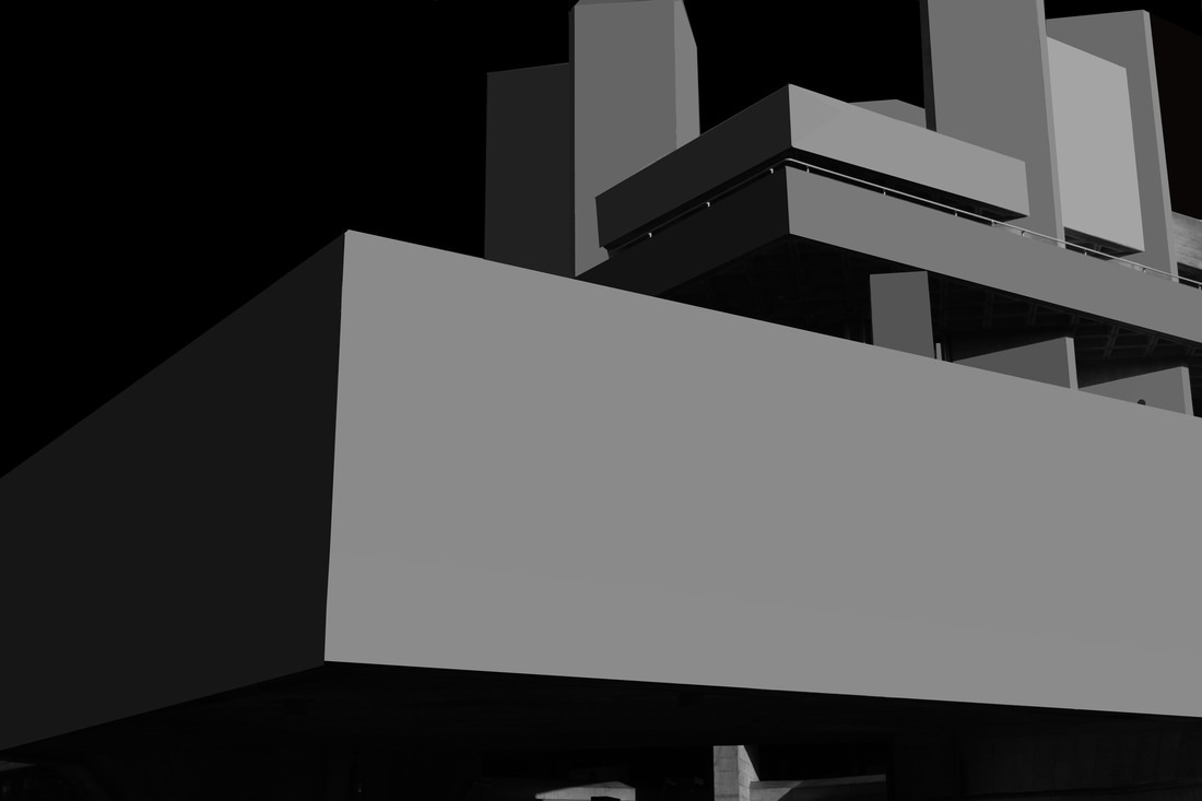
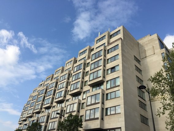
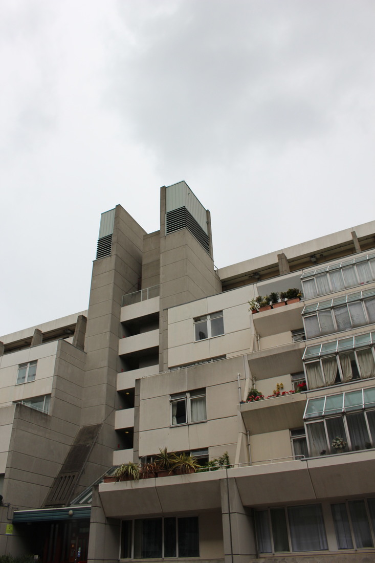
I then went to the Brunswick centre again but this time I used a DLSR camera, not film. I found that the balconies that the building consisted of added an usual feel to the images. The architecture here was very different to other Brutalist structures and thus felt like elsewhere in Europe.
|
|
LOCATION 3:
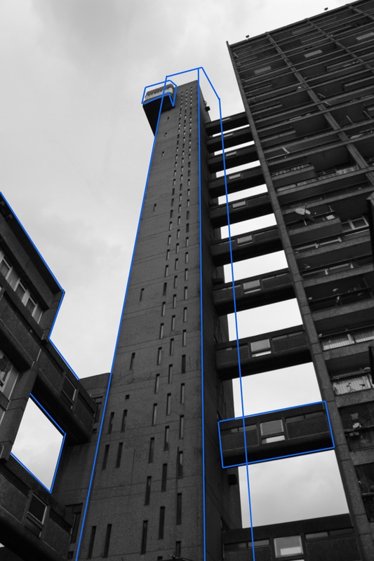
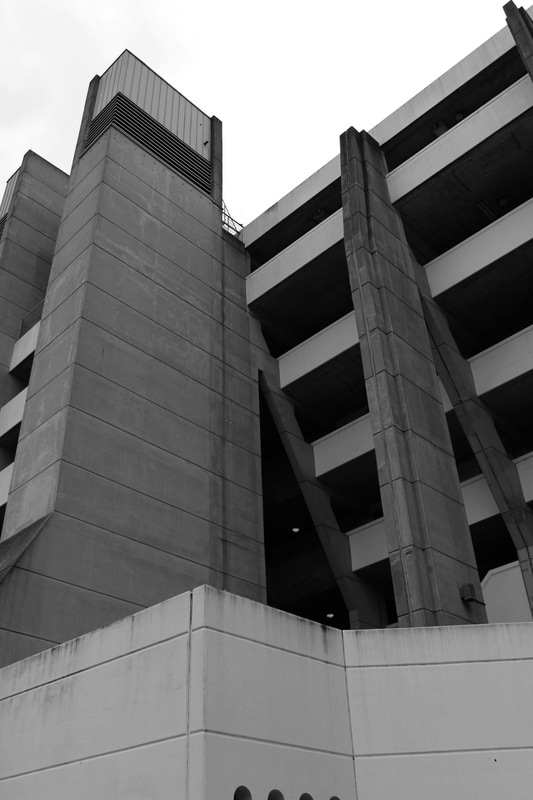
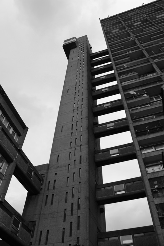
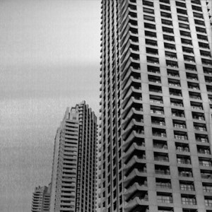
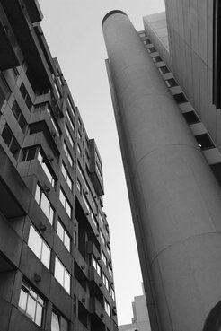
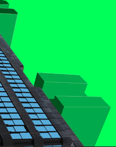
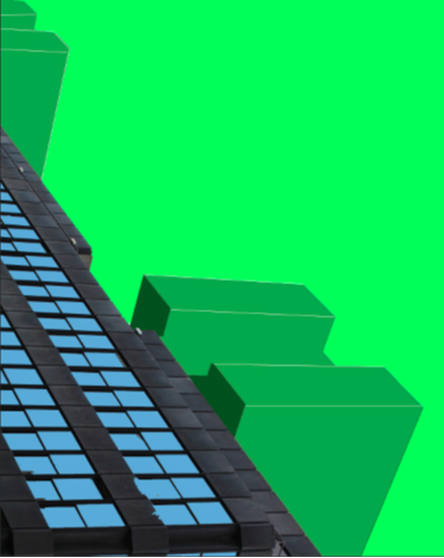
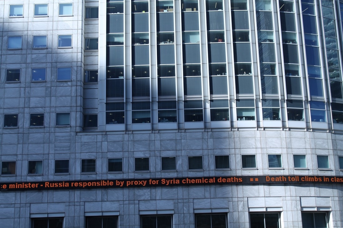
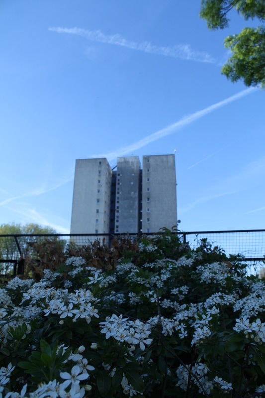
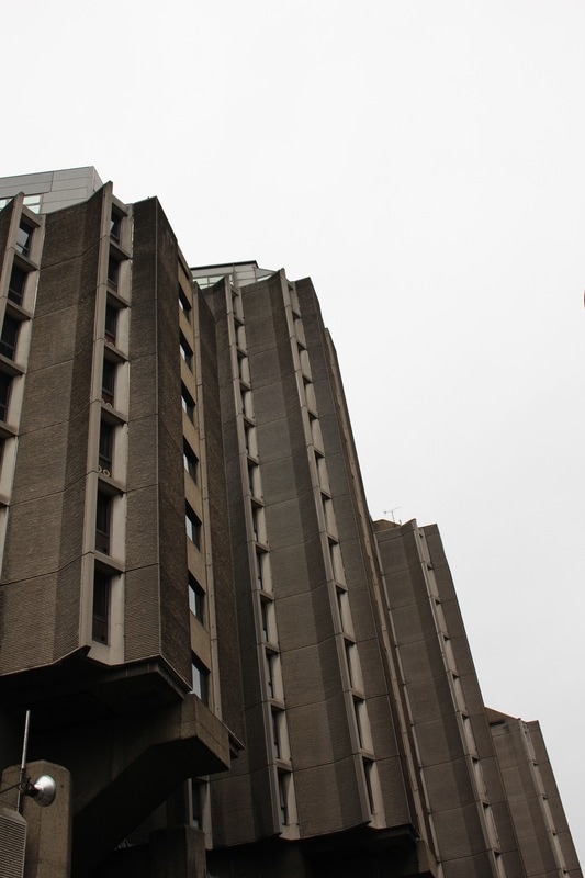
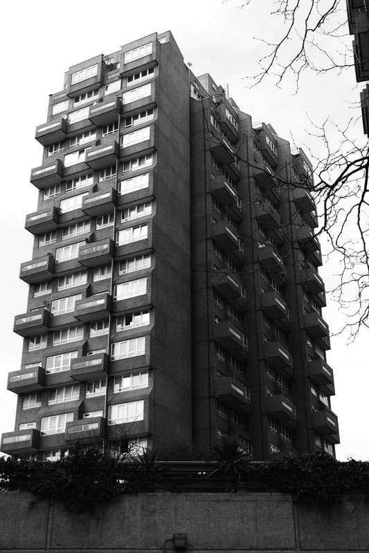
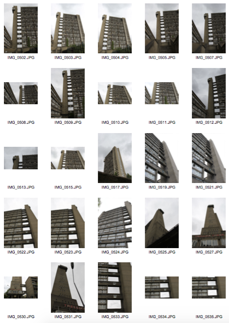
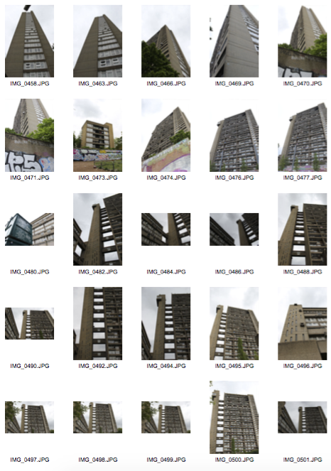
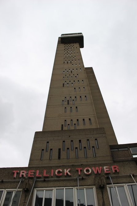
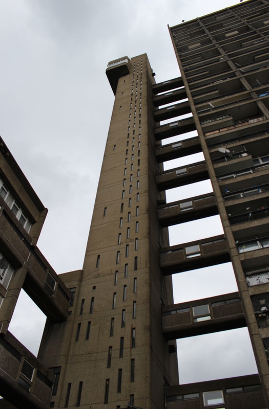
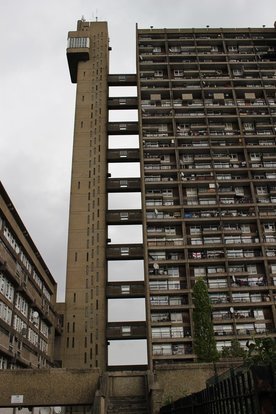
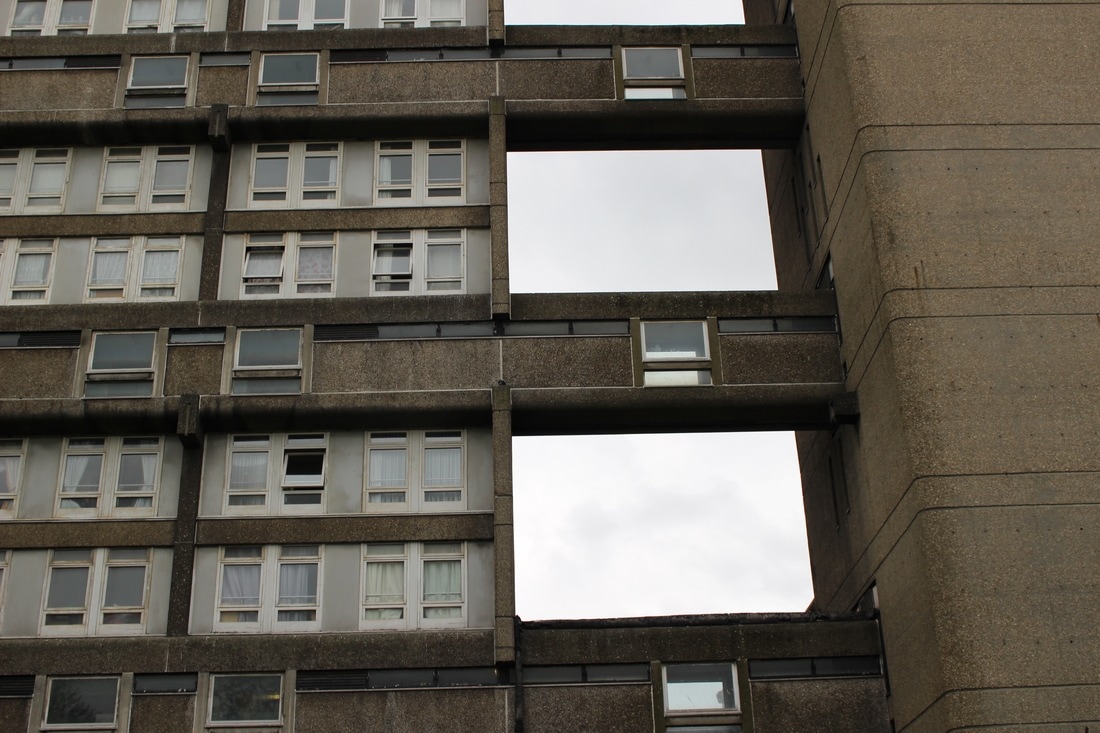
Trellick tower is a thirty one story building located in Kensal Rise in the borough of Chelsea. It was built by Enro Goldfinger with the intention for it to be a new a new innovative structure for social housing with a community. The structure was built in 1966 and completed in 1972. It's a very tall, imposing structure with its dimensions being 98 metres tall. Unlike the Brunswick centre, which purpose is entertainment as it is a shopping centre, this location had a very different feel to it. It's very urban and the residents homes are captivated into the images through their personalised balconies and the graffiti present on the building.
|
|
|
|
|
In the photos above my main intention was to focus on the dramatic height of the building, I achieved this through the use of different perspectives. For example, in the photo to the left I wasn't close to the building and in the other two I was near the building looking up.
ARTIST LINK - RUT BLEES LUXEMBURG
German photographer, her technique is usually to take pictures at night, she is interested in landscapes including estates and other urban areas, she often experiments with different shutter speeds in her photos to create long streams of light. She creates immersive and vertiginous. Through her work she investigates and explores how the city scape both reflects and affects human condition, her distinctive style creates really abstract quirky photographs. I feel like this is very relevant to my response to Trellick Tower.
|
This piece captures the Heygate Estate based in Elephant and Castle, South London. The photograph is called 'Towering Inferno'. Heygate estate was built in the 1970's so its relatively new, the estate is famous for the social problems the 3000 residents experienced living here due to a range of physical problems including increasingly poor security and low energy efficiency, eventually the residents of the estate got what they wanted, it was demolished in 2008 and all the people were rehoused. The estate is now fully secured. really like this photo as it holds a lot of meaning within, the warm artificial colouring provokes mystery and danger. The lights being on in different windows represents the fact that the people living there were very unhappy and wanted to burn down the estate as they hated it with such a passion.
|
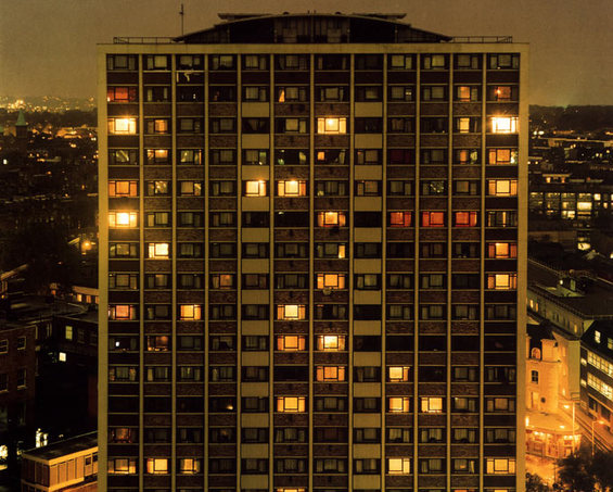
Towering Inferno
|
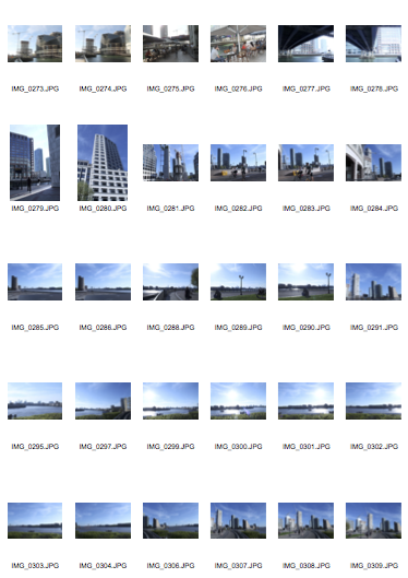
LOCATION 4:
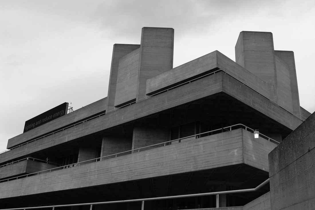
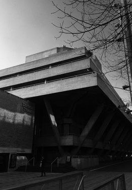
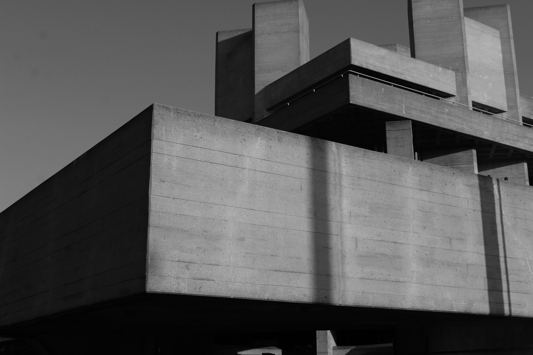
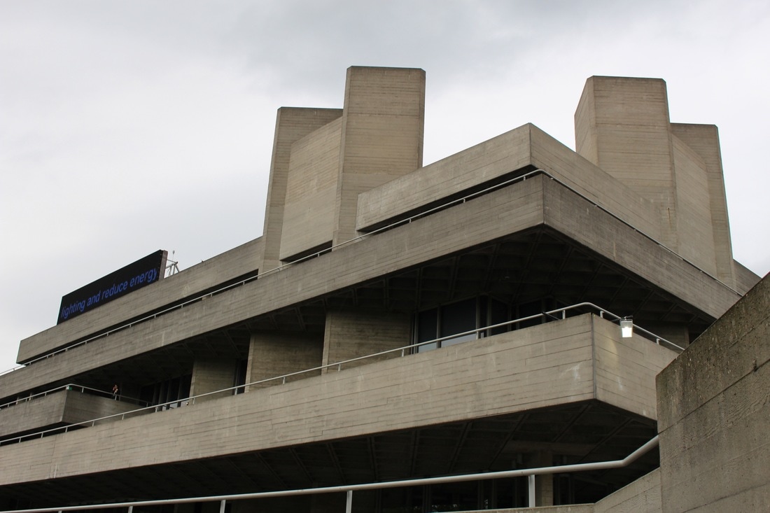
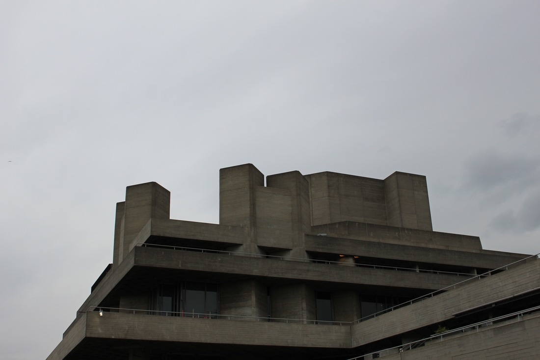
Although I have visited the South Bank centre and the national theatre before I chose to go again on a darker, more gloomy day. Furthermore, I took a variety of wide shots as well as close ups. The Southbank Centre is a complex of artistic venues located on the South bank of the River Thames. Southbank Centre was built in 1951 as part of the Festival of Britain and the concert halls were originally funded and managed by the London County Council and their successors, the Greater London Council.

LOCATION 5:
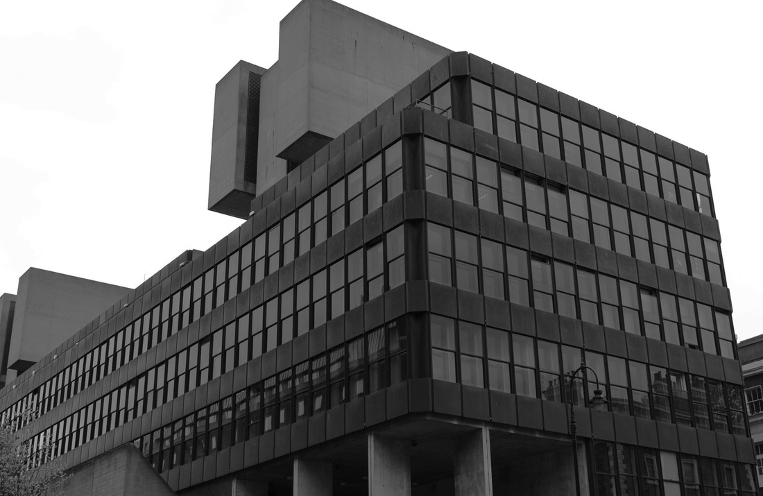
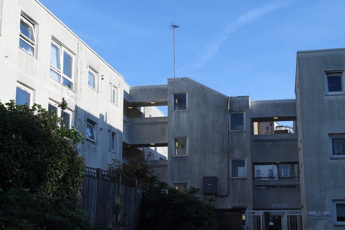
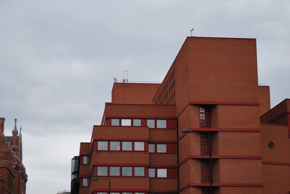
These photographs were take in King's cross at another estate. I feel these images were effective in the sense that they are different to any other brutalist structure i have photographed previously. The building has a lot of detail through its patterns and the arrangement of windows and frames.
|
|
FINAL PIECE
For the first part of my exam I chose to emphasise the predominant shapes that made each structure unique. I wanted to do this because I feel like this technique was the most effective out of all the processes I have experimented during the duration of this strand. It is similar to what Alexey Bogolepov did in his project, however I felt using red was ineffective so I used a variety of colours for each building and location. I chose vibrant colours so that they would stand out against the grey of the images. All my final images are edited into high contrast, I feel like this is suited because it ensures that the viewers attention is simply on the buildings and not on anything else, such as the weather.