ABSTRACT FORM
TASK ONE
WHITE PAPER TASK
FIRST RESPONSE
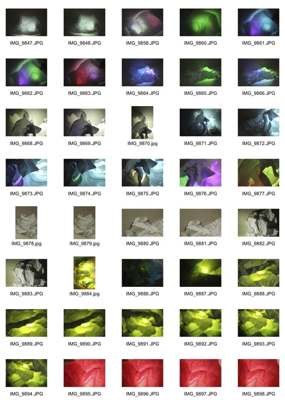
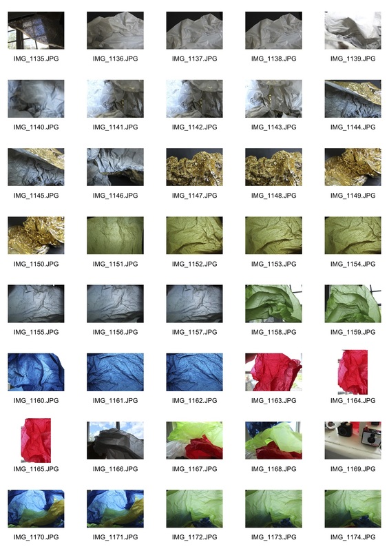
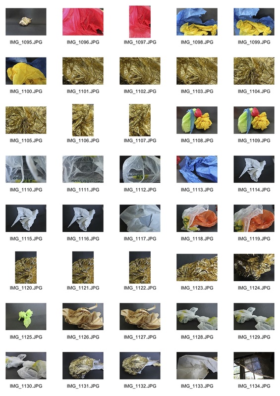
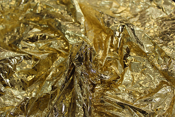
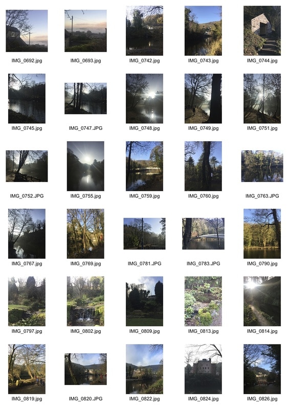
For our first task on abstraction we were told to take 24 interesting photographs of a piece of A4 paper. I tried to make my photographs more interesting with the use of artificial lighting, different angles and a variety of applied forces on the paper. Below are my contact sheets:
|
|
|

SECOND RESPONSE
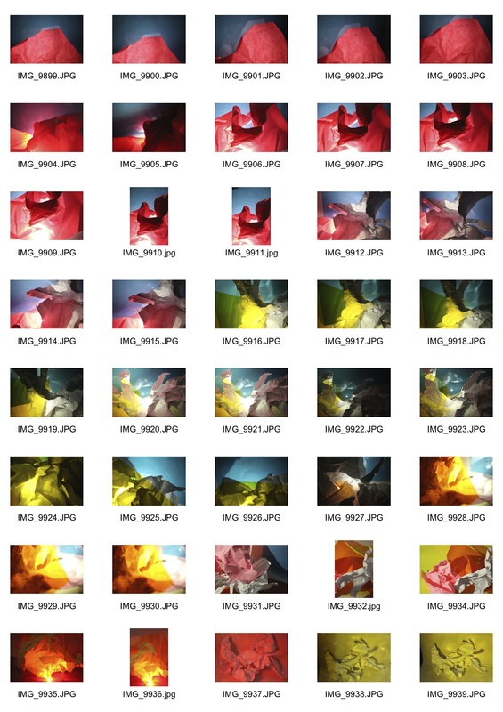
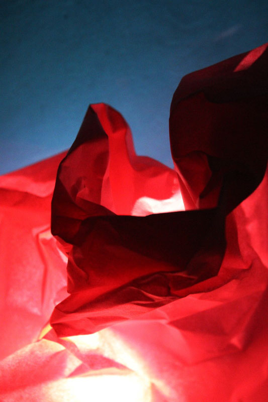
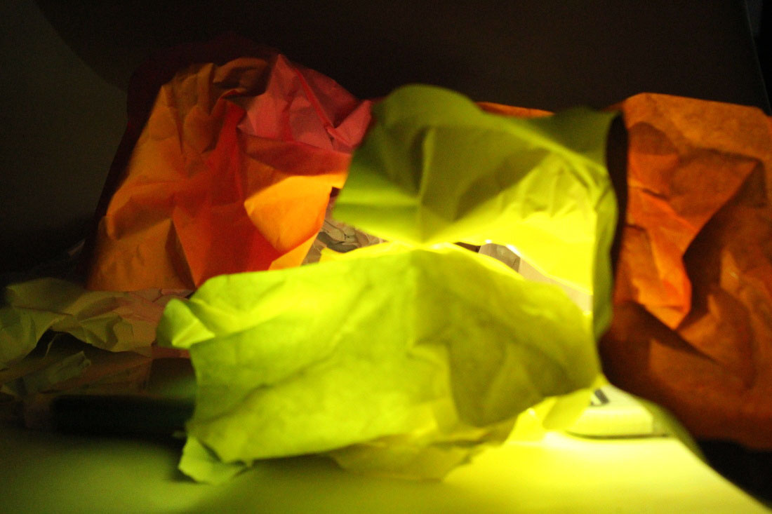
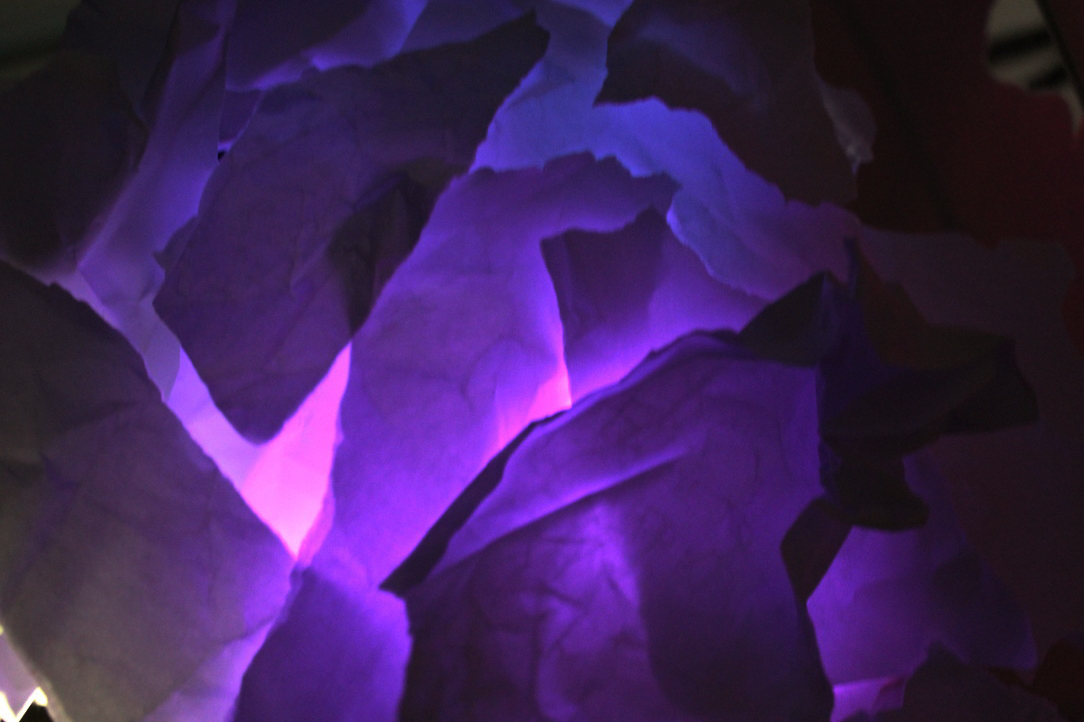
In order to develop my work I then experimented with a variety of coloured paper and different materials to create more complex looking pieces. I tried to make my photographs more interesting through the use of reflections, shadowing and different lighting.
|
|
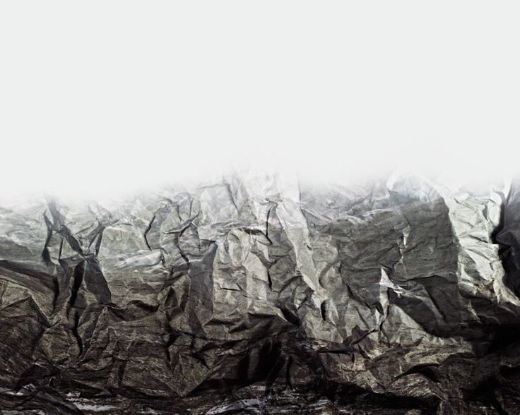
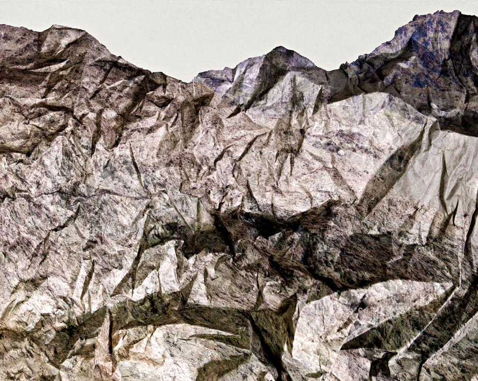
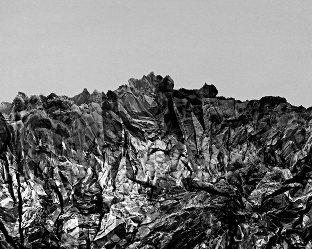
BRENDAN AUSTIN
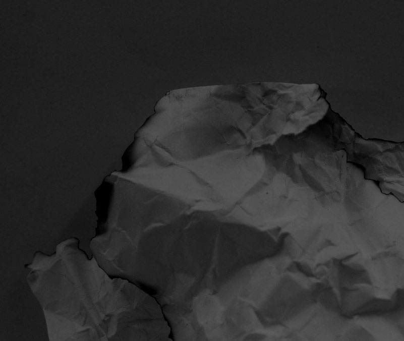
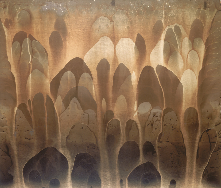
Austin's series "Paper Mountains" features landscapes made up of crumpled pieces of paper. He examines what we mean by nature and the way in which humans have impacted this. His photographs depict the thousands of details within one singular focal point through his technique. He does this by manipulating with perspective so that when viewing his Paper Mountain collection we feel as though the paper is a mountain because of the scale Austin achieves. Furthermore, texture is another key detail in his work, this is accomplished through the obvious focus on detail within the paper/mountain. The high contrast of the photographs emphasises these bold details in his pictures.
TASK TWO
ABSTRACT DEVELOPMENT
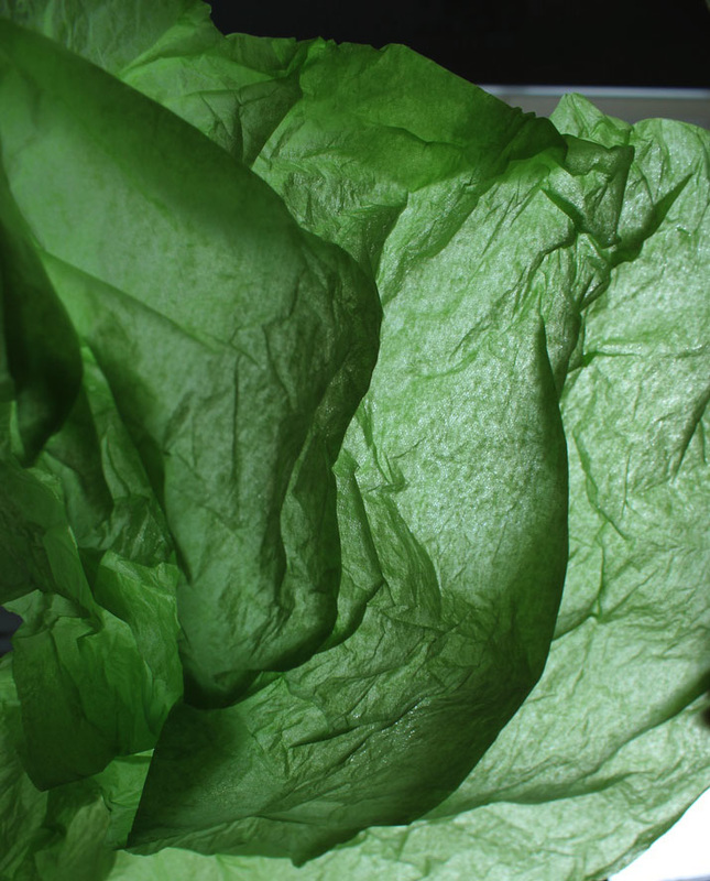
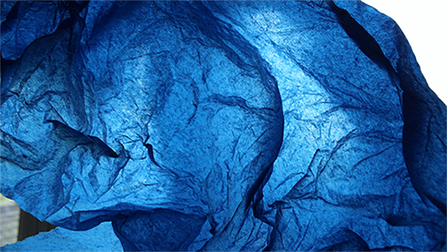
To refine and develop my work from the white paper task and prior to researching Brendan Austin's inspiring project I decided to photograph with the aim of creating a landscape. To do this i changed my material from paper to a more vulnerable material, tissue. When doing this task i came across the artist Francios Delfosse.
FRANCIOS DELFOSSE
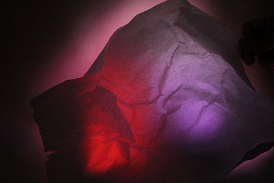
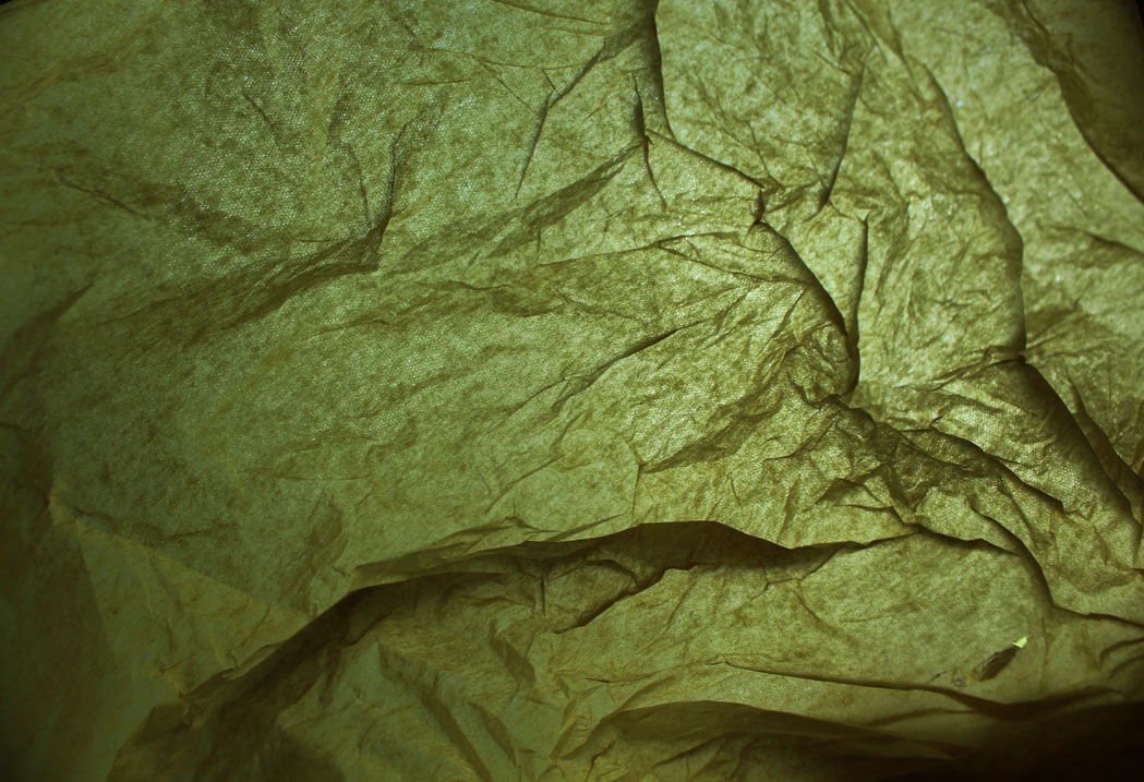
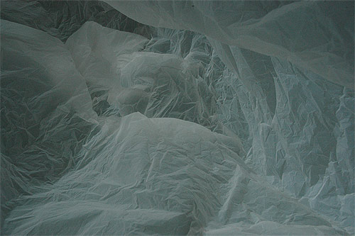
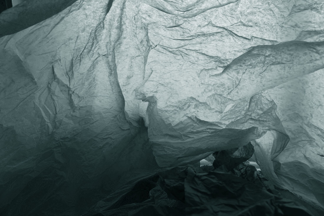
Delfosse is an abstract artist, he captures the inside of a crumpled white plastic bag intending for the plastic bag in the photograph to resemble a glacier case in the South Pole. I really like the idea of his work as it promotes how basic objects can be used to form pieces of stunning conceptional pieces of art. It also allows a varied, imaginative observation of the photo by the viewer, they can perceive the object as what ever they want.
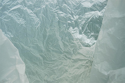
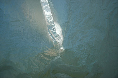
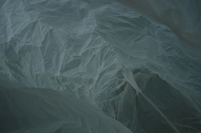
The photographs above present an abstract, unique concept. The first photo seems to have been taken using the MF setting on a digital camera (not automatic), this is clear as the sides are not in focus but the centre is. I am most fond of this piece as the details in the bag are most apparent, this could have been done using the applied force of crushing. Comparably, the second photograph is made intriguing by the strong shadowing, this adds more variety in terms of colour to the composition which i like. The last photograph consists of depth within the picture, i like this as it adds a more realistic tone to the photograph and makes it resemble a glacier case to the maximum. Delfosse's work is commonly linked to Ansel Adams because both their series consist of simplistic nature. However strangely their photographs are very different as Adams photographs real landscapes in a wide shot style. Where as Delfosse photographs the inside of plastic bags.
MY RESPONSE
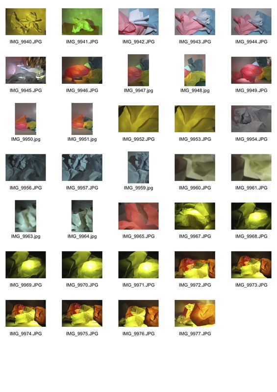
The contact sheets below present my process of experimentation for this task. I trialled different colours and instead of using artificial lighting like I did for the white paper task I let the natural daylight impact my photographs.
|
|
SELECTED IMAGES

ARTIST AND ME
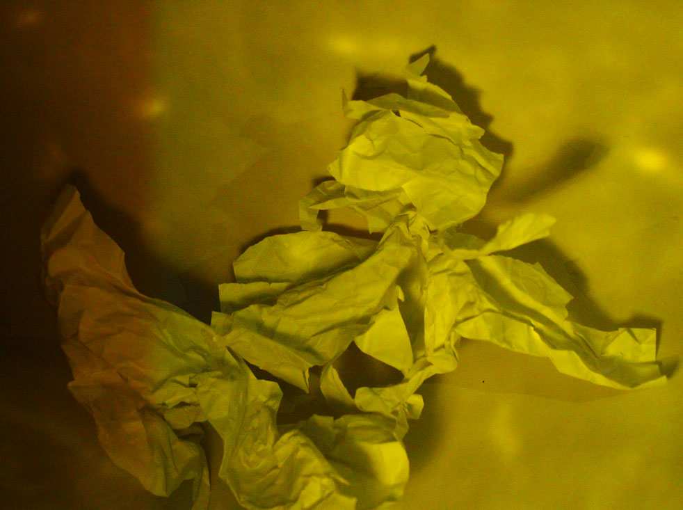
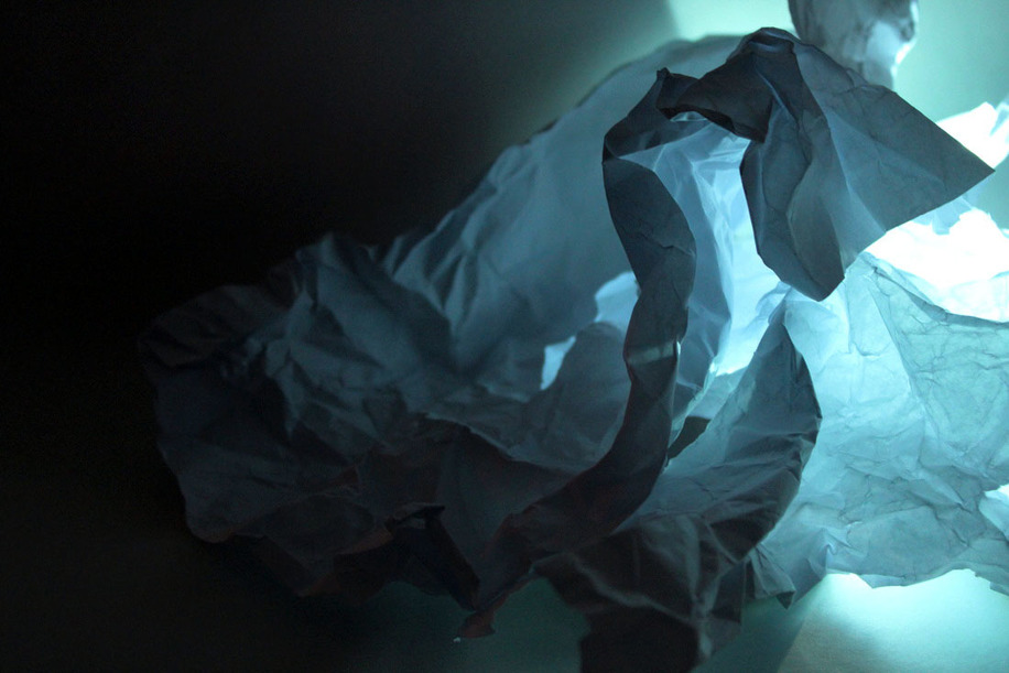
Here i have tried to form a similar styled composition to Francios Delfosse by creating the same enclosed feeling and the crumpled effect of the tissue, i did this my crumpling the paper before hand. However instead of using white tissue like Delfosse, to form a glacier i used a vibrant green tissue and used the natural lighting of the room to manipulate my outcome. Afterwards i edited my photo in photoshop, changing the tone and editing the levels and curves of the photo so that it resembles Delfosse's work more accurately.
DELFOSSE'S WORK |
MY WORK |

REFINEMENT
To develop my work even more i decided to create double exposures that clearly display the landscape i was trying to create when taking my original photographs. I chose to present this through a GIF because it shows the transformation of my abstract photographs into the landscape I thought they suited.
|
|
TASK THREE
ABSTRACT EXPERIMENT
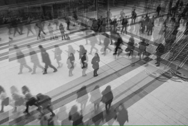
This task focuses on the idea that a photograph can become more than just a representation of a moment in time is something that both Artists and scientist have experimented with. I will experiment with my photographs both manually and on photoshop to investigate this thesis.
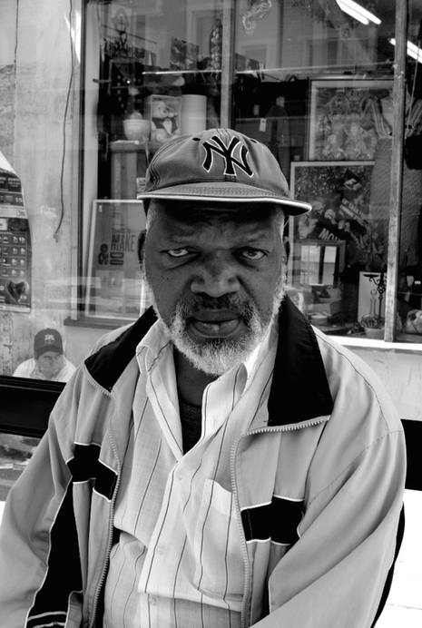
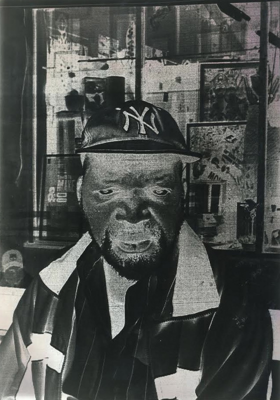
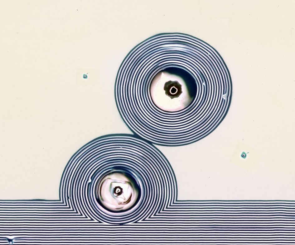
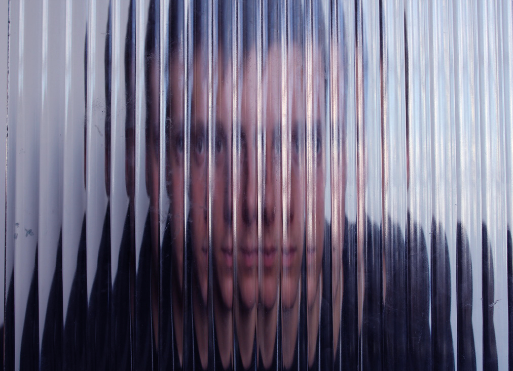
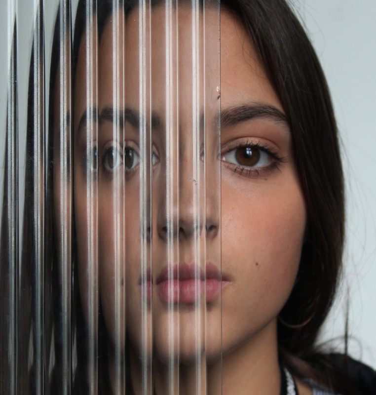
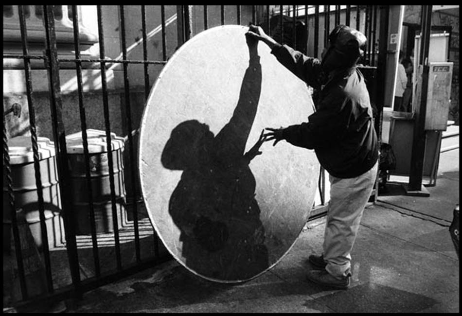
I chose to use this photograph for my abstract experimentation because I feel it is a powerful composition that can be manipulated in various ways. Moreover, I think the high contrast edit will be interesting to change.
|

|
MANUAL
In class we were given a number of copies of our chosen photograph to experiment with making it abstract. Below are my two chosen pieces:
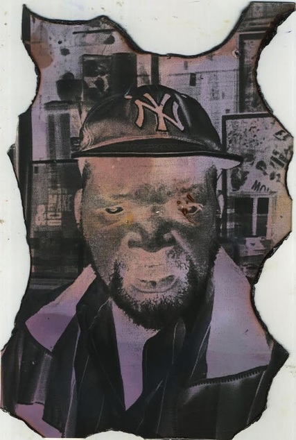
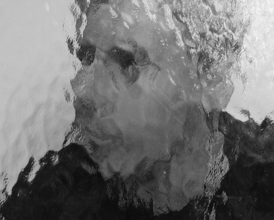
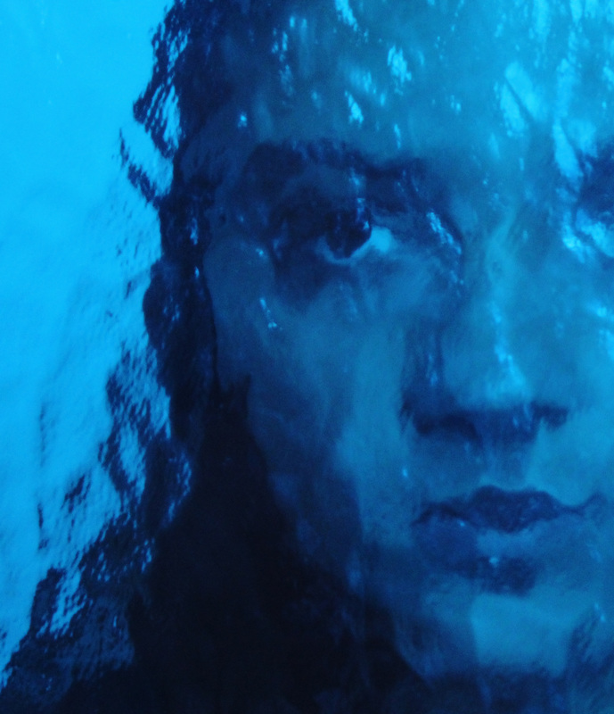
In the above photo I used the acetate version of my original photograph so that I could clone it in the dark room using photographic paper. I exposed my photo to the white light for a total of two seconds. This enabled an x-ray affect, making the photo more distorted and destructed. Moreover, the colours are opposing to my original piece.
|
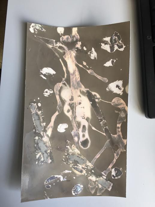
Here I have experimented with a more ruinous approach. I did this by bleaching and burning my photogram that had already been transferred to photographic paper and exposed for three seconds. The bleach caused the pink overtone in the composition, i quite like this outcome however I think I could have burned my image more to make it better.
|
PHOTOSHOP
In order to maintain a balance in my work I also tried editing the photographs on photoshop. This created more simplistic, neat outcomes:
|
|
|
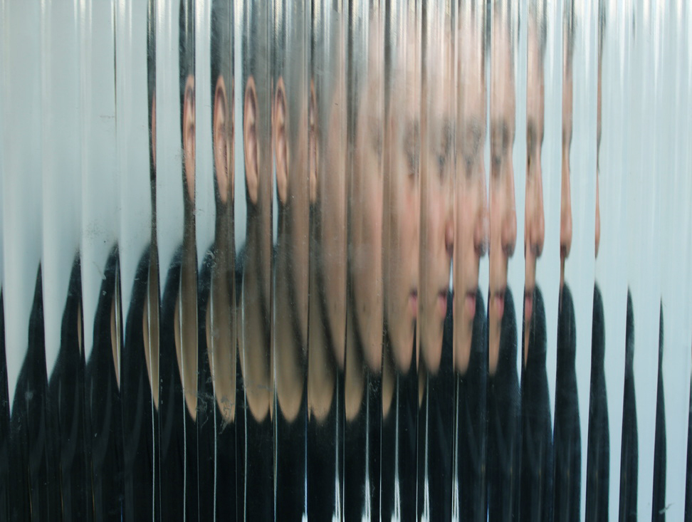
Due to the fact the original photograph is already an imposing, intimidating shot I decided to emphasise this further through adjusting the layers and curves/levels in photoshop. I wanted to make the photo look 3D so that the viewer gets a fright. I think the direct eye contact the man is making with the camera makes this effect powerful.
|
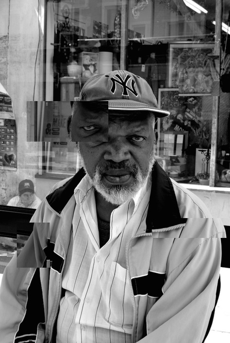
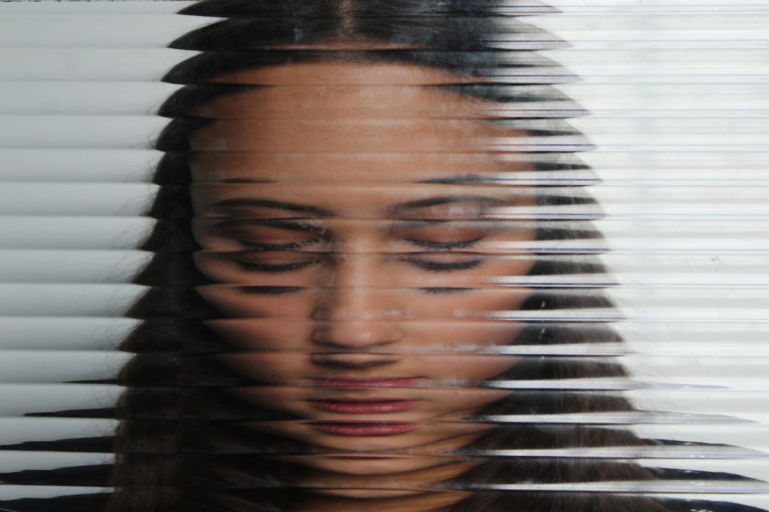
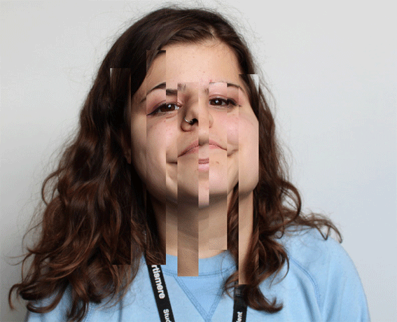
In this edit i have made different layers in photoshop using the rectangular marquee tool. This is how i have created the squares in the photo. I then changed the brightness of the different layers so that the shapes are slightly visible. I did this to form a more abstract piece.
|
TASK FOUR
CHEMIGRAMS
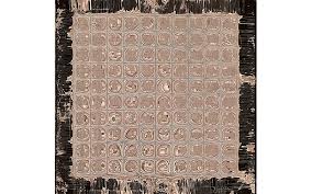
Pierre Cordier discovered the chemigram process in 1956. It involves placing exposed photographic paper in either developer or fix with a resist such as washing up liquid or tape placed on top. This means that the exposed paper will turn black when placed in developer or white when put in fix, apart from where the resist is sat. This creates abstract prints that can be manipulated by alternating the paper from chemical to chemical, whist washing off the resist in water at different points.
PIERRE CORDIER
RESPONSE
|
|
TASK FIVE
ABSTRACT PORTRAIT
BILL JACOBSON
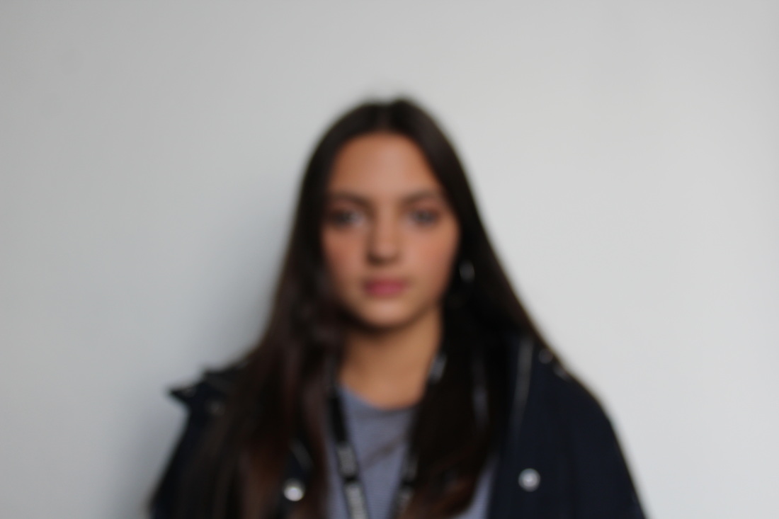
Born in Norwich in 1955, Bill Jacobson begun his signature out of focus photography in 1989. These photographs consist of both landscape and portrait but I am more interested in his portrait work. Since 1989 Jacobson has been exhibiting in many galleries and museums globally. The work that I am going to look at is his series labelled Interim portraits, these photographs capture shadowy pale figures that evoke the loss expierienced by many aids victims.The blurred subjects underline the futility of capturing a true human likeness in both portraiture and memory.


|
The posture of the figure in this photograph suggests exhaustion, this is very obvious from his tilt back positioning. I think this is very effective as it shows the severity of this epidemic. Furthermore the lack of colour adds to this effect and emphasises how drained the man is. The technique used in this piece seems to be manual focus, which causes the blur. This had resulted in the figure appearing to be blending into the background of the photo, perhaps this has a greater message behind it.
|
In this photo the mans facial expression is more dominant. He looks disgusted and fed up. This is emphasised by the black background which matches the shade in his open mouth. By blurring the subject the edges of his body look softer and less viewable. This creates a variety of tones within the composition which will interest the viewer a lot more. The fact the figure is turning to the side makes him look more distant and thus emphasises the series objective and establishes his pain and anguish.
|
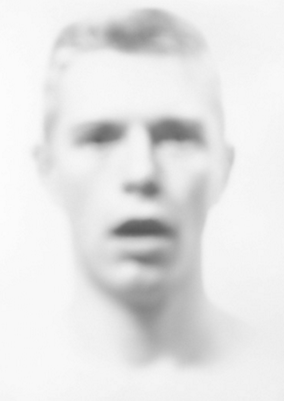
Here, Jacobson uses the rule of thirds to intimidate the viewer. This is further exaggerated by the direct address the figure creates by staring into the camera. However, an interesting aspect to this is that his eyes are faded through Jacobson's manual focus, this creates a sense of uncertainty which is very intriguing. The blurred subjects underline the futility of capturing a true human likeness in both portraiture and memory. This is my favourite photograph of Bill Jacobson.
|
RESPONSE


DEVELOPMENT
To develop my work I decided to experiment with the usage of colour and patterns in class. We were asked to use some sort of movement in our work hence the videos. In order for my work to still relate to Bill Jacobson i manually changed the focus of my camera while making these videos.
|
MVI_9043 from Natasha Kouppi on Vimeo. |
MVI_9033 from Natasha Kouppi on Vimeo. |
|
MVI_9043 from Natasha Kouppi on Vimeo. |
TASK SIX
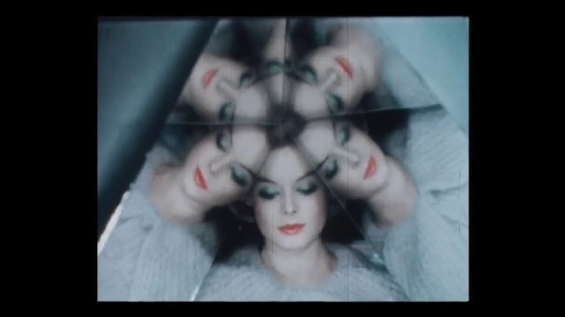
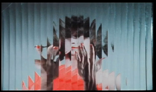
ERWIN BLUMENFELD
Born in Berlin in 1897, Bluemenfeld is a experimenter and thus an immensely influential photographer through his thirty five year career. His work includes black and white portraits and nudes, celebrity portraiture, advertising campaigns and his renowned fashion photography. When Erwin Blumenfeld died in 1969 he left the disposal rights of his photographic archive to his assistant, Marina Schinz. At the time there was little interest in vintage prints and Marina chose to divide the prints into four parts, one for each of the three children and one for herself. Having four disparate stakeholders in Erwin Blumenfeld's legacy has caused a lot of confusion amongst curators, galleries, museums, collectors, editors and publishers.
|
The photographers technique of using stained glass makes it apparent that he wanted his piece to be unclear and thus abstract. The flower in her hands seems to play a significant part in this composition as it is elevate intentionally. Moreover, the colours within this piece are all quite mono tone which evokes a sad mood. Perhaps this is the artists way of establishing his own feelings
|
The above photo uses rule of thirds and symmetry. This technique has led to a predominant shape in the centre of the composition. I am fond of this. The girls heavy make up consisting of two vivid colours is very effective because it contrasts with the other calmer colours, making them stand out more. This piece looks like it on a cinema screen or something, this may have been achieved manually by the artist. I like the fact he uses a large format camera.
|
Here, Bluemenfeld has created a more complex, abstraction piece. This is apparent from the confusion of layers. His technique here may have been to cut out the segments of his photographs and stick them together. However it looks like stained glass which is similar to his other work. The similarity between the figures jumper and nail colour is nice. Due to the edit in this piece, the girls head seems to be turning from side to side. This creates a sense of movement.
|
RESPONSE
|
|
EXPERIMENTATION
TASK SEVEN
DOCUMENTARY PHOTOGRAPHY
SAUL LEITER
Saul Leiter (December 3, 1923 – November 26, 2013) was an American photographer and painter whose early work in the 1940s and 1950s was an important contribution to what came to be recognized as the New York school of photography.His work is in the collections of many prestigious public and private collection
|
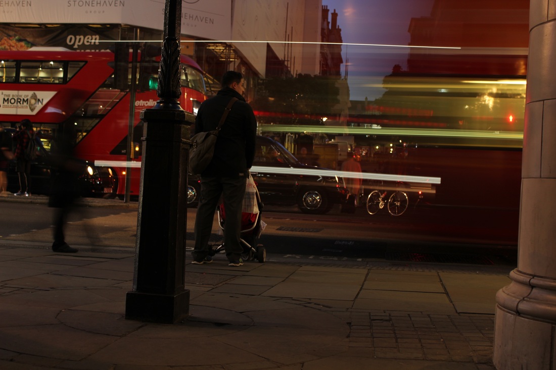
This composition uses the refection of a cafe's window that features a bus. I like the fact that the figures in the photograph are in their natural environment and are not posing for the photo. This adds a raw touch. The focal technique Leiter uses in this piece is reflection, this has been successful and I like the fact it has made the bus look blurry.
|
It looks like this picture has been taken with the camera leaning on a car, this is effective because it enables a variety of focus in the composition. For example, the foreground is slightly unfocused and the background is in focus. This contrast makes it look sharper. Leiter uses the technique of keeping the faces of his models anonymous which can be seen in this piece
|
This image consists of shadowing and the main tool used to manipulate the viewer is
|
THREE STRANDS
F I R S T S T R A N D:
N I G H T L I G H T S
FIRST RESPONSE
U T A B A R T H
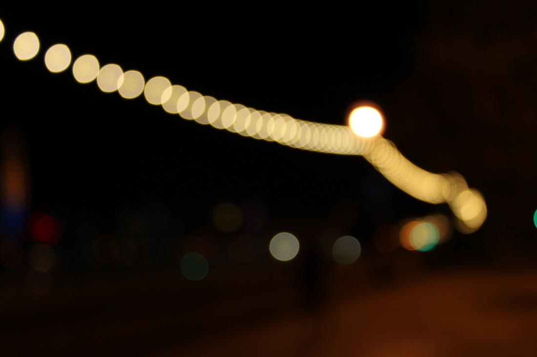
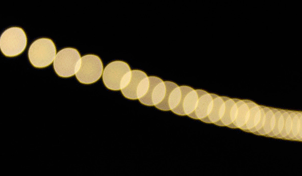
Uta Barth is a German-born contemporary photographer who lives and works in Los Angeles, California. Her work often shows quite abstract, out of focus, minimal themes and she often uses a variety of strange angles. Her work includes a mix of different subjects, but what inspires me the most is her out of focus images which also feature lights, but the focus causes the lights to become sort of orb-like, which give the image a more interesting, mysterious feel. Here are a few examples.
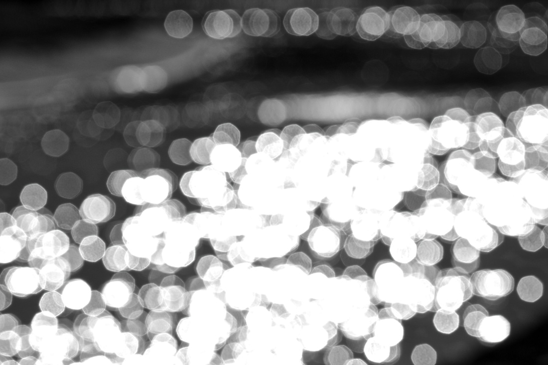
Barth has taken the focus away from the subject of the image and the lights have taken over. This causes the viewer to want to investigate and wonder what they're actually looking at. The image being out of focus has created a beautiful array of orb-like light balls, scattered all over the image. The desaturation also highlights the importance of the lights in this image, where the viewer can solely focus on the lights.
RESPONSE
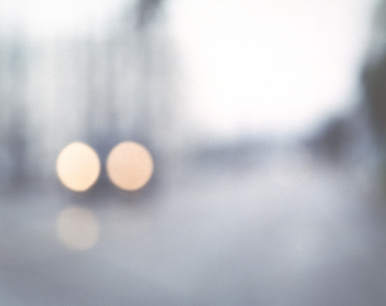
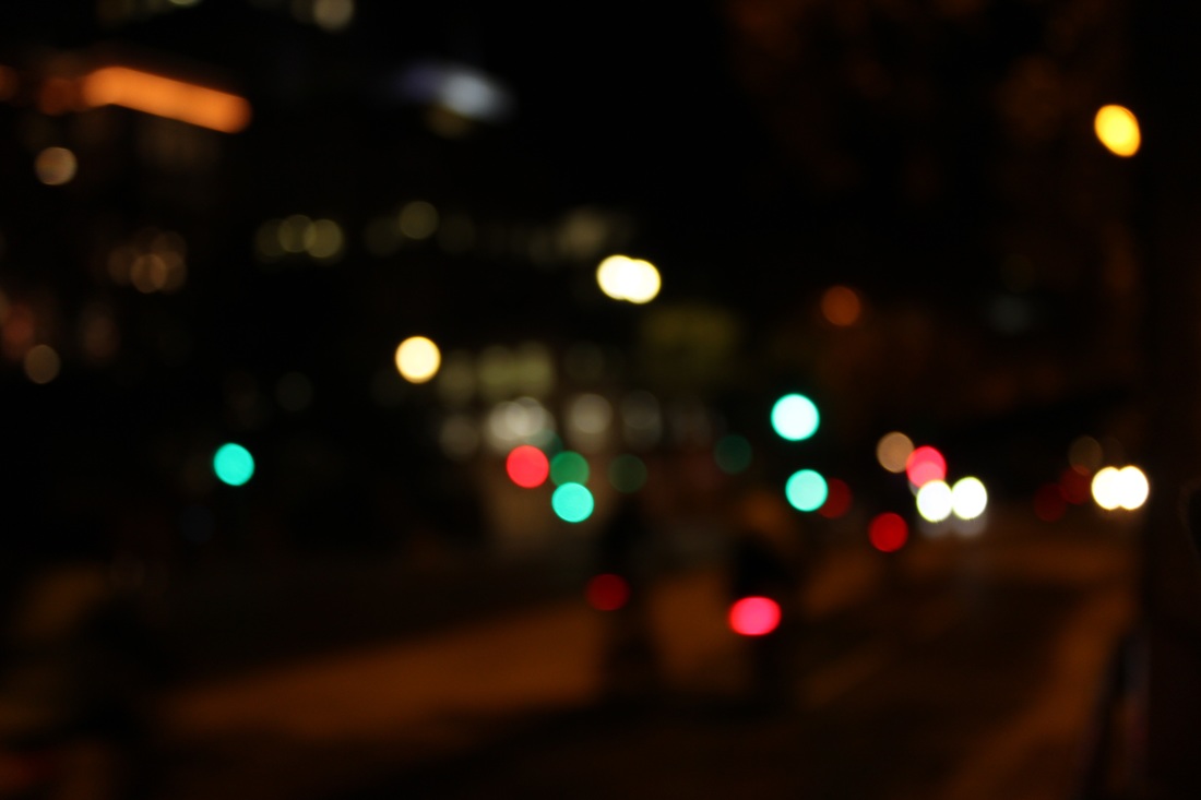
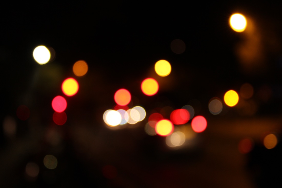
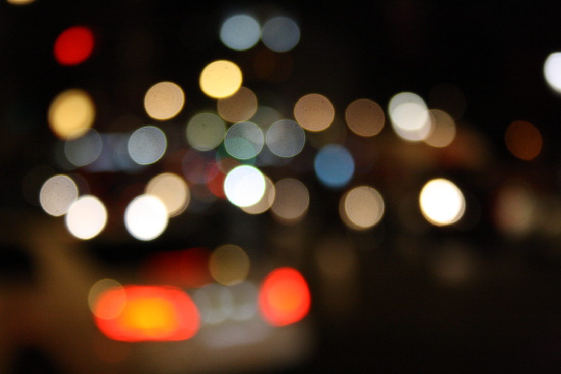
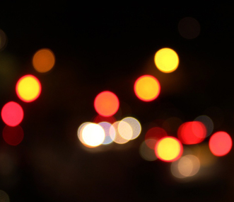
For my response to Barth's work I took my photos at night time instead. This makes the lights look more exaggerated and powerful. Moreover, in my photos i aimed to capture as much colour as possible. I found this task quite challenging

EDITS
Below i have cropped the original photographs in order to create more of a focus on the lights. I have also used the saturation tool in photoshop to intensify the colour. I did this because i felt the outcome of my original photos didn't achieve a dramatic effect i hoped for. So I figured cropping the images and increasing their saturation would improve them.
|

|
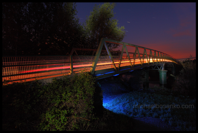
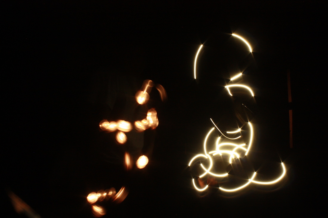
M I C H A E L B O S S A N K O
"Light Art (or Light Graffiti) for me had its humble beginnings back in summer 2004 in Greece when by chance, photographing a moonlit landscape went unexpectedly wrong. Unclipping the camera from its tripod, I quickly discovered that by putting the camera into long exposure I could move the camera in my hands and use the moon itself to write out a word. Buzzing with excitement, the next natural stage was to keep the camera on a tripod, and use torchlight to ‘draw’. Ever since then, I have been on a solitary journey of discovery, pushing the limits of my photographic knowledge, my imagination, and always overstepping the boundaries of what is feasibly possible. I find enormous reward in creating a piece of work that only exists in the moment; the only evidence of its existence recorded on camera. The environment; my canvas, is all that’s left behind, exactly as it was before my arrival. Filling an environment with 3 dimensional ‘brush strokes’, vibrancy, energy… turning the ordinary into the extra-ordinary… these are some of the things that drive me; fuels my passion." - Michael Bosanko
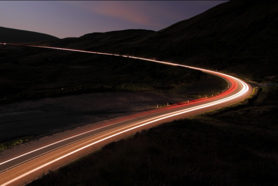
This composition is particularly strong due the high contrast and the predominant focal point. The blurred car lights are very effective and the transition of the lights creates more depth. For example, at the foreground of the photo the different coloured lights merge and blend but in the background they are clearly divided into two sections. Bosanko has clearly used a tripod to take this photo as the lights are in focus and nothing is blurry.
FIRST RESPONSE
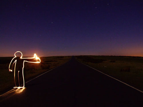
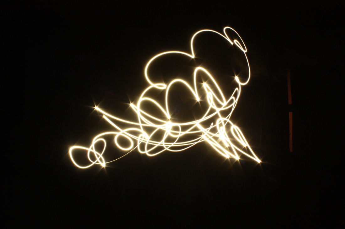
For my initial response to Bossanko's light work, I decided to focus on his light painting images. The process of this was some what difficult, I used the flash light on a mobile phone and photographed a friend moving the light around in order to make different shapes. In order for the light to be shown, the room had to be completely dark.
SECOND RESONSE


S E C O N D S T R A N D:
STREET PHOTOGRAPHY
FIRST RESPONSE
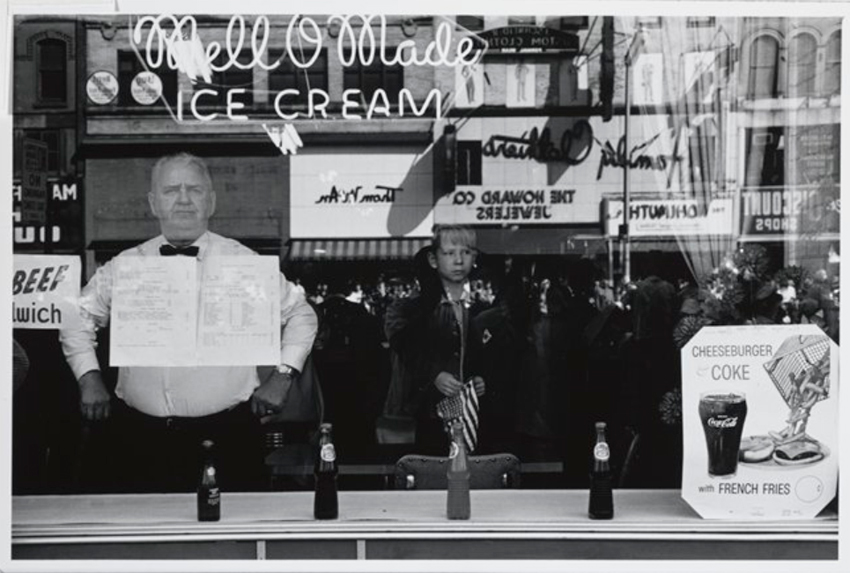
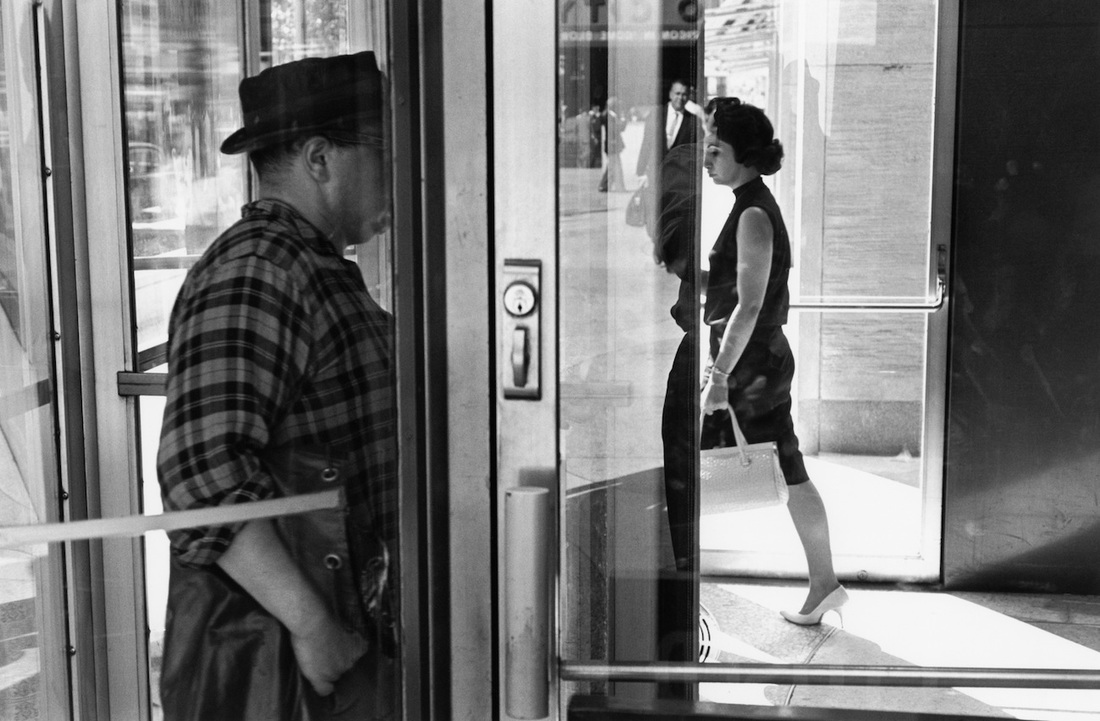
LEE FRIEDLANDER
Lee Friedlander, born in 1934, began photographing the American social landscape in 1948. With an ability to organize a vast amount of visual information in dynamic compositions, Friedlander has made humorous and poignant images among the chaos of city life, dense landscape and countless other subjects. Friedlander is also recognized for a group of self-portraits he began in the 1960s, reproduced in Self Portrait, an exploration that he turned to again in the late 1990s, and published in a monograph by Fraenkel Gallery in 2000.
|
The photographer uses high contrast to portray the stern impressions of the subjects. Moreover, the rule of thirds can has been used due to the fact the young boy is in the centre of the image, this makes the image more strategic and thus visually pleasing. Like the rest of Friedlanders work reflection makes up this piece as it enables more details to be seen.
|
This photo was captured in 1963 in New York. The interesting aspect of this piece is the fact that technique achieved most probably was not the intended intention. An example of this is the man walking across the road in the reflection. Friedlander probably captured this by accident.
|
The fundamentals of this photograph are shadowing. This adds mystery to the piece as you cannot make out the man's appearance. This is a common theme in Friedlandes work that makes his street photography unique and abstract. The shape of the object is significant because it enables a distinguishable degree of reflection to be viewed.
|
RESPONSE
|
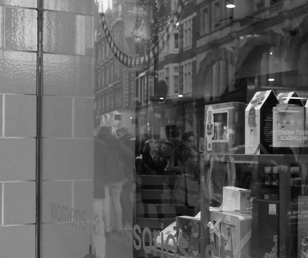
For my first response to Friedlanders work I decided to take photographs in central London (Leister square to Oxford street). Like Lee achieves in his work, I aimed to capture reflections and shadows in my street photography. Therefore the photographs become far more interesting and abstract. However I also tried to manipulate the imposing architecture in my photos. I got this idea from another photographer Arnold Newman who quoted: "The surroundings had to add to the composition and the understanding of the person. No matter who the subject was, it had to be an interesting photograph. Just to simply do a portrait of a famous person doesn't mean a thing"
|

To refine my work and make it mirror Friedlande's more precisely I edited the levels, curves and contrast of my photos in photoshop. Prior to this I then edited all my photographs into black and white. Therefore the focal point of my images (shadowing and reflection) becomes more predominant because of the increased contrasting and the simplistic choice of colouring. Below are the edits that I feel are the most successful:
|
|
|
|
SECOND RESPONSE
STEPHANE JUNG
Stephanie Jung is a freelance photographer based in Berlin, Germany. In 2010 she finished her studies in Visual Communications, where she discovered her passion for experimental photography. Since 2012 she is working as a freelance photographer, focussing on fine art and portrait photography.


|
This photo was taken in Gion, japan. Unlike Jung's other work I've analysed, this photograph is harder to define. It looks like a road is being captured due to the lights, the double exposure effect creates confusion making the composition hold more depth, the lights create an interesting pattern. The sky is a very unique, surreal shade of dark blue adding a fictional aspect to the photo. In the centre of the photograph you can see a car which causes more confusion to the viewer as a result of the pavement clearly shown as the focal point of this image. A blur of people are apparent however this Isn't definite, i like this because it creates an uncertainty making the photo more interesting and the people don't dominate the scenery; instead the colours and double layering do.
|
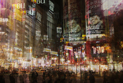
Captured in Shibuya this photograph features a busy city street with many shops, cars and people. The three aspects of this photo make it very strong as they form a busy, crowded photograph that is almost overwhelming. In the foreground of the image, we can see the movement of the people, they all seem to be wearing black which adds an orderly aspect to the photo. The movement of the people is captured perfectly, possible created using a long exposure. The division of the moving people to the shops and buildings is strong as it almost creates two parts to the photo with different colours. The buildings are very lightly coloured and the double exposure effect used emphasises this. Similarly, the poster at the right of the photograph repeated twice is very effective.
|
This photograph is called "A view of Paris".The main focal point of this photo is the Eiffel tour, in the right hand side. The famous building is repeated three times within this composition. This method could have been achieved by Jung duplicating the photo into different layers and moving them. The result of this technique here particularly is a 3D, realistic effect. There is an apparent pattern within this image, the lights are used in almost every part of the photograph, the yellow, red and orange tones create a warm effect which contrasts very nicely with the natural, misty blue of the sky. This photo is taken from a very high point,increasing its effectiveness as the viewer gets a birds eye, wholesome photo of Paris consisting of a blur which creates confusion and therefore curiosity to see the image raw.
|
RESPONSE
T H I R D S T R A N D:
P O R T R A I T T R A N S F O R M A T I O N
FIRST CONCEPT:
D I S T O R T I O N
A Z I Z A N D C U C H E R
Anthony Aziz (born Fitchburg, Massachusetts, USA) and Samuel Cucher (born 1958 in Lima, Peru/grew up in Caracas, Venezuela) are visual artists working together as a collaborative team since meeting in graduate school in 1990 at the San Francisco Art Institute. They are pioneers in the field of digital imaging and post-photography with projects exhibited at numerous venues including the 1995 Venice Biennale.
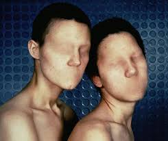
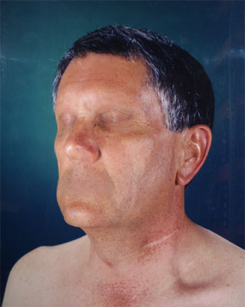
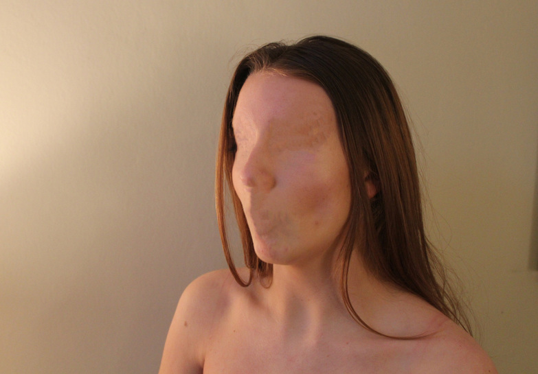
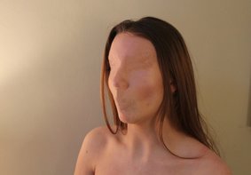
Their unusual series is from 1994-1995 and is titled ‘dystopia’. in the series of large scale colour photographs to two artists depict a series of people, photographed in portrait without any facial features. in each shot, the subject appears completely normal, expect their eyes, mouth and nostrils have been removed leaving only skin. the images were described by art critic adrian w.b. randolph as follows, ‘dystopia, seems to document a pathology. it seems clear that at some level this pathology is not only dermatological, but cultural, commenting, perhaps, on the gradual but waxing loss of identity and the means of communication in a technological environment that promotes anonymity and conformity’.
R E S P O N S E
SECOND CONCEPT:
D O U B L E E X P O S U R E S
P I E R R E D E U B S S C H E R E
.For my second response to abstract portrait I wanted to capture something quite different. I chose to capture movement through the manipulation of layering and opacity in photoshop like the artist, Pierre Debusschere. Furthermore, I also plan to experiment by responding to his landscape/portrait abstraction work
|
Belgian director, photographer and curator Pierre Debusschere utilizes innovative technologies to create high impact visuals. In 2009, he founded 254FOREST, a creative studio working in the realms of film, art, photography and music. Debusschere launched his career at Dazed & Confused in 2008. Shortly after, he was invited to work with Nicola Formichetti on an acclaimed digital content application for Vogue Hommes Japan and Dior Homme, the first of its kind for the magazine. |
|
|
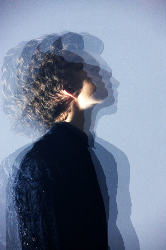
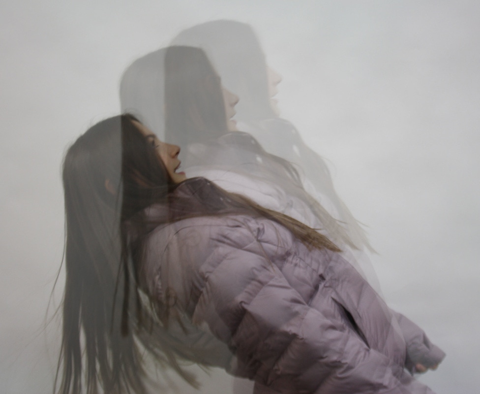
This photograph is the one which I have aimed to interpret within my work. The fundamentals of the piece are made up of quite a basic technique of double exposure. Pierre has most probably achieved this effect on photoshop. The opacity of the layers towards the left and the right of the frame have been given a lower opacity than the centre image.This creates the illusion that the man is moving from side to side and thus movement becomes a feature of this piece. The two colours in this photo compliment each other because they are both blue, but different shades.
|
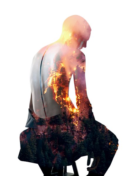
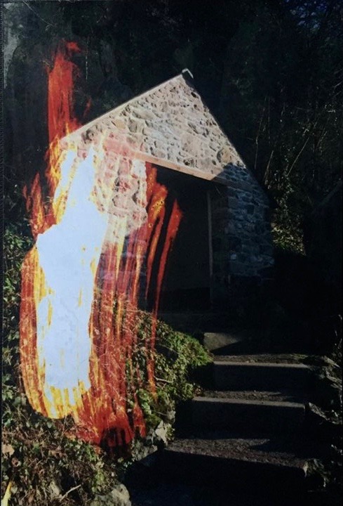
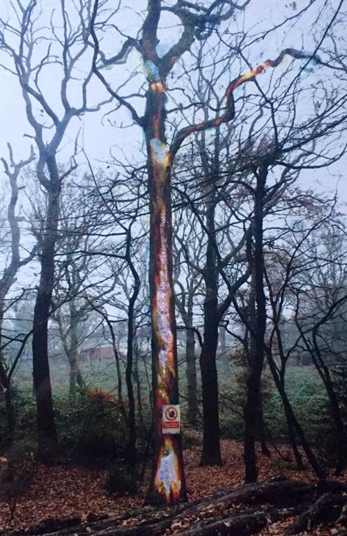
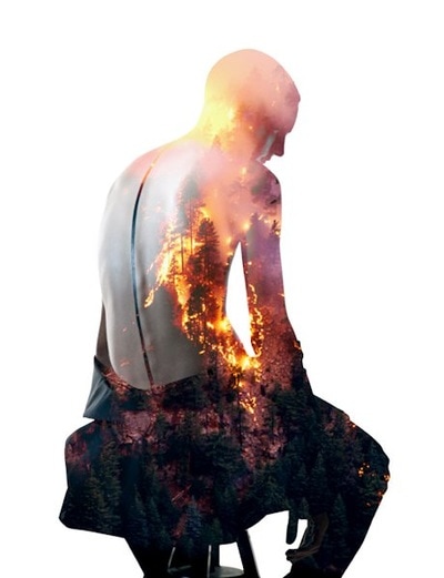
In this piece, Debusschere has merged a landscape piece with a portrait image. Like the majority of his work, he has used double exposure and played with the opacity levels. The choice of portrait is very suited as his back enables the fire to be seen precisely. The colours in this composition are very basic, the figure is in high contrast (black and white) so the orange and red flames have a greater affect. It looks like the artist has edited this piece in photoshop because the background is completely white. This a common theme in his work and it makes the focal point stand out.
|
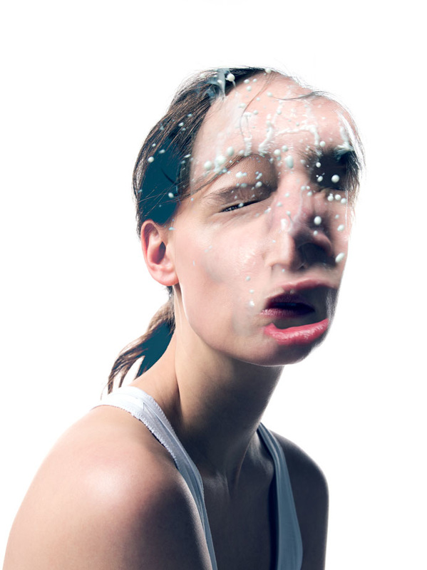
This photo displays a lot of abstraction due to the girls exaggerated and distorted facial expression. It links to a quote by Debusschere: "I always want to put emotions in my work and maybe this could serve as a reason! I like when you dive into a picture, when you need time to read it ... It gives also space to create your own story while reading the image." He has clearly edited the girls face in as the sizes don't match, however this creates a nice unrealistic effect. The bubbles suggest one of the layers of this piece was taken under water. The surreality of this image makes it good.
|
R E S P O N S E
|

|
|

|
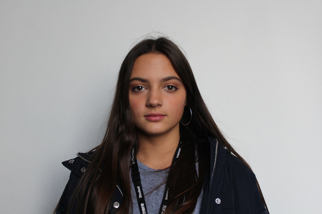
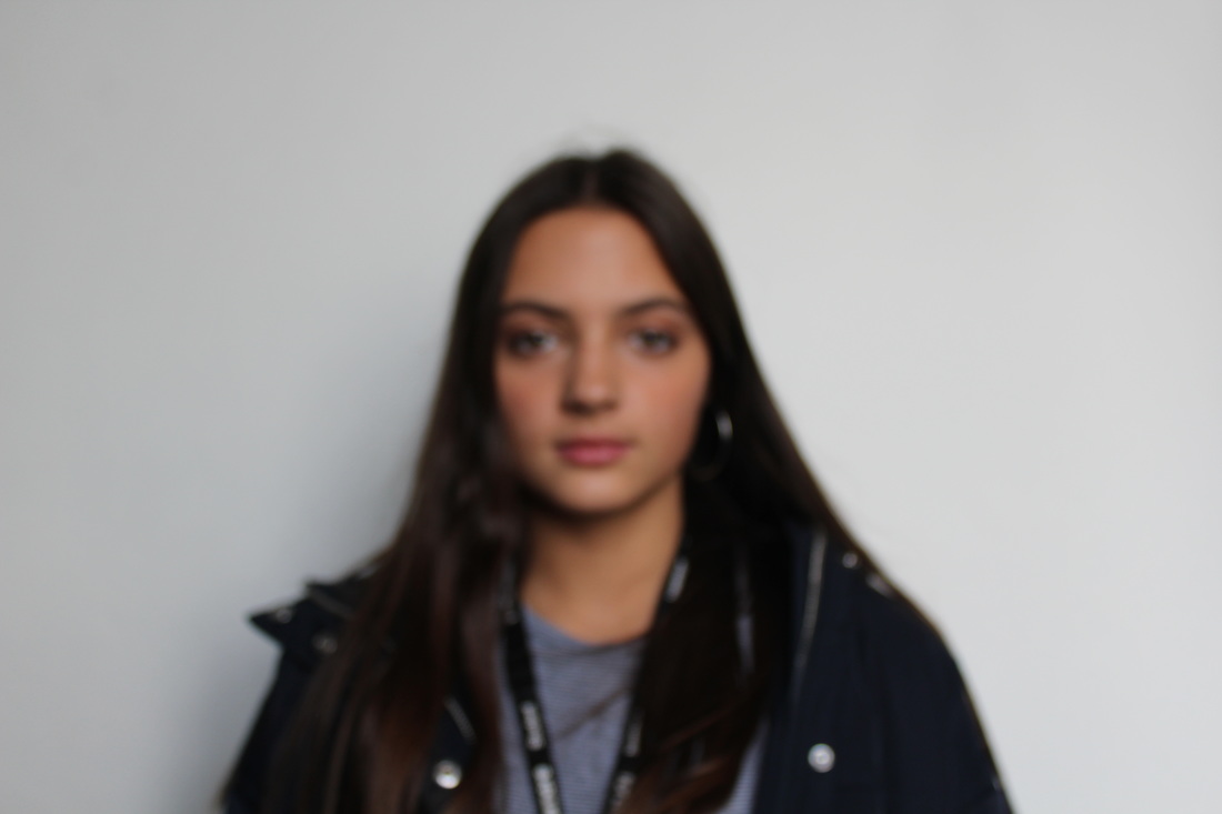
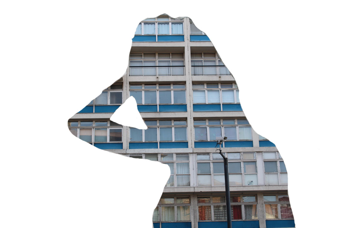
A R T I S T A N D M E

M Y W O R K |
A R T I S T ' S W O R K |
Like Debusschere, my piece shows a variety of opacities within the figures body. Also, both photos have been taken taken at a portrait angle and the second photo used is of nature and the portrait images are both in black and white. Finally, both images have a white background because i edited my photo on photoshop ensuring to erase the background so that the focal point is more apparent and predominant.
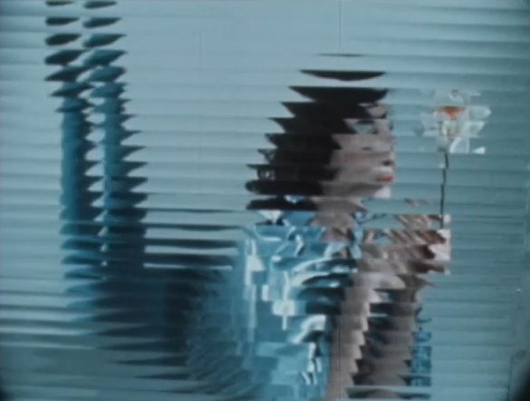
G L I T C H I N G
FIRST RESPONSE

|
|
SECOND RESPONSE
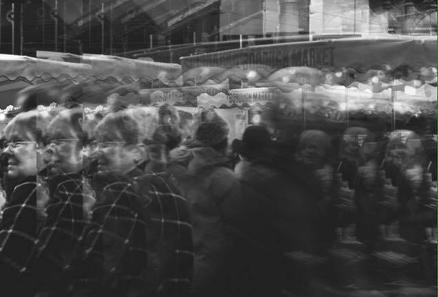
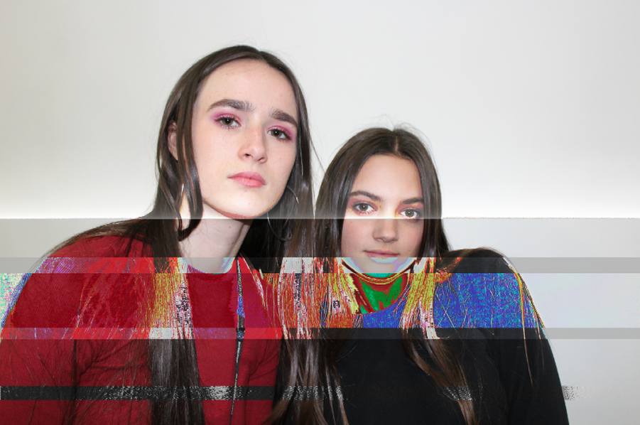
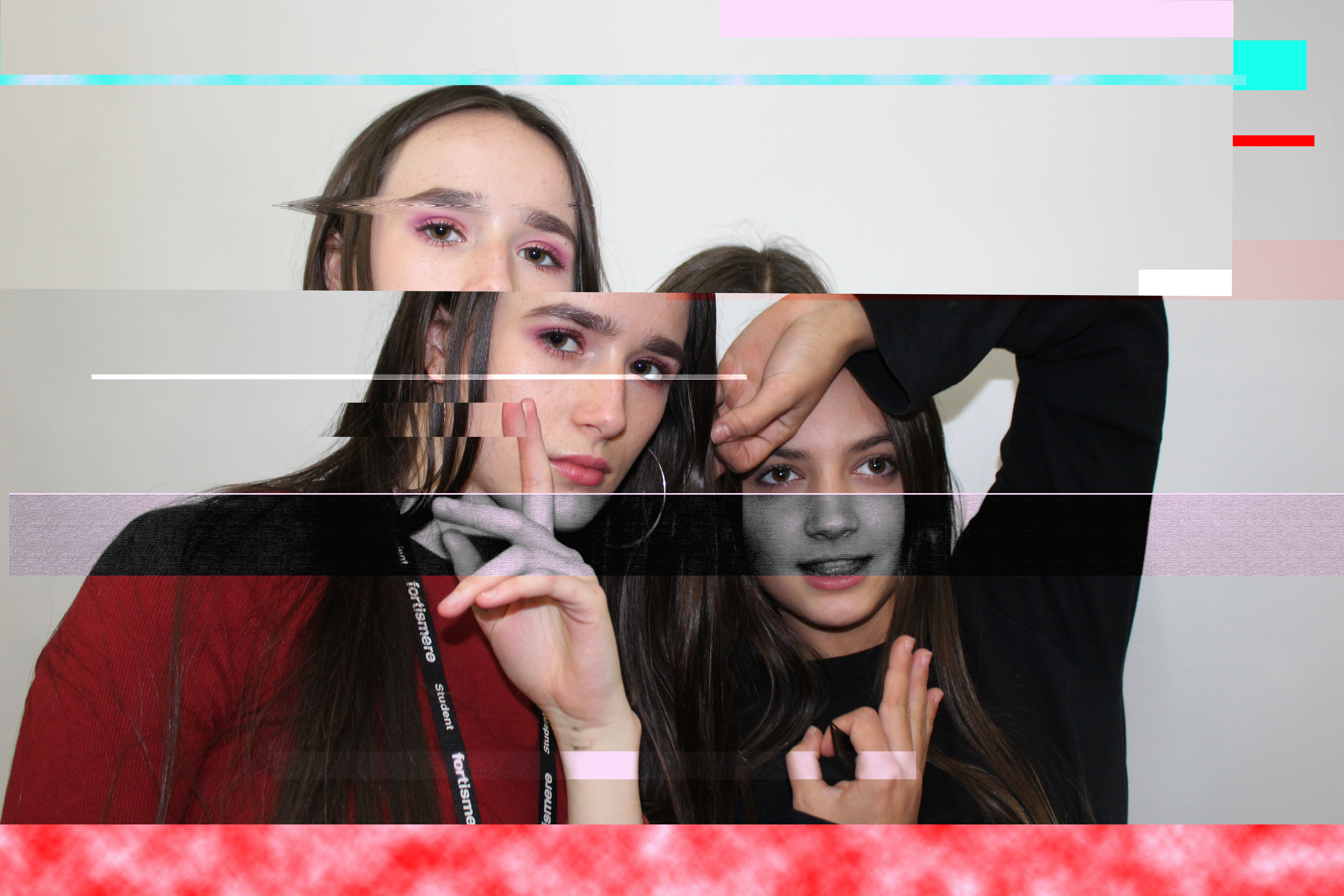
To develop my work I decided to photograph outside of the studio in a more diverse and urban location. I photographed people doing their shopping at the farmers market in elephant and castle. This enabled my photographs to have more depth in terms of containing landscape as well as portraiture. I thought this would look more interesting with glitching.
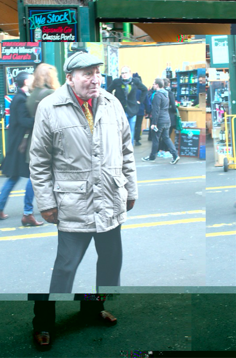
|
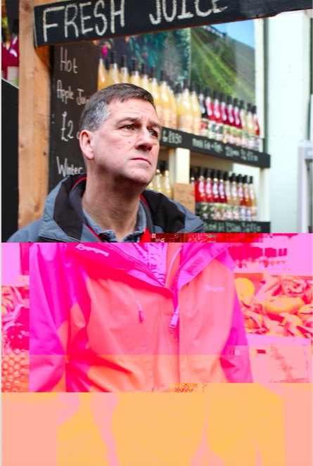
|
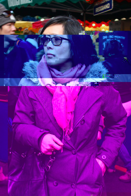
|

DEVELOPMENT 1
I realised that glitching images of the environment looked more subtle and appealing so using a film camera I visited a nearby graveyard. I chose this location because it holds much meaning and the use of the film camera enabled a thrilling, sinister effect which i think suits the theme of this response, this was because of the black and white film I used.
|
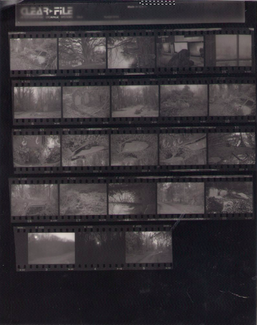
|
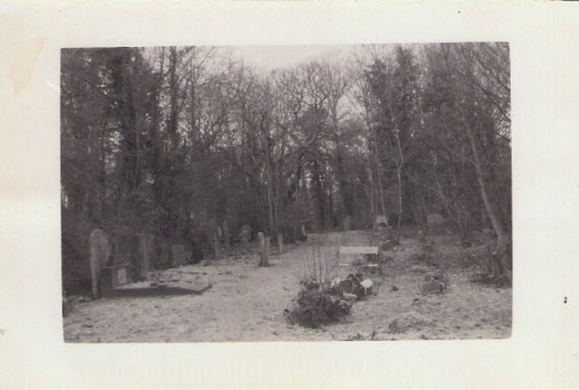
|
|
|
|
DEVELOPMENT 2
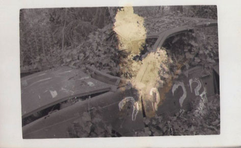
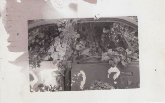
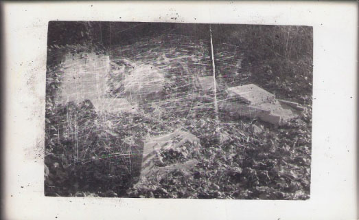
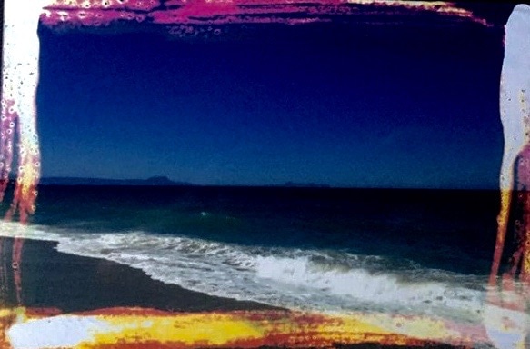
For my final development stages of abstraction I decided to capture a series of images that feature the natural environment. Due to this derelict untouched theme I found it appropriate to glitch my images in a practical way using bleach and isotope as opposed to photoshop which i experimented with previously.
Here I photographed the local area around my school, focusing on trees and the natural environment. To make the focal point of each image clear I used the negative space technique and the MF camera setting.
|
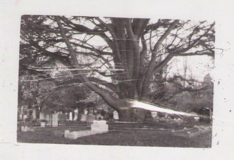
The second location i visited was in Highgate and consisted of grounds of villa built in 1798 by Sir Henry Tempest, thus it consists of historical value yet there was also lots of interesting greenery and plants in the estate.
|
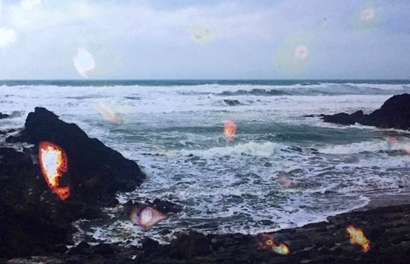
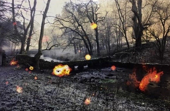
For my third set of images I went to the Peak District and focused on incorporating the river into my images. Furthermore, unlike the other set of image the sky plays a more significant role in the composition.
|


|
|
E X P E R I M E N T A T I O N
DEVELOPMENT 3
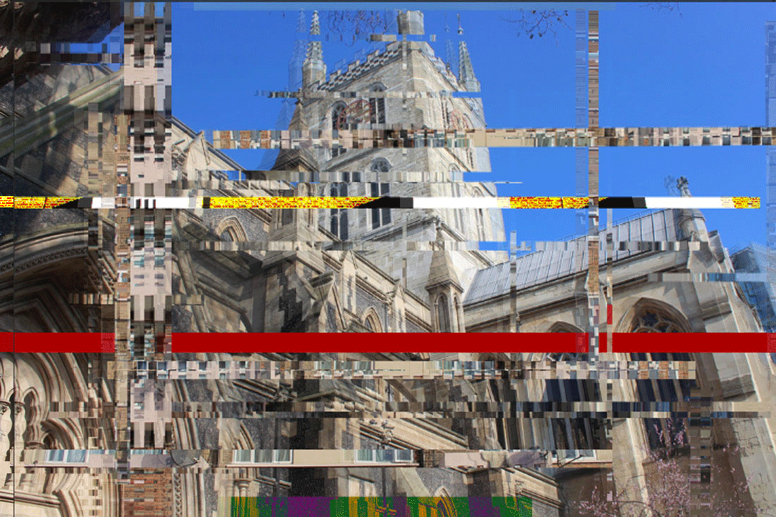
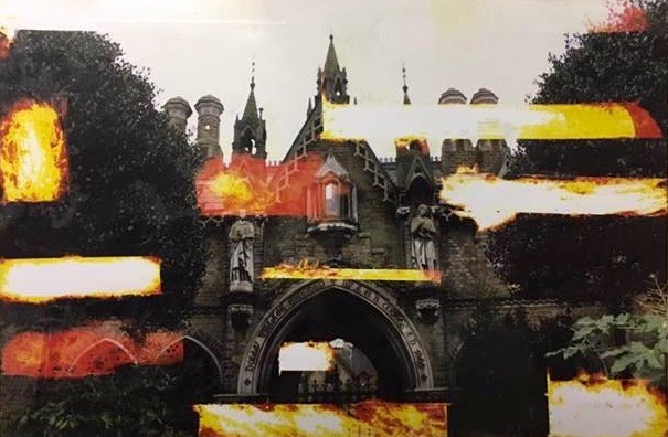
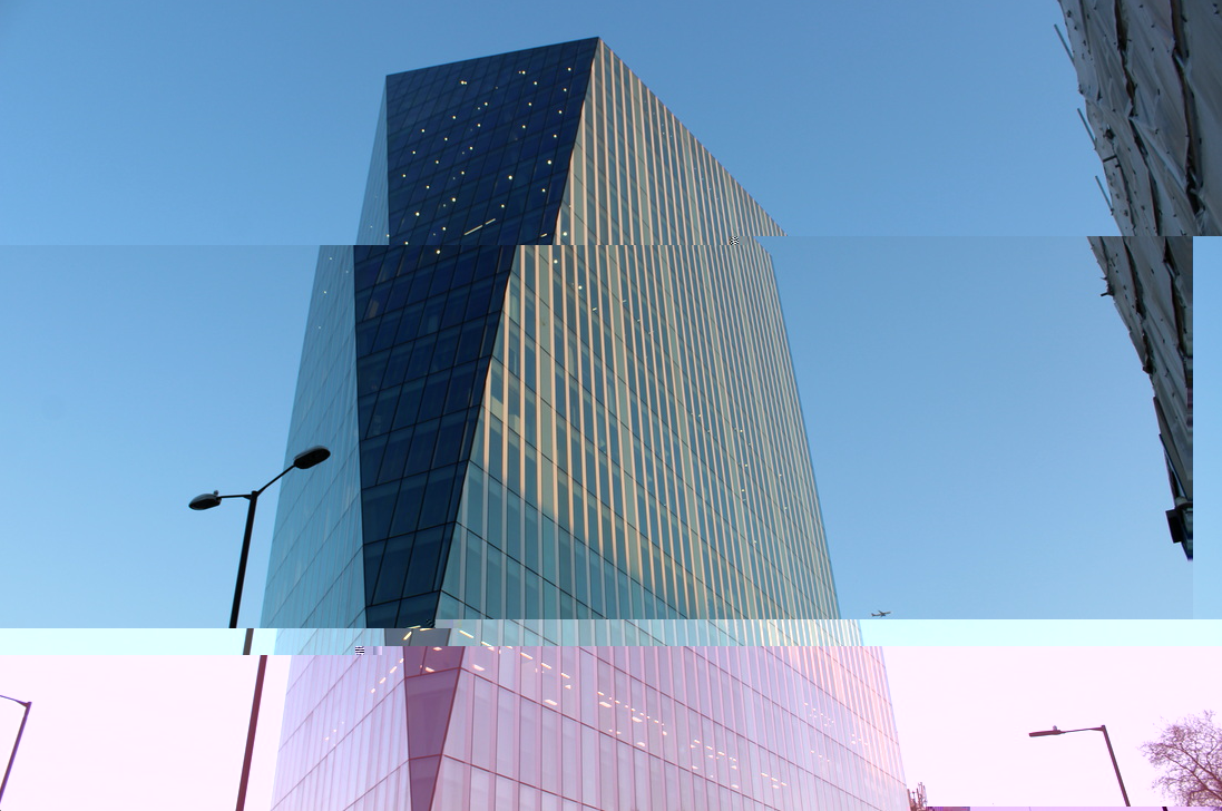
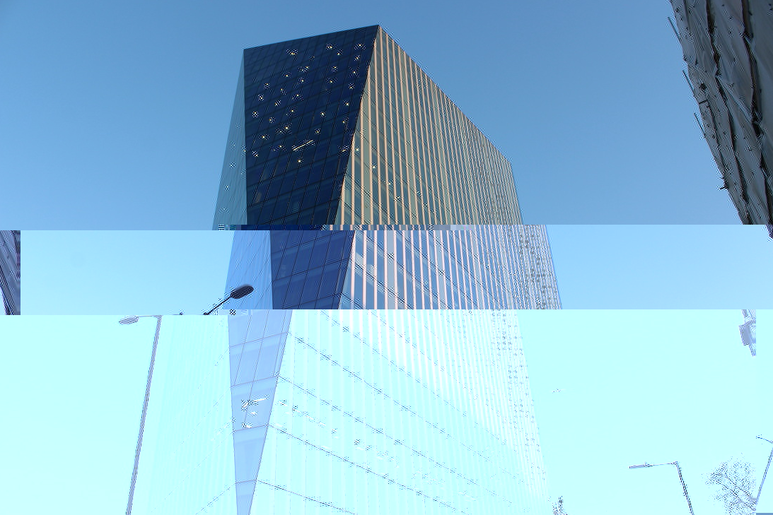
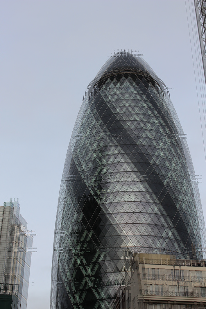
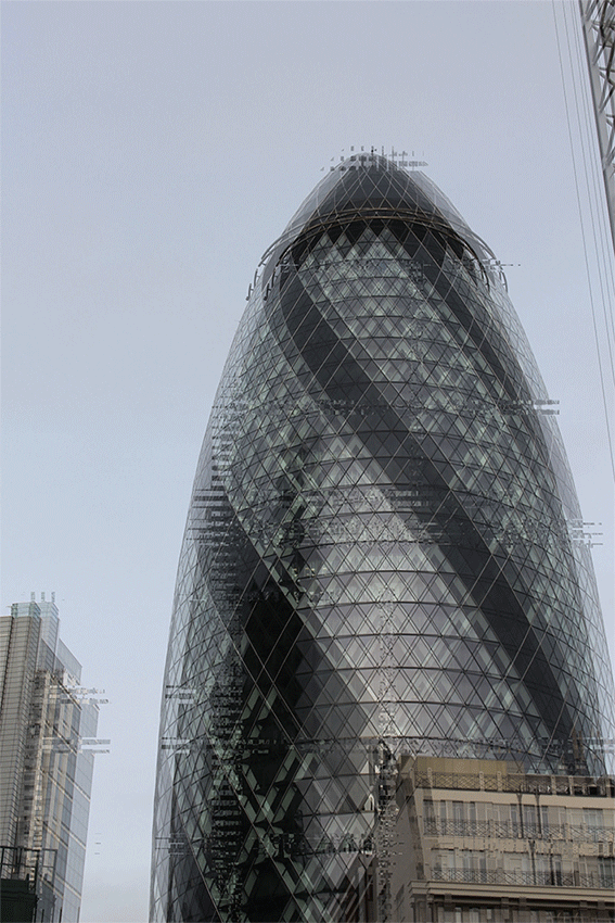
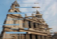
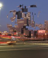
From my third response to glitching I realised that I prefered the outcome of glitching on landscape photographs because it looks more effective and abstract. Therefore, for my third response I went in to central London photographing architecture. I then tried a different approach to glitching in photoshop. I made it in to a GIF to refine my work and so that the process of destruction became more dominant. Within my responses i photographed old and new archItecture to show the contrast. In doing this, I am portraying the digital era on an old building that was built in 1675. The digital era is the transition from mechanical, and electronic technology to digital technology. "Glitching" was first introduced in the digital era. The outcome of my development is supposed to portray a futuristic visual as I am making the image quirky and unrealistic through glitching, I am also using vibrant colours to show the vibrancy and brightness the present and future have had on the past.
W A T E R L O O

DEVELOPMENT 4
For my fourth response I went in to central London photographing architecture. I then tried a different approach to glitching in photoshop. I made it in to a GIF to refine my work and so that the process of destruction became more dominant. Within my responses i photographed old and new archItecture to show the contrast. In doing this, I am portraying the digital era on an old building that was built in 1675. The digital era is the transition from mechanical, and electronic technology to digital technology. "Glitching" was first introduced in the digital era. The outcome of my development is supposed to portray a futuristic visual as I am making the image quirky and unrealistic through glitching, I am also using vibrant colours to show the vibrancy and brightness the present and future have had on the past.
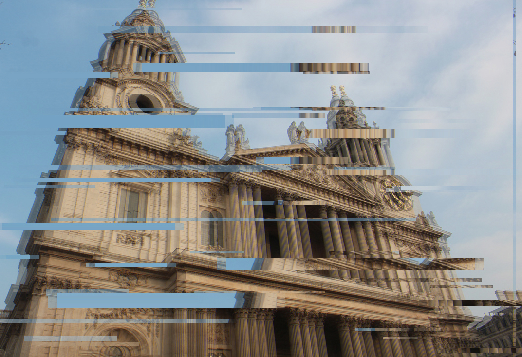
S T P A U L ' S C A T H E D R A L
E U S T O N
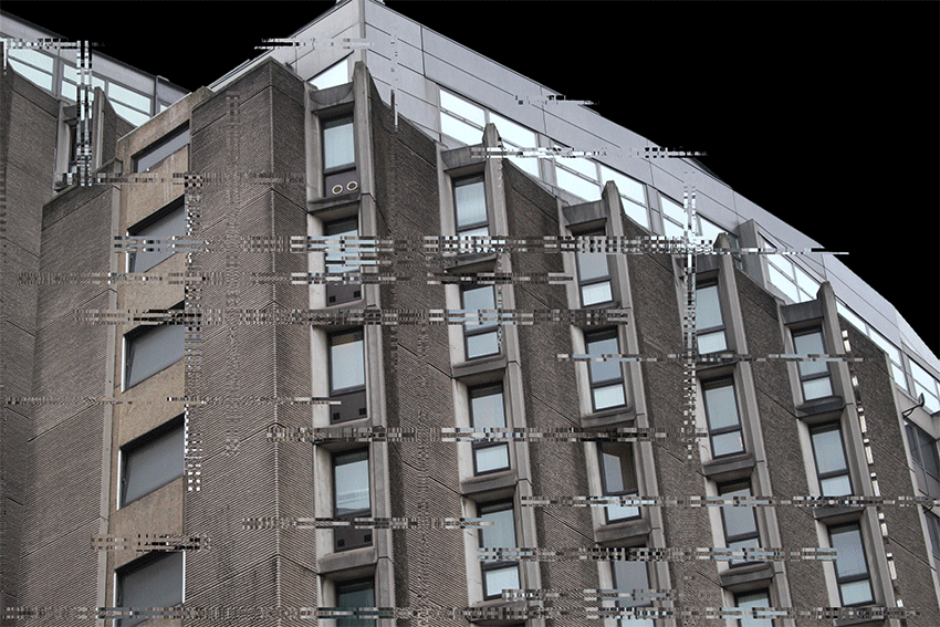
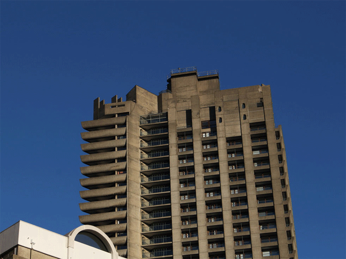
T H E B A R B I C A N
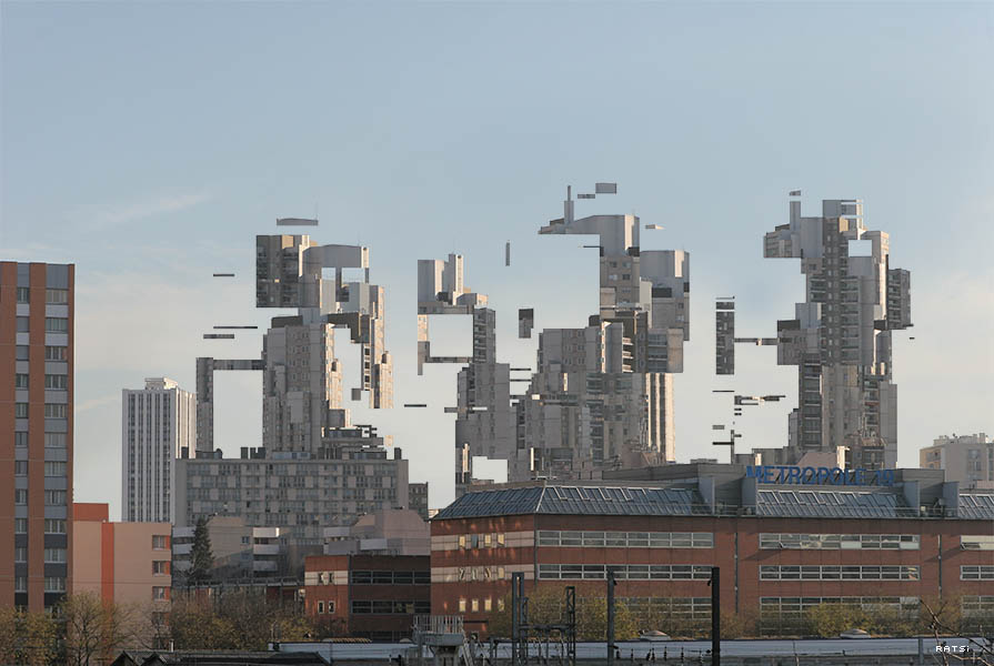
O L I V I E R R A T S I
Olivier Ratsi is a french visual artist, he lives and works in Paris. Olivier Ratsi’s work presents objective reality, time, space and matter as a series of intangible informative notions. Focusing on the experience of reality and its representations, as well as the perception of space, he conceives works that encourage the viewer to question his or her own interpretation of what is real. As part of his work process, Olivier Ratsi creates systems that deconstruct our spatio-temporal reference points, often using the technique of anamorphosis, developed during his research. Making a break with objective reality, Olivier Ratsi’s works are not specifically aimed to unleash emotions or to perturb the senses, but rather to work as a catalyst for different points of view and cultural and psychological references.

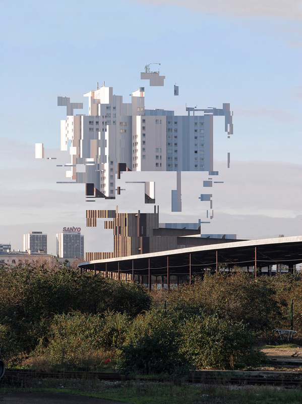
I N S P I R A T I O N
http://modernarchitecturelondon.com/pages/index.php
DEVELOPMENT 5
To refine my work further I tested altering the layers from side to side in my gifs to create a 3D effect.
|
|
BREAK DOWN OF DEVELOPMENTS
|
Development 1-
For my first development I focused on portrait transformation, thus i created pieces in response to the artist Aziz&Cucher. I looked at the ideology of confidence and beauty |

|
Development 2-
I then looked at double exposures and the artist Debusschere I used the layering tools in photoshop to create my responses. |

|
|

|

|
|
|
Development 3-
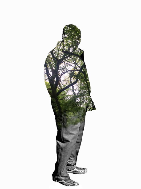
I then started to manipulate double exposures so that the landscape and portrait merged. I was inspired by the photographer Nacho Ormaechea |
|

|
Development 4-
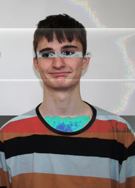
Then i decided i wanted to glitch so I photographed people in the studio and edited them using audacity, text edit and photosh |

|
|
|


Development 5-
I then decided to bleach images of landscapes to achieve a different distorted affect |
Development 6-I then tried glitching modern buildings in textedit to test different techniques in my work

|

|
Development 7-Digital building glitches using photoshop and GIFS by manipulating layers and shapes
|

|
EXPERIMENTATION
In the piece below I have tried to make a GIF that combines the two aspects of man and nature through digital manipulation. To do this I chose to photos of the same length and width and then copied and pasted rectangular cut outs of one image onto the other. used a 0 second interval between each animation, except the last one. This makes the landscape photo more obvious and thus predominant.
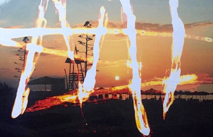
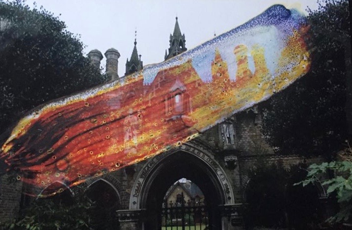
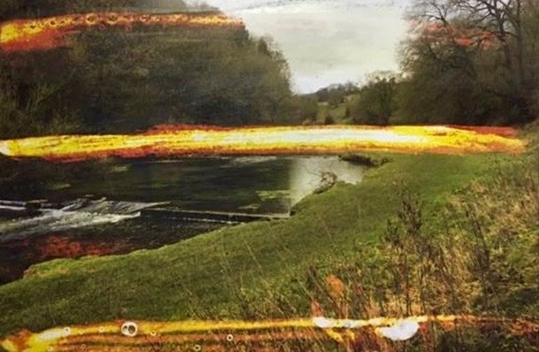
In the above photographs I have printed photographs from the countryside and abroad and glitched them manually. I chose to do this because I thought it was appropriate to glitch the urbanised city pictures in photoshop, but that the photos consisting of nature were more suited to manual effects such as acetone and bleach. I used a paint brush and masking tape to achieve the effect I wanted.
F I N A L P I E C E